
It doesn’t get any easier.
It doesn’t get any easier to assimilate what we are experiencing as daily death statistics become a normality. Not an acceptable normality. It is becoming increasingly difficult to ‘Reconcile’ the reality of the figures and confined Isolation.
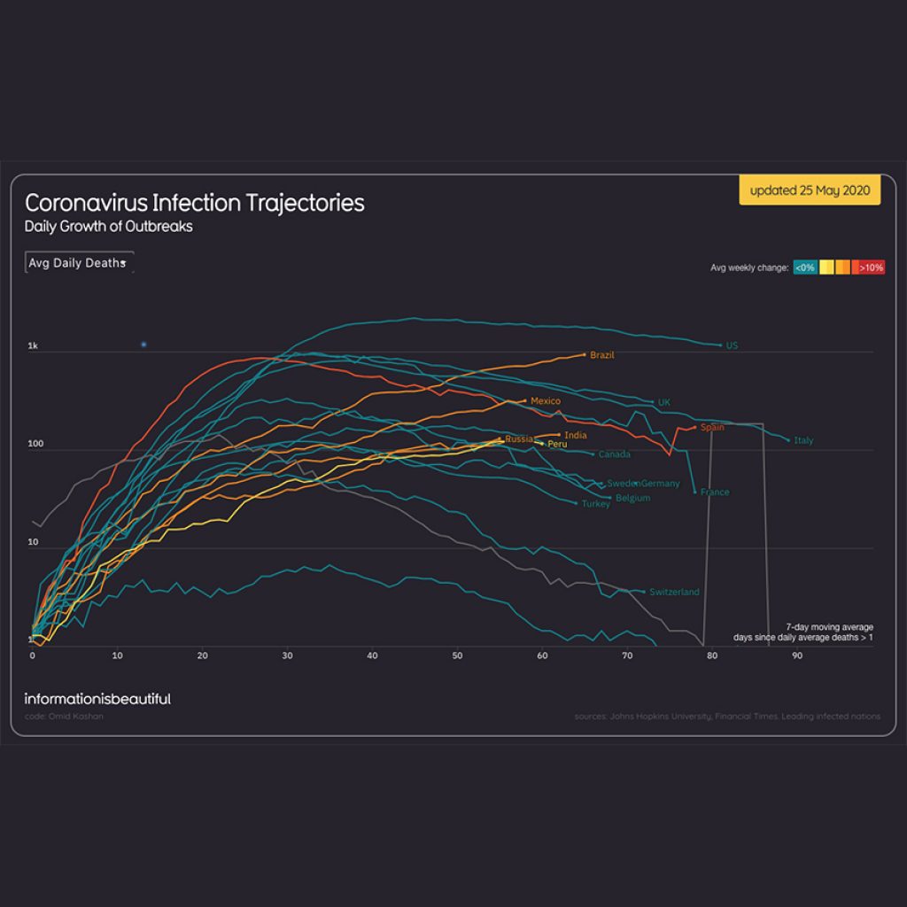
The infographic is interactive : https://informationisbeautiful.net/visualizations/covid-19-coronavirus-infographic-datapack/
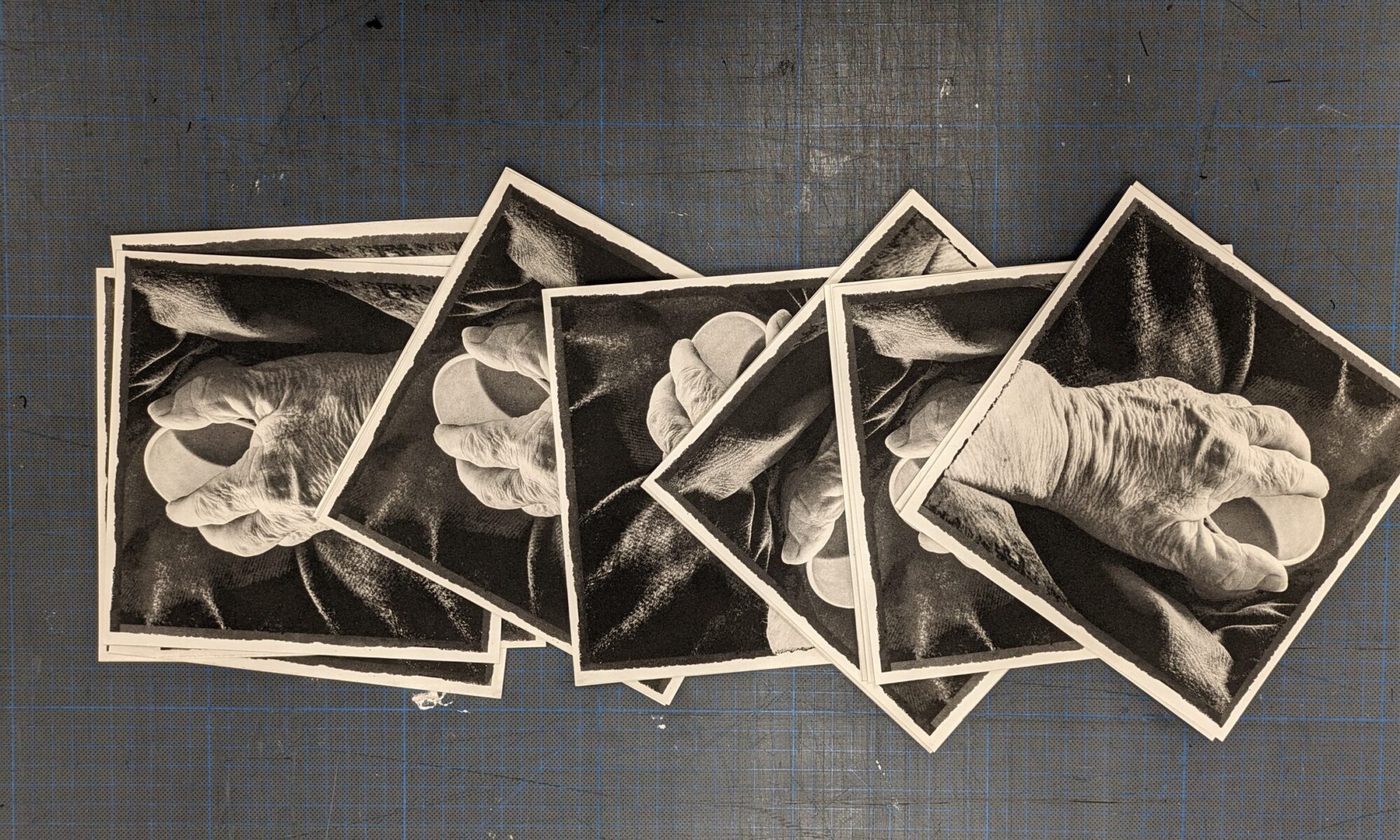
Birmingham School of Art #printgang
While posting a recent #Printgang screenshot an image from @Crownpointpress, the iconic San Francisco arts press caught my eye. Crownpoint is a unique press where artists spend dedicated time making ground-breaking prints with expert printmakers.
Crownpoint founder Kathan Brown observes in her introduction how printmakers traverse image making: “In 1965 Richard Diebenkorn drew a woman’s face on a plate and fifty-one years later Jacqueline Humphries, working at the same table, integrated emojis with abstraction. She said she was thinking about the plates, not the prints. The plates make the print.”
Jacqueline Humphries at Crown Point Press
My first impression of Jacqueline Humphries’ featured print ‘Red’ was that it was a layered colour screen print using stencils, half tone and cmyk techniques.
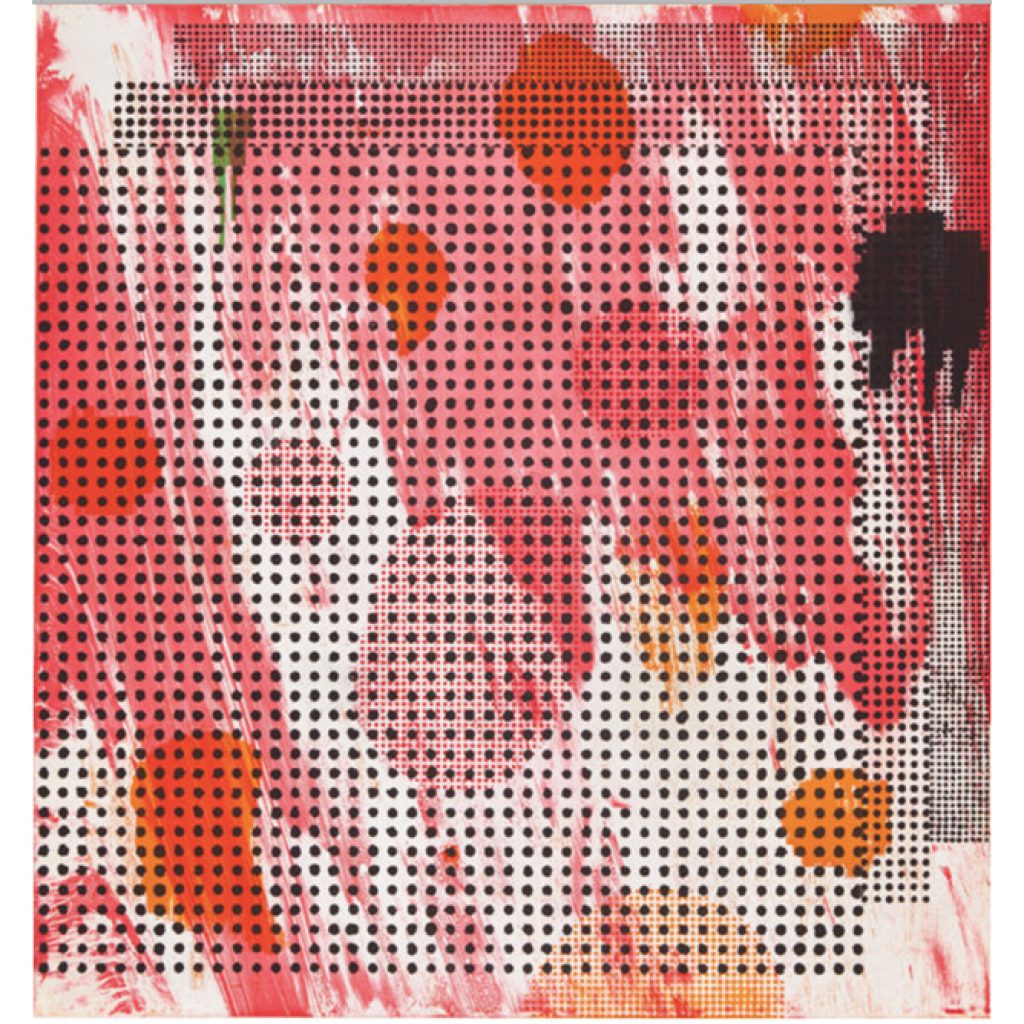
Color sugar lift and soap ground aquatints
45 × 42 in
114.3 × 106.7 cm
Edition of 25
It was not. It was a large-scale, large plate sugar lift etching. The process is captured on Crownpoint magical moments: https://www.youtube.com/watch?time_continue=418&v=zafzGvlMer8&feature=emb_title
After further research into Jacqueline Humphries’ work and online video interviews, I was rewarded with insights into her layering work aesthetic. She makes images between abstraction and figuration. Mixing abstraction and modern tech images. In print and painting, she uses keyboard characters, emonicons, colons, commas, ascii code, parenthesis and emojis. ‘It’s all done in a computer. Proof those and I make a decision, I have a large laser and I stencil them onto the canvas, then maybe I paint into it. Some characters are blown in contrast in photoshop and bring out different qualities.’
‘For three decades, Humphries has tackled the question about the relevance of abstract painting in a visual culture that is increasingly influenced by screens and technology. The paintings she has developed over the past few years combine both traditional and contemporary methods, abstraction and figuration, gesture and mechanical reproduction, density and flatness, optical illusion and physicality— creating a new language in the long history of abstract painting.
“I am less interested in harnessing technology as a means to make painting or changing painting through technology,” Jacqueline Humphries has said. “But in how technology has changed me. How computers have changed bodies. And so by reimagining painting as a technological interface, I think of painting as a screen upon which anything can be projected.”
Her integration of the complementarity of abstraction and technological imagery encouraged an appreciation of how one artist has embraced these two facets of image making in print. As well as enjoyment of the ‘Red’ artefact’s dark patterning over bright painterly coloured ground it is a contribution to my research into analogue and digital silk screen printmaking.
Other works:
https://www.greenenaftaligallery.com/artists/jacqueline-humphries
And an interview from Aspen Art Museum on July 25, 2019: https://youtu.be/kl6YydkDqDI
Material Encounters
The Material Encounters Cluster at BCU presented a philosophical webinar delivered by Professor Tim Ingold from Aberdeen University on the subject many arts researchers tussle with in and out of lockdown: HOW CAN ART BE A PRACTICE OF RESEARCH. Professor Ingold is a world renowned Anthropologist and author of books including: Lines (2016), Making (2013), Being Alive (2011) and The Perception of the Environment (2000). This was a most stimulating lecture and Q&A enabling the sold out audience to consider their research in a wider intellectual context than the current restricted environment enables. https://materialencounters.wordpress.com
To wear or not to wear, that is the question.
As debate of how Lockdown might be relaxed the issue of masks has to be dealt with. In considering the pros and cons I looked into the 1918 pandemic flu response that devasted populations having just survived the mass deaths of the first world war. It threw up century old images of masked people and the theories of effectiveness reminiscent of current consideration:
The gauze mask was another prevention method using similar ideas of contagion and germ theory. In the United States it was widely accepted for use in hospitals among health care workers. The face masks consisted of a half yard of gauze, folded like a triangular bandage covering the mouth, nose and chin (BMJ, 11/2/19118). These gauze masks acted to prevent the infectious droplets from being expelled by the mouth and from the hands, contaminated with microbe from being put to the mouth. The barrier from the hands was thought to be more important than the barrier from the air. This rhyme was a popular way to remind people of the ordinance.
Obey the laws
And wear the gauze
Protect your jaws
From Septic Paws
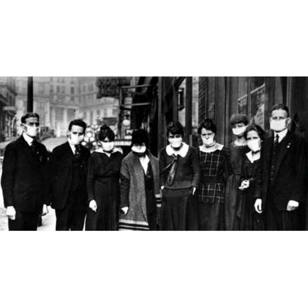
They found that the mask wearing led to “a rapid decline in the number of cases of influenza,” (JAMA, 12/28/1918). A study in the Great Lakes, however, did not find such beneficial results. Mask wearing by hospital corps did not have an effect on the incidence of disease as 8% who used the mask developed infection while only 7.75% of non-mask wearers did (JAMA, Vol. 71, No. 26). Despite these results, the masks were commonly used by many in an effort to avoid the pandemic influenza disease.
https://virus.stanford.edu/uda/fluresponse.html
LockDown LookOut
Major development!
Reviewing the digital iPad drawing I decided that the drawn dark framed tree could benefit from and extended frame to situate it in a wider visual context. In photoshop the drawing is positioned on a photograph of the window frames, at 40% opacity creating a light grey abstract irregular grid. The drawn black and white image is tinted, much like the making stencils for silkscreen prints to give a green flat background to the tree and flat blue to the sky. These are all made in separate layers and reminiscent of the waking images that have inspired the print. For print it has become by applying analogue silkscreen conceptions in the data processing of photoshop to be printed out from an inkjet printer.
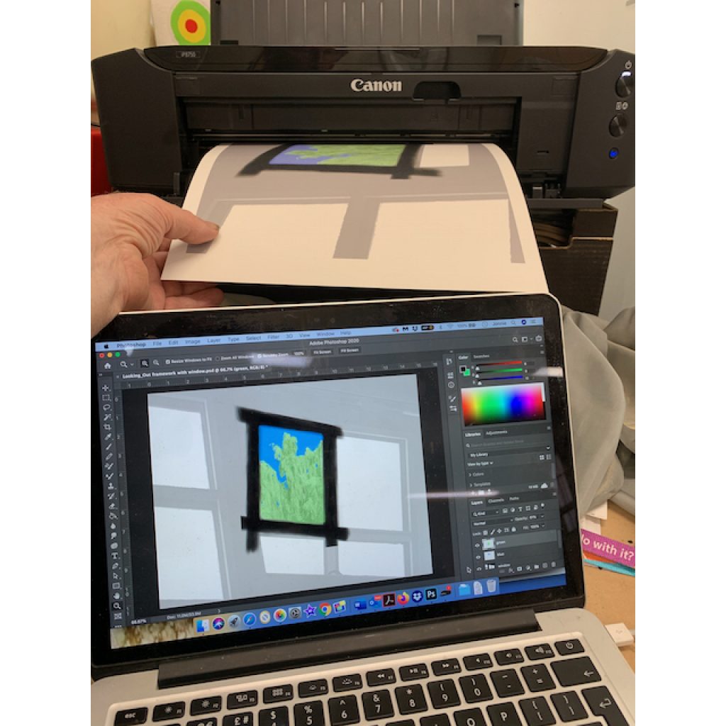
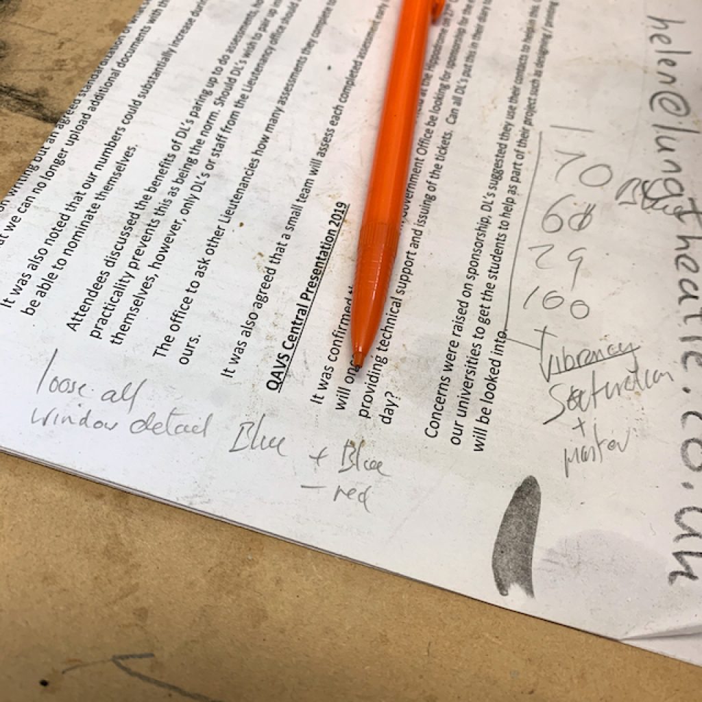
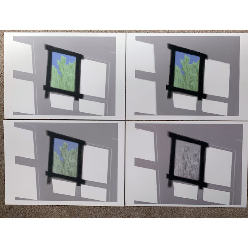
1. Bright colour settings 2. Bright settings with no window detail. 3. Softer colour settings. 4. No colour with window detail. Over the next week one will be selected to print an edition.
SUPA Gifting Success.
I am very happy to report that the SUPA lottery lucky dip has been a great success raising £2500 for women’s aid. See the postcard artworks: https://www.supagallery.co.uk/supa-dip
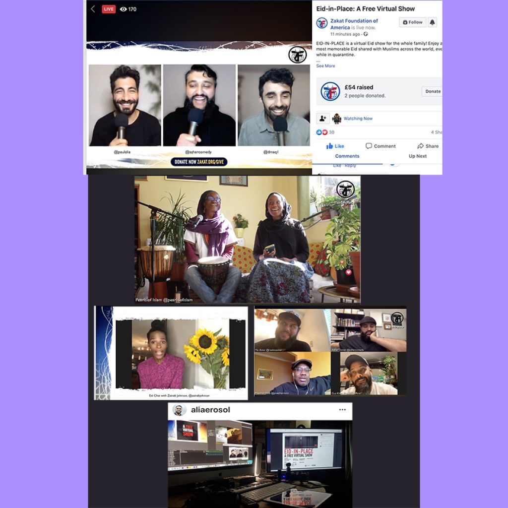
Eid Mubarak

Sunday 24th was the Islamic celebration of the ending of the month of Ramadan and fasting which Connect Futures observed with a creative visualisation.
On the 24th USA Zakat Foundation broadcast a free virtual show and celebration on Facebook live: Eid-in-Place. Birmingham UK’s Mohammed Ali and Guz Khan contributed.
Take Care. Stay Safe.