Two colour silk-screen portrait. A case study in context.
This article aims to present the research and methodology of fine art silk-screen print portraiture, created from small smart phone digital photographic images, analogue drawn image interpretation into large-scale photo-mechanical silkscreen images and finally into a serigraphic print on paper. Discussed are the interdependent relationships and transitions between the selected media, methodology and the underlying philosophical, phenomenological and lived experience of the practice. A single serigraphic portrait is the vehicle for exploration.
(This written article was the basis for a rewritten and peer reviewed article for the IMPACT Printmaking Journal. ) Now published: Impact Journal (2). UWE Centre Fine Print Research. Title: ‘Gestural drawing for serigraphy’. Published November 2020.
The print began at a lecture at Birmingham School of Art in November 2019, given by PhD researcher Ian Sergeant on: ‘Visual Representations of Black British Masculinity.’ Sergeant, presented in front of projected slides surrounded by wide, white borders creating dramatic silhouettes. A portrait was not envisaged at this scholarly event, however a single smart phone photograph was made to review whether a photographic image might be visually dramatic. Further photographs were taken while the subject delivered his presentation. From time to time he entered the projector beam, which illuminated parts of his head and hands, in contrast to his body, which remained in darkness.

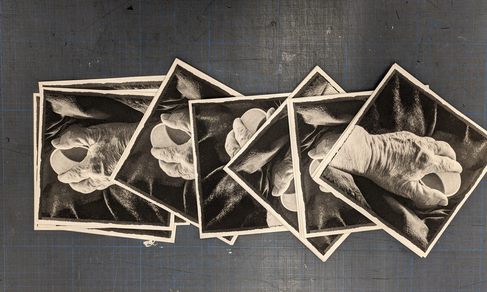
Fig 1. Original smart phone presentation digital images
Following the image capture, eighteen photographs were reviewed and a selection sent to the subject as documents of his presentation for his use, if he so wished. (Fig 1) Sergeant was thankful for the images and commented on how well they captured his gestures. He agreed that they could form a basis for contemporary printed portrait research.
Smart phone image transformation for serigraphy
Transforming the smart phone photographic image into a serigraphic portrait begins with the selection of a photograph exhibiting the subject’s performative commitment. To focus on the active illuminated subject digital cropping of extraneous contextual details is made by exporting the image into a photographic editing software application. Before leaving the smart phone domain it is worth taking account of how central to human experience this technology has become. It is a global phenomenon that as well as fulfilling its original function of mobile communication it has become an item of human apparel with data, algorithmic and purchasing powers. It provides alternatives to mass broadcasting and increasingly delivers personal defined private group communications excluding public engagement and control. With the smart phone’s bedfellow social media, privacy in personal and public realms is threatened through the anonymity it seemingly enables. In addition to the multiplicity of these modern phenomena the smart phone’s built in, computational camera technology has enabled the democratisation of contemporary portraiture and in particular self-portraiture. This is an extrapolation of the democratisation initiated by the mid nineteenth century introduction of photography and the carte-de-visit.
To increase understanding of the social and psychological affects of the prevalence of smart phones, there is much further and necessary research underway. This fine art print research recognises the role large and small images of human portrayal play in modern global society. By pursuing and refining a methodology, integrating smart phone, drawing and silk screen printmaking, an alternative to the lived experience of mass communication is provided in the form of small through to large scale, bespoke printed portraiture.
Although prints can be made on a huge variety of substrates, this research prioritises paper and the array of surfaces borne of their source material and manufactured processes. As the selected image has an expansive flat background a paper with a smooth surface will be best suited. The intriguingly named ‘Bread and Butter’ fulfils this requirement. It is an acid free, wood pulp, bright white strong machine grade paper. At double elephant size of 68 x 101cm, it offers a large expanse to host the printed image and background composition. The portrait is envisaged to be impactful and celebratory and printed at a large scale. The selected photographic image is enlarged digitally to two thirds size of the paper, split into A3 images, printed out on to plain paper at low 72dpi resolution, composited together and placed under an A1 sized sheet of drafting film for the drawing of a screen positive. This is the first moment that the image becomes material. To this point it is virtual, ‘seen and worked on in the digital screen, and stored within the computer as data.’ (Love 2015:218)
Drawing on drafting film
As Paul Thirkell suggests the transformation from data to an analogue fine art print ‘is a highly subjective exercise and requires a craft like knowledge and mastery of the process to achieve a desired result.’ (Thirkell, 2005:5). The medium for making this transformation is Mark Resist: a transparent sheet film with a tooth capable of holding drawn graphite marks securely for exposure on to silkscreen. A 9b graphite stick is selected to begin drawing over the photographic image. This decision sounds simple, but it is informed by extensive investigations on this specific film surface with many tools. Unique material mark-making and associated meaningful results have been internalised, to be applied at this decisive moment of embarking on a new print. Once selected one responds to the precise demands of the tool, image, material modalities and encounters. Regular pauses, reviews and critical assessments of progress of image, or part thereof, are taken. Quietly, consciously and subconsciously an internal dialogue between mark making and viewing is embraced. As Tim Ingold suggests: …’we have things to know only because they have arisen. They have somehow come into existence with the forms they momentarily have, and these forms are held in place thanks to the continual flux of materials across their emergent surfaces. (Ingold. 2019: 60)
The initial concept for the portrait was to compliment the tonally drawn facial and hand highlights caught in the projector beam, with an overall flat silhouette of the rest of the body with Indian ink, or similar opaque medium. However the energy, physicality and materially of the drawn intensely textured graphite delivers marks more abstract than literal, embodying the subject’s energy and commitment. Such stratums of graphite marks are in contrast to a stark binary, graphic style and are judged to deliver more effectively the diversity of characteristics prevalent in the subject.
Mark resist drawing for serigraphy.
The widening range of continuous tone mark making for silkscreen has been made possible through the introduction of Mark Resist and True Grain drafting films. These were introduced in the 1990’s to enable continuous tone more efficiently than half tone. (Purcell 2019: web) The film is transparent with textured pits that retain particles of drawn graphite that prevent exposure to the emulsion on fine mesh silkscreens. The portrait in this research is drawn on 150 Micron mark resist. In comparison to half tone exposure times, mark resist times are substantially less. The resultant serigraphic prints may be mistaken for original drawings or lithographic prints owing to the drawn detail retained and exhibited in the final prints. As the image takes form the materials and technique offer the opportunity for response and reflection. To pursue subtlety of detail the original photograph is reviewed and examined on a computer screen in close proximity to the emerging drawing. Photo editing software functions enable additional visual information to be displayed and assessed. By brightening the shadows (most of this image) the hidden body shape, hair textures and garment folds are revealed and can be drawn into the emerging image. The facial profile is drawn to reflect the light the subject looks towards and holds his expression, through marks delineating forehead, eyes, cheeks, nose and mouth. These are delicate marks made with the sharpened tip of the stick as small deposits of graphite adhere to the surface and are embedded in the film. The stick is used to make lines, deep shadows, figurative references in contrast to tonal planes and abstract expanses. Mark-making gestures are applied with purpose, even though they may imply free, effortless or even thoughtlessness they are meaningful. Each element and area is drawn in relation to the whole, which is kept in mind and reviewed throughout. For the expanse of the body, marks are gestural exemplifying the support for head and hands, and drawn with the rounded butt of the stick being pushed hard into the film, leaving deep graphite deposits. The broad drawn gestures of the lower body are left to live themselves on the background, not restrained by a frame edge, as in the photographic image it has come from, but is being transformed by reinterpretation for serigraphic print.
Smooth card is employed to protect the drawn surfaces from the sweaty heels of the drawing hand. To suggest movement the subject’s fingers are drawn with differing light values and less figurative marks are made to the left and right. Reflecting these movements are central to this portrait. It is not a static portrait of a subject sitting for an artist, but a subject in action, expressing deeply researched views. The draughtsmanship, in the widest sense, is the means to this interpretation. The lived drawing experience is reciprocal as the marks are made, the drawer perceives them develop on the film and responds to them in the moment of recognition of representation: that a mark is correct for an image, in part and whole, before the next meaningful mark is made. This is an embodied experience where the artist interacts with the drawing being made, as a phenomenon in itself.
The last two paragraphs have taken minutes to read while it has attempted to describe the hours of material improvisation between the surface; photographic and anticipated serigraphic image; the known persona of the subject’; embodied knowledge and memory of the reality it has been drawn from as the portrait comes into being. David Edgar valuably describes mark-making interactions from his drawing research into voids and landscapes:
‘Phenomenologically speaking, each suggestive mark that I make projects my embodied knowledge and memory of the observed world. Each mark has its own personality, mood and rhythm. A drawing evolves as the marks continue against and over each other over time. A mark made activates against another mark made.’ (Edgar 2019:10)
A drawing may stand on its own terms as a unique single artwork. However, the serigraphic printmaker must pay attention to parameters of the medium with its screen exposure, inks, screen, paper qualities, squeegee pulls and pressures. Marion Arnold (2019:2) explains the complex creative drawing translation for print process:
‘Printmaking requires commitment to a prolonged process of image realisation and time-consuming, labour intensive analytical and technically complex procedures. Responsive to the evocative and signifying capacity of the lines, tones, and shapes intrinsic to drawings, artist printmakers face the challenge of translating a drawing (the source language) into a final graphic state with aesthetic resonance and evocative meaning, delivered by ink imprinted on paper.’
Proofing it
To assess whether a drawn portrait has achieved a valuable state for further printmaking it must be proofed. ie a silk screen print of the image must be made to assess its voracity. First the image is electronically exposed on to a fine silkscreen by virtue of a photosensitive emulsion wiped and dried into the screen-mesh. The drawn film positive is placed flat on a light exposure unit glass, followed by the coated emulsion screen and vacuum sandwiched together. The close proximity of the drawn positive to the emulsion is essential to ensure there is no light encroachment between both surfaces when exposed to strong UV light. Exposure timings are critical to delivering detailed drawn information. Research into the specific exposure unit, bulb,165 line screen-mesh, emulsion and drawn techniques indicates a 9 light unit exposure value should be applied.
A mix of water-based ink is mixed to the consistency of single cream using medium and retarder. From previous research a pre-mix of Mars Black with small amounts of Crimson is selected. Based on research of printing portraits of people of African and Afro Caribbean heritage an additional portion of yellow ink is added to give additional warmth. The ink is ‘swatched’ on paper to assess if the hue has warmth radiating from the blacks. The proofing paper is positioned to take the printed image. The squeegee is locked centrally to the pulling arm, the screen lowered to activate the vacuum to hold the paper in place and the squeegee pulled to load the ink. The screen is lowered to the paper and the squeegee pulled across the image pressing the ink through the screen mesh gaps on to the paper. Without releasing the vacuum and the paper it holds, the screen is lifted to allow assessment of the printed image. Unlike screenprinting convention where one pull should be adequate to deposit sufficient ink the mark resist drawn screen is extremely sensitive to squeegee pressure and may need a second or third pull to reach the required ‘coverage’.
Akin to the embodied experience of the drawn image the printmaking experience is material and cognitive. Each element of preparation and printing is dependent on precise learned print making knowledge complemented and carried out in conjunction with responses to visual and tactile signals on the day of the printmaking.
The serigraphic print
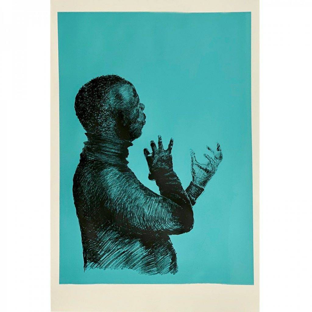
Review of the proofed print indicates that compositionally the positioning of the body to the lower left creates a dynamic relationship with the expanse of space above and right without any locating signifiers. Although the head is in profile and tilted away from the viewer the likeness of the subject is apparent. The dramatic gesticulation of the hands, are encapsulated in the selective detail, light, shade and descriptive marks of movement in contrast with the steadiness of the head. The body provides the core for the head and hands with the broad drawn gestures building subject dynamism. The dispersal of the marks, colour and gravity of ink contributes to the substantial presence of the image in contrast with the bright white paper they are deposited upon. The balance of the body in shadow and the highlighted profile and hands encourages a positive reading of the subject’s expressive commitment. The technical assessment of the proof is that the above attributes are judged to have achieved through the print process a dynamic serigraphic monotone portrait.
The addition of flat colour
Based upon the proofed print an edition of the monotone portrait could be made, however to extend the research, consideration of printing a flat colour background is made. The colour perceived in the original setting was white. The colour as interpreted through the digital photographic technology and displayed on the electronic viewing screens was light green. Now the drawn print is manifest, a new colour, appropriate to it, must be selected. To determine this a white ink is mixed to provide a base opacity into which blue and yellow pigments are added until a blue/turquoise hue is reached. In analytical research terms it is difficult to describe the subjective process on how the colour is chosen. It is informed by cultural, emotional and psychological interpretations of colour alongside the memories of the lived experience of the subject, setting, digital photograph and response to the warm black on white monotone proof. Silkscreen printing flat saturated colour is unforgiving. It is technically difficult to achieve even though it is the definitive singular block colour. Any blemish will be perceived and detract from the intended overall effect. The right ink mix, consistency and uniform squeegee pressure has to be applied throughout. To achieve this, due in part to the size required, the artist and master printmaker together pull the squeegee arm evenly across the silkscreen. The resultant mass of saturated colour with a light colour value and turquoise hue deliver a smooth uniform expanse for the over printing of the monotone drawn portrait.
Comparing the monotone on white and blue connote very different impressions and elicit different interpretations. In particular the focus on the portrait on white draws attention to just that: a drawn portrait. Being printed on a fine art paper substrate encourages the perception that the drawing is being presented as a limited print edition. Whereas the portrait on blue indicates that this is a combined, printed artwork. By printing on a colour with a white substrate border, it is clear that the substrate has been rejected in favour of a replacement background colour, thereby offering a cohesive serigraphic work that could be taken forward as a limited edition.
Fig 2. Ian Sergeant. PhD Passion. Two colour Serigraphic Print.
68 x 101 cm. 2019.
Printed States
To review the meaning of the image at each stage of the research it is useful to refer to intaglio terminology, where print stages of progress are described as ‘states’. They denote points where print progress is reviewed, to be potentially altered and developed for the next iteration, in the judgement of what it means to the artist. In this research the first state of progress is a photograph viewed on a smart phone, then computer screen, then in a software application. In the material environment the first image is digitally printed on sheets of plain paper to be put under mark resist film to be drawn upon. Once completed the positive image is transferred into a negative silkscreen stencil. A monotone ink image is printed on white paper. A second proof is made with a bottom straight edge to compare two compositions, before the image is printed on a flat blue background for the final serigraphic print. The image passes through twelve states to reach the final artefact. At each stage aesthetic, material, and technical judgements are made in the journey towards a satisfactory encapsulation of the intention to create a unique serigraphic portrait.
William Kentridge describes the print appearing to the printmaker at the end of the process as a separation from the making as it is now an image on its own artistic terms:
‘There’s a separation from the gestural mark of your hand to what you get on a sheet of paper . . . There’s something in the drawings going through the process of invisibility under the press and coming out, in your peeling the sheet of paper of the etching plate or lithographic stone or taking it off the silkscreen bed, which is a difference. It is a moment of separation between making and seeing the image, which is important.’ (Hecker. 2010:14)
The drawing and printing choices and processes explored through the research have delivered a new serigraphic artefact: a printed portrait with flat colour background contrasting with the gestural printed figurative image. The figurative image has been developed through a fine art process, whereas the flat blue aligns with industrial processes and applied here within the fine art context. Contemporary recognition of these interdependent artistic and commercial principles is why the research utitises the term ‘serigraphy’. (Saff, D. and Sacilotto, D., 1978:291) Although not universally used it is a positive definition as silk-screen materials, technologies and artistic applications are developed, they broaden the serigraphic palette. In the judgement of the researcher the visual, production and conceptual differences in the making of this print compliment each other to deliver a unified image. Perhaps the complimentary nature of the two elements makes a serigraphic print in union with itself, as it represents, within social and cultural terms, the Black masculine subject it set out to celebrate.
References:
Euripides Altintzoglou. 2018. Portraiture and Critical Reflections on Being. New York. Routledge
Euripides Altintzoglou (2019) Digital Realities and Virtual Ideals: Portraiture, Idealism and the Clash of Subjectivities in the Post-Digital Era, Photography and Culture, 12:1, 69-79, DOI: 10.1080/17514517.2019.1565290
Love, Johanna. 2015. Somewhere between printmaking, photography and drawing: viewing contradictions within the printed image. Journal of Visual Art Practice. Volume 14, 2015Pages 214-223. DOI: 10.1080/14702029.2015.1094239
Ingold, T. 2016 A Questionnaire on Materialisms.USA.October No 155. October Magazine, Ltd. and Massachusetts Institute of Technology
Tallman. Susan. 1996. The Contemporary Print. London. Thames and Hudson.
Hartley, C. 2012. Screenprint and the Painter. Bridget Riley, Complete Prints. London. Riding house.
Henning. Roni. 1994. Screenprinting: water-based techniques. USA. WatsoniGuptill.
Edgar, David. 2019. AGITATING THE VOID:
DRAWING AND PHENOMENOLOGY.TRACEY.Drawing||Phenomenology: tracing lived experience through drawing. Volume 14 Issue 1 Loughborough University
Montarou, Christian. 2014. EMBODIED KNOWLEDGE AND SKETCH DRAWING WITH A MODEL: ‘A PHENOMENOLOGICAL APPROACH. Thinking through Drawing
The Norwegian University of Life’s Sciences (NMBU)
Arnold, Marion. 2019. THE SENSING, KNOWING HAND: A PHENOMENOLOGICAL DRAWING TOOL
TRACEY. Drawing||Phenomenology: tracing lived experience through drawing. Volume 14 Issue 1 Loughborough University
Half tone: https://www.pixartprinting.co.uk/blog/halftones-screens/
Last accessed 22nd, January 2020.
Henning, Roni. 1994. SCREENPRINTING: WATER-BASED TECHNIQUES. New york. Crown Publishing Group.
True Grain – http://johnpurcell.net/true_grain_Rev.pdf. Last accessed 22nd, January 2020.
Hecker, Judith, B. 2010. William Kentridge. Trace : Prints from the Museum of Modern Art. New York. Museum of Modern Art.