Inspired by the ‘reinvention of scraperboard’ observation by artist Kevin Atherton about a recent portrait with a ‘light out of dark’ technique, a preparation of a dark background was embarked upon.
Studio Experiment: a mixture of Carbon Powder, washing up liquid; sparkling water and an applicator in the form of a kitchen scrub was applied to mark resist film to make a positive image to be used to expose on to a silk screen for printing.
Once powder, washing up liquid and water was mixed the scrub was used to make wipe marks with horizontal, vertical and circular movements. The more scrubbing, the finer the marks. The first marks were dramatic, but would dominate a drawn portrait. A final ground was selected that provided enough overall dark tone, however retained scrub wipe marks that generated an energy, rather than flatness tone. The edges of the ground were darker as the powder mix was deposited after wipes and could not be altered as to do so would make obvious secondary marks of removal in contrast to the softer wipes composing the overall ground. The edges provided a tactile physicality creating and irregular, but effective frame within the film frame.
The finest ground, once dried was atmospheric and energetic and providing enough tone to draw trough. It was used to begin a portrait of artist Kevin Atherton. Taking this approach was inspired by his comment that I had reinvented ‘Scraperboard’ in response to the portrait of ‘NAV’ but it used dry carbon sticks to create a background. Scraperboard technique is very black and white, by removing a black top surface to reveal white of china clay, to make highlights. There is little opportunity to make tone in this technique.
[foogallery id=”5966″]
By making the dark, but not wholly opaque surface on the mark resist film enabled an eraser to be used to remove the dark top surface to create highlights, as light would be exposed through the mark resist. Differing erasure pressures and sizes allowed assessment of what detail of the wiping movement marks could be retained.
The eraser was used in expressionist movements to begin with. However, the carbon from the ground quickly built up on the eraser edges, and unhelpfully, deposit the carbon back on to the surface. Regular cleaning after few rubbing erasure in comparison with t e strokes is required, before moving on to the next element of the drawing.
[foogallery id=”5973″]
Reviewing the eraser drawn image it became clear that shadows required further depth. The contrast between highlight, midtones and shadow was not a wide enough spectrum. A graphite stick was used expressively to achieve dark tones. Additional dark marks were made with the stick to give further depth in the elements that had been erased a step too far.
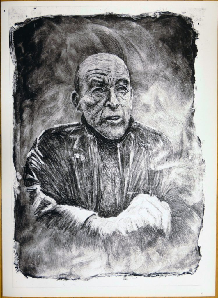
First print: Unsatisfactory.
A first exposure of the drawn positive was made and a silk screen print made on a smooth Canaletto paper. Unfortunately, the light erased lines depicting the jacket and body beneath, were not effective in carrying the presence of the subject; the moving hand was not defined; the head had not enough detail in the highlights; the head was not integrated with the background; the body was fragmented; the print overall was not integrated across all textures. The ground was not overall. Both highlight and shadow areas lacked in detail and had not the drama and depth of tones of the mark resist positive drawing. The background was not of equal status to the facial drawing.
In drawing on mark resist for silk screen printing one is aware of the difference in printed output being of higher contrast and less detail and works with that in mind. Similarly one is aware that the drawing must provide balanced tones in order to make the higher contrast ares of the print work to the benefit of the print tonal range, as a whole. Highlights must include some detail otherwise they will remain 100% white, (or the colour of the printed paper) which in many cases does not encourage perception of the shape being defined. The drawn marks are reviewed by backlighting before moving to revisions.
Second Print Positive Revisions
To address the analysis of the first print additional drawing on the mark resist positive was embarked upon. 4 tools were tested for weight of mark – charcoal stick, ‘chunky’ graphite stick; 6B pencil and woodless pencil. Rather than making small adjustments at the onset the chunky hexagonal graphite stick was selected. To build the darkness of the jacket, shoulders and arm was drawn into with vigour to achieve the presence of the body supporting the head and contributing to the shape of communication. The highlights of the jacket’s arm folds were complimented with direct marks to create the shadows; the right shoulder highlights drawn over as the marks were made to create depth and in contrast to the left shoulder that was illuminated by the existing light source of the original photographic image.
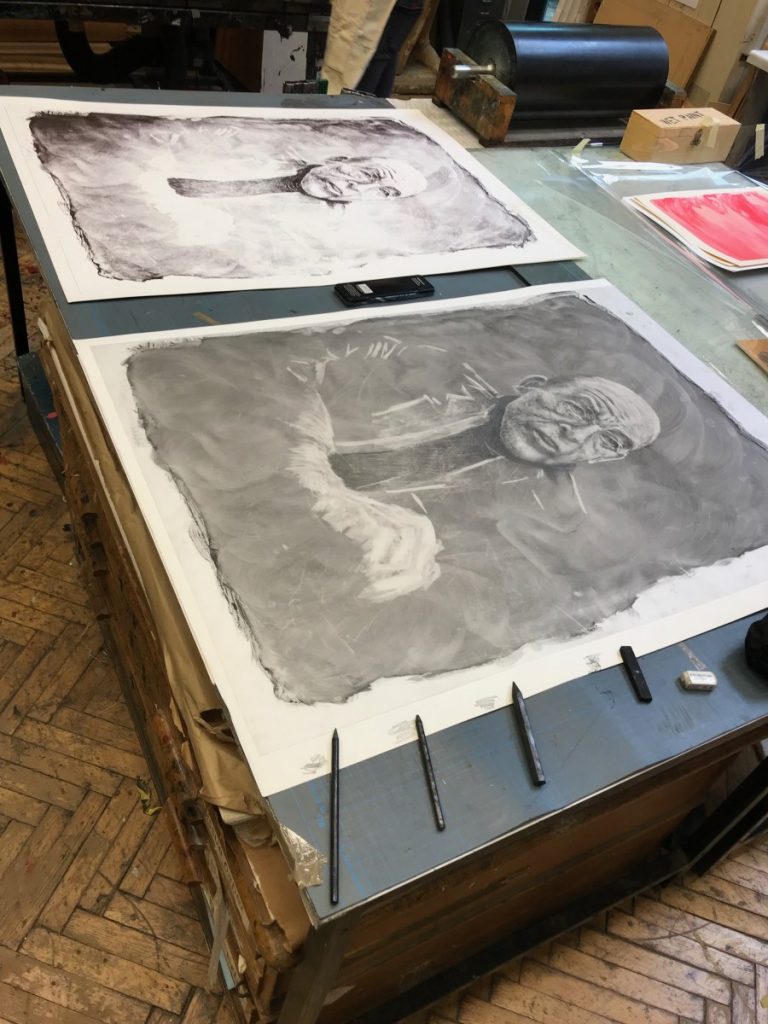
The jacket chest was drawn into from the shoulder downwards to differentiate from the subject’s signature dark polo neck, and create the body substance. The ‘moving ‘ hand required drawing into the overall blurred whiteness.
It is clear that looking at the drawing, the perceived shade created by the scrubbed background that has been retained in the highlights, has not registered on the exposed screen. This is because it is a smooth tone with no solid deposits of graphite on the mark resist. This is the difference between the drawing and the printed image. It is made up by the ink being stopped from passing through the screen on to the paper by the emulsion solid matter that has been formed by the light being prevented from reaching the emulsion during exposure.
The background scrubbed marks holding the motion of their creation are prominent on the mark resist, however are not throughout the print. To enhance their tonal effectiveness the graphite stick is applied with little pressure across the breadth of the ‘sweeps’ of movements. This lays further deposits on the protruding ripples. The minute difference in height must be respected by the stoking with delicate pressure of the graphite to preserve ripples. By literally dragging the graphite stick over the powder scrub ripple deposits lays an additional, and stronger, deposit on the dark areas. Deepening the rippled scrubbed areas creates a greater differentiation between highlighted and background.
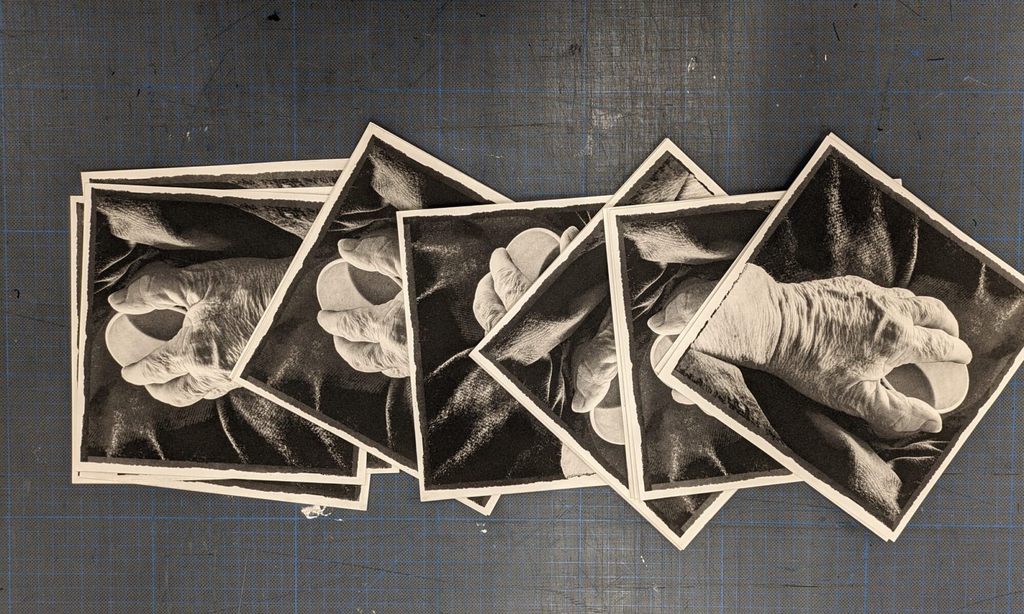
The high lit hand is similarly given increased graphite deposits to enhance the blurred moving fingers indications, while maintaining the lack of clarity that gives motion to the hand.
The head highlights are delicately enhanced with graphite. Each white, empty highlight spaces are given a coverage of graphite to ensure the printed highlights will have contour and shape. [foogallery id=”6080″]
Print Materiality and States
What is being pursued here is the attention to the Materiality of the marks being created, heightened and enriched from initial powdered background, erasure, silk-screen exposure, ink, paper, print and back to the drawing for re-exposure to a new screen for a second pull. In intaglio printing this process might be referred to as print ‘states’. In serigraphy / silk screen there is not such a definition.(they are referred to as pulls, tests, proofs.)
Re-exposure for Second Print
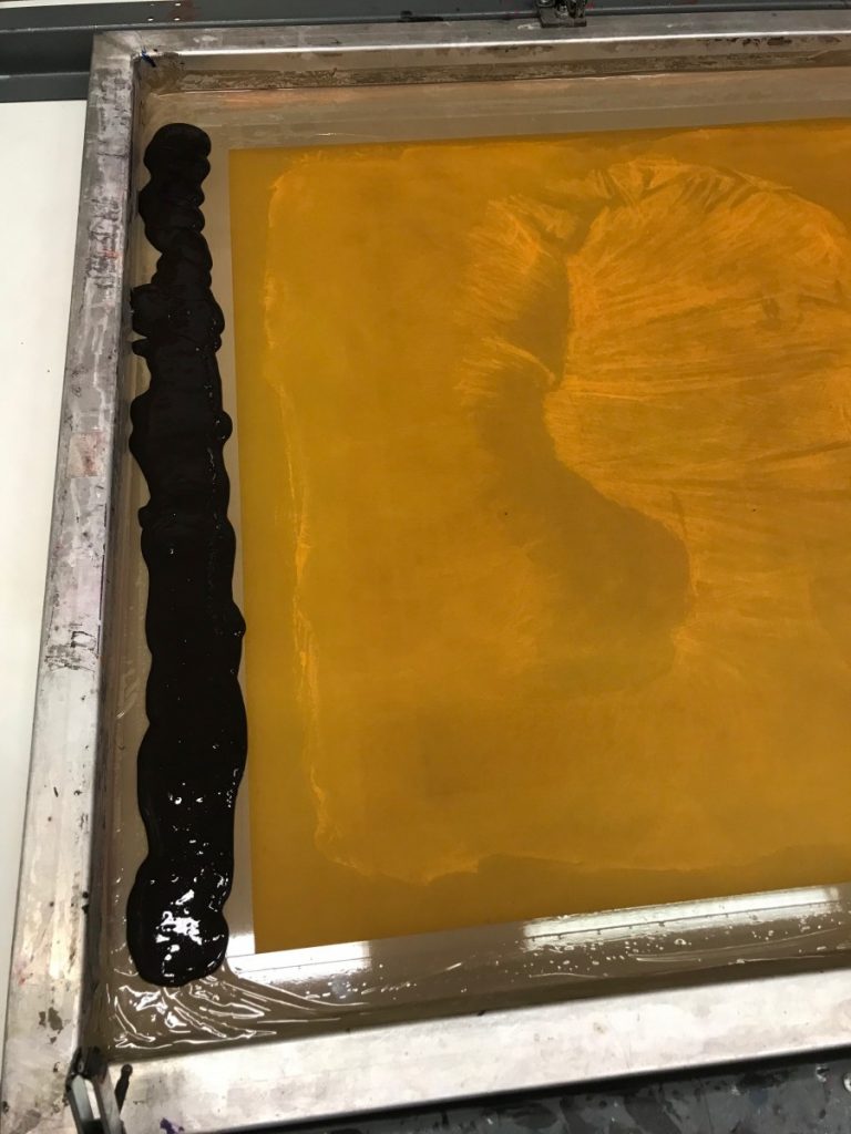
Following the many discreet, but potentially effective changes to the master mark resist drawing it has to be exposed on to the silk screen. The original exposure was 12 light units and an educated guess was made to decrease exposure by one 1 light unit. This would further encourage the retention and rendition of detail in the highlight areas, without loosing detail in the shadows.
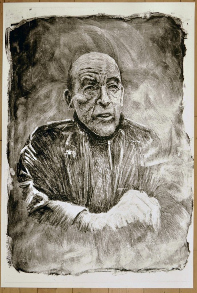
Second Print
Following the revisions and preparation they are subjected to the printing process. Two smooth surfaced papers are selected: white and off white Canaletto. A fresh ink mixture is prepared with less medium and retarder added to the process black (4 parts) and crimson (1 part) pigment. This provides a concentrated ink requiring less pulls to build the integrity of the image. A successful test pull on tissue paper is made and followed by the sturdy fine art paper. Each sheet is subjected to 4 pulls. Each pull is reviewed before a decision to apply a subsequent pull is applied. Each deposit is reviewed by lifting the screen. This requires being careful not to release the vacuum holding the paper in place, to preserve the registration of following squegee pulls.
Finally an increase in pressure over the duration of the pull is applied to increase ink on the lower third of the print to enhance the detail on the highlighted hand. The final Print is accepted and an edition of 4 is printed and racked to dry.