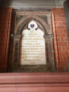
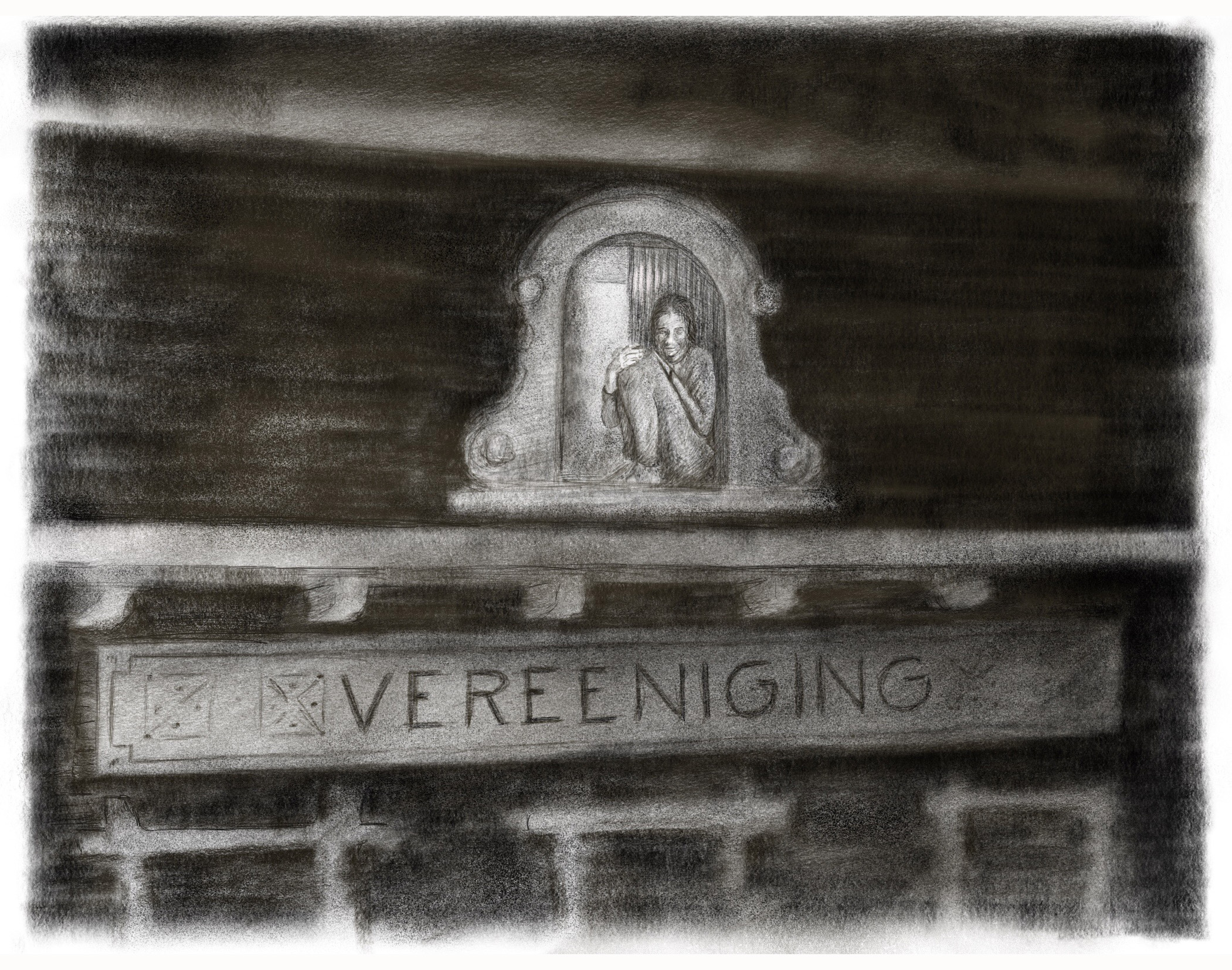
 On leaving the School of Art in Birmingham’s historic city centre I noticed a plaque to my right that had escaped my notice on the many occasions I have descended the stairs down to Margaret street. The municipal history of the building is there for all to see in the ornate gold stone carved type : “This Building was erected by the Corporation of Birmingham for use as a School of Art, upon land given for that purpose by Grecoe Collmore Esq with funds contributed by Miss Louisea Anne Ryland and MESSers Richard and George Tangyea 1884.”
As I ruminated on the age of municipal and philanthropic value of the Arts to Birmingham, I crossed to the Waterhall gallery, a part of an equally cultured contribution to Birmingham’s proud city centre – The Museum and Art Gallery.
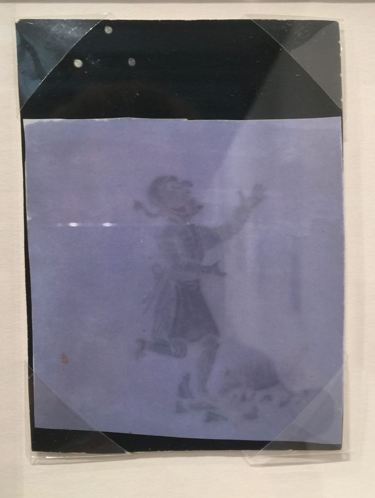
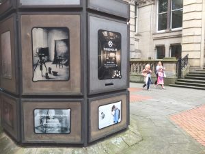 Sitting on the steps was Pete James the curator of Matt Collingshaw’s Thresholds. Pete is a mine off knowledge and information on the unique role Birmingham and its scientists and artisans played in the invention of photography. Thresholds captures the amazing moment Fox Talbot made his first Photogenic Drawings in King Edwards School. He and Matt have recreated the space he displayed his first pictures:
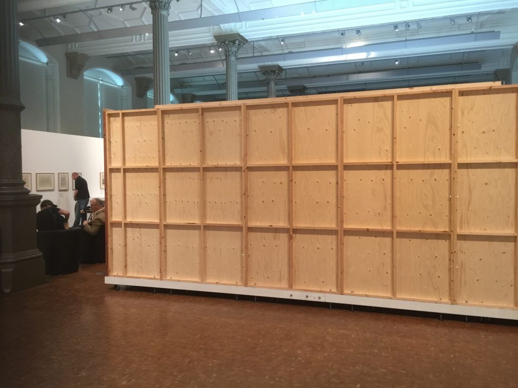
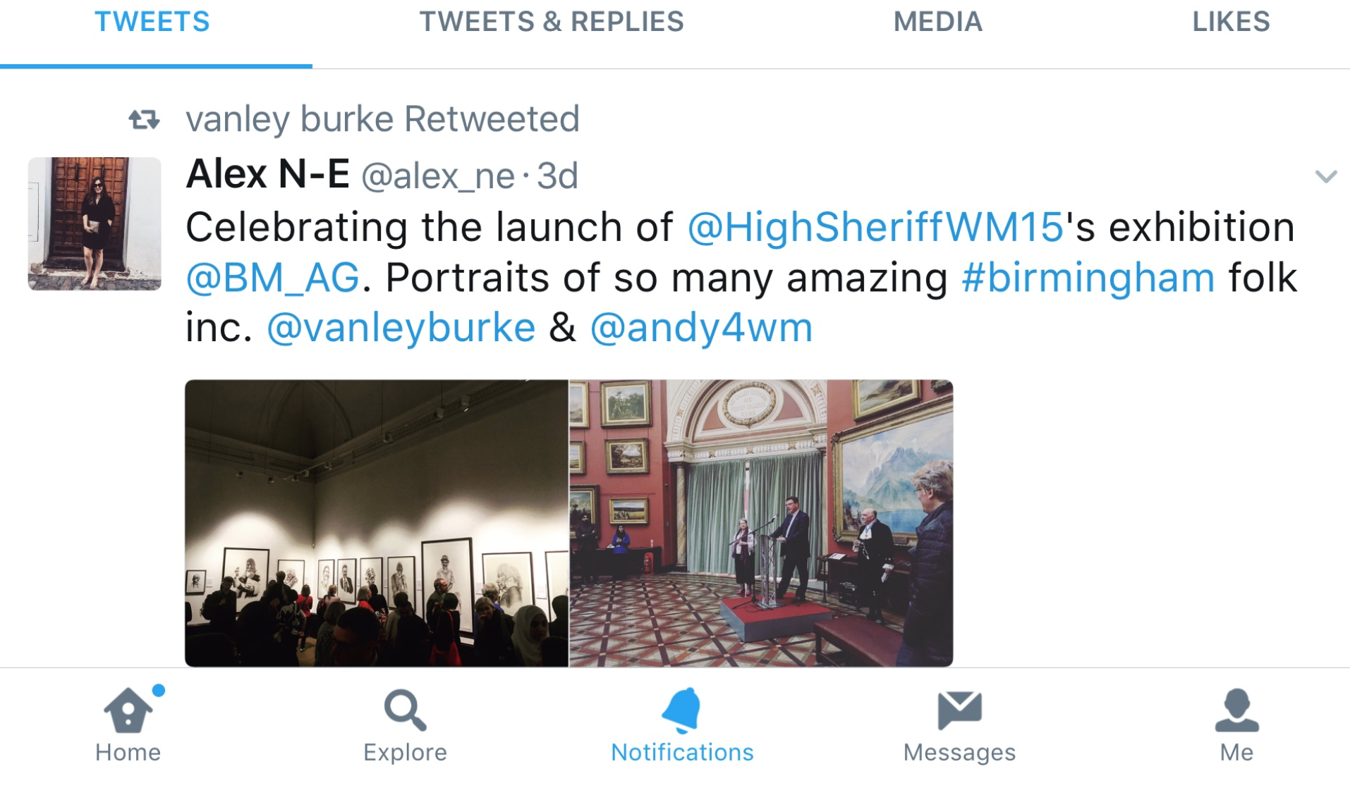
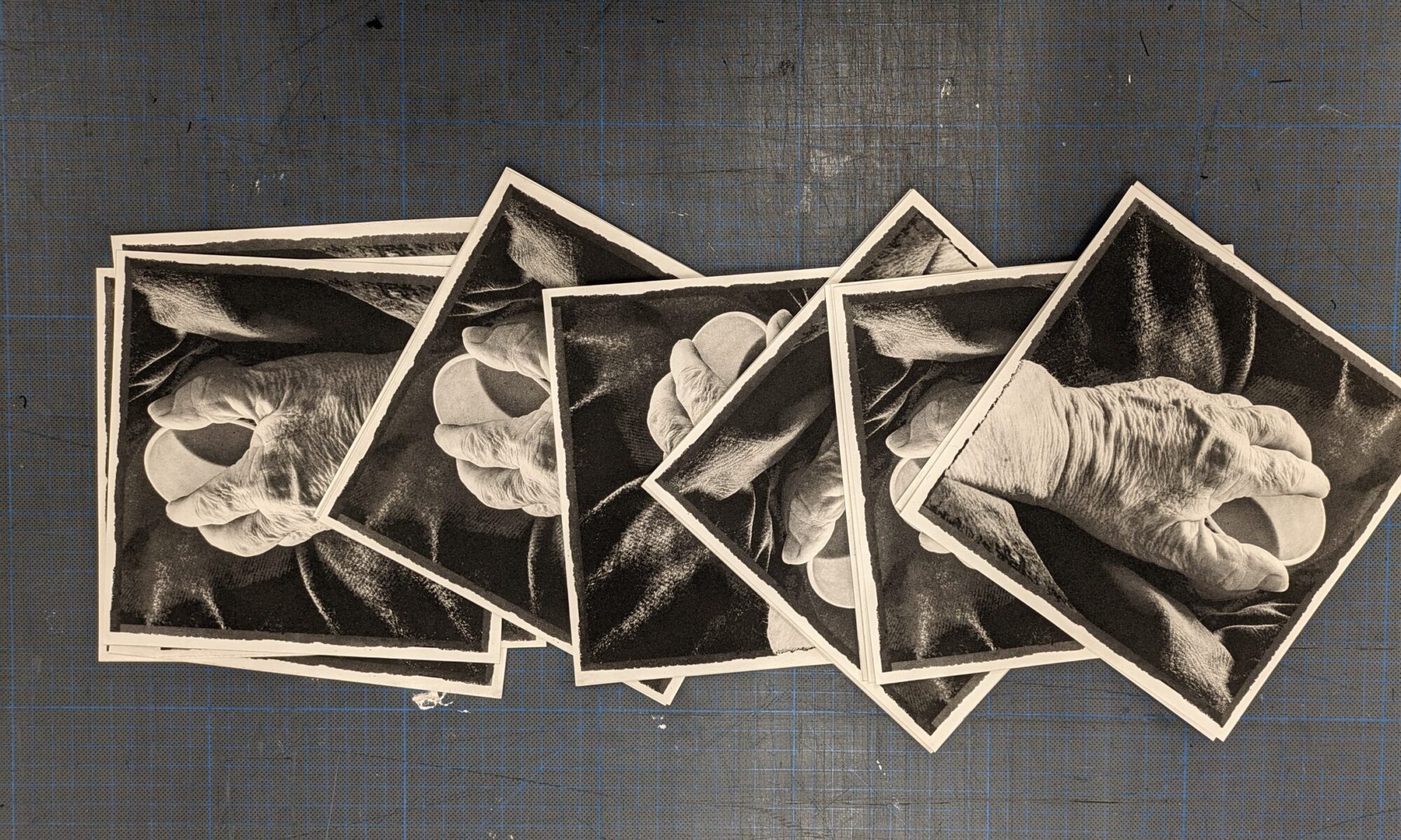
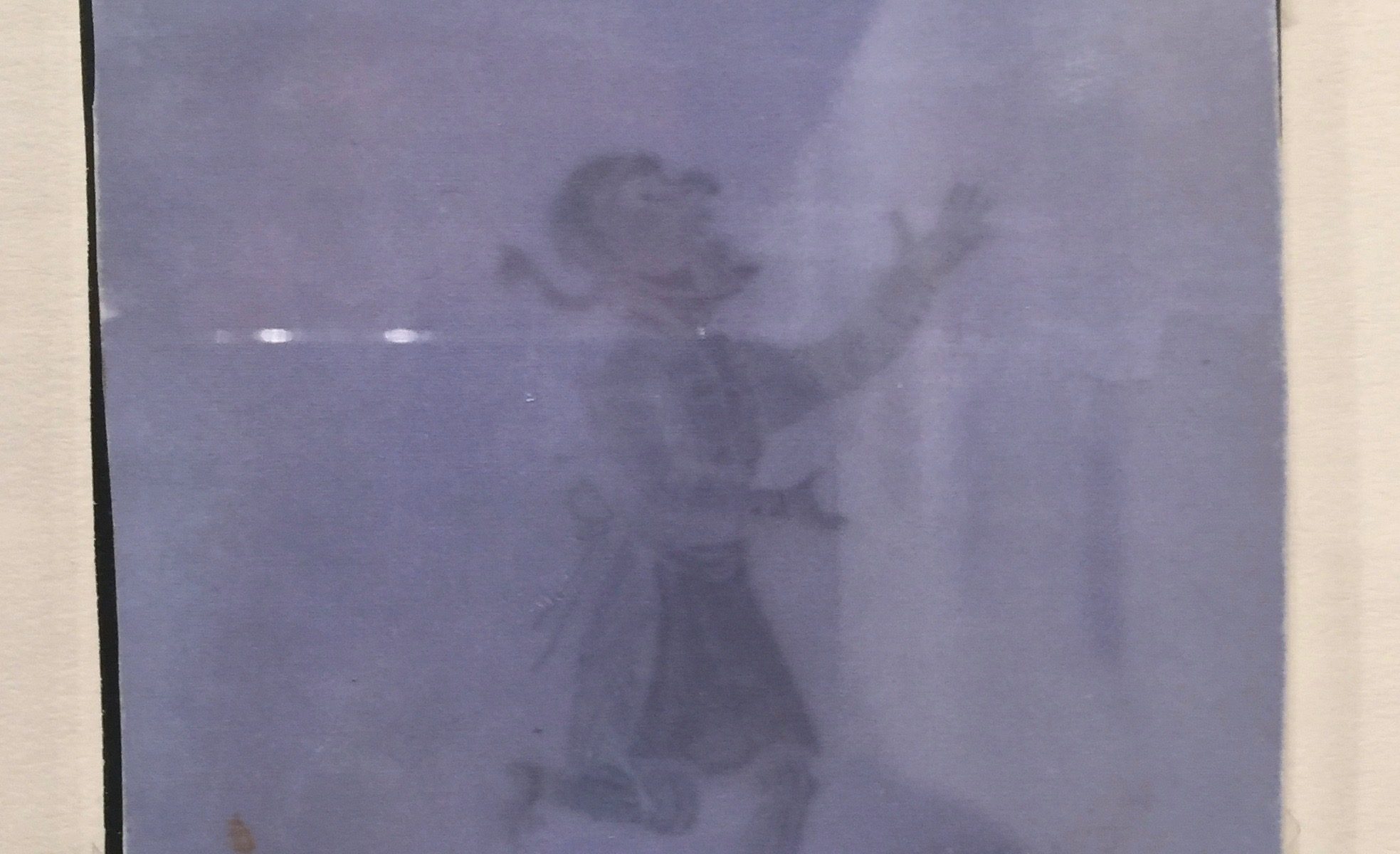
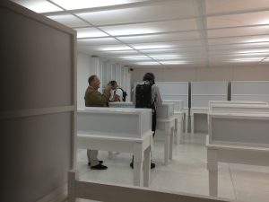
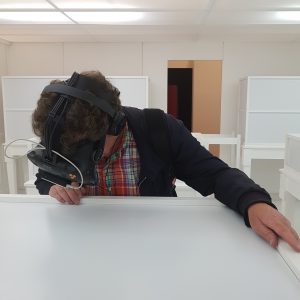
Behind the large wooden box in the gallery is a white space with a few empty white cases and tables. A number of people walk around the space with an electronic backpack and headset seemingly seeing and touching invisible objects. 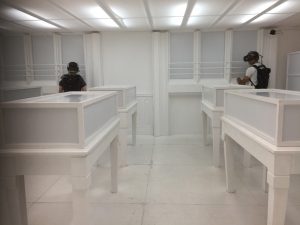 I was kitted up with the gear by the gallery assistants and encouraged to venture into the space. I was immediately ensconced in a 1830’s room with wooden ceilings, paintings, candle chandeliers and Talbot’s first photogenic drawings. Astonishing in their lifelike quality as one moved around them. Even more surprising was the ability to see a cloudy white version of your hand hovering above a picture, which when you turn your hand towards you, appears in front of you to inspect more closely. This is virtual reality. What would Talbot have thought about this when he first showed his photogenic drawings to amazed friends, students, teachers and scientists? How image making has developed in 200 years, from Birmingham New Street’s School. The school was demolished in the mid 1800’s and rebuilt as King Edwards opposite another gallery the Barber Institute.
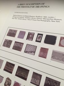
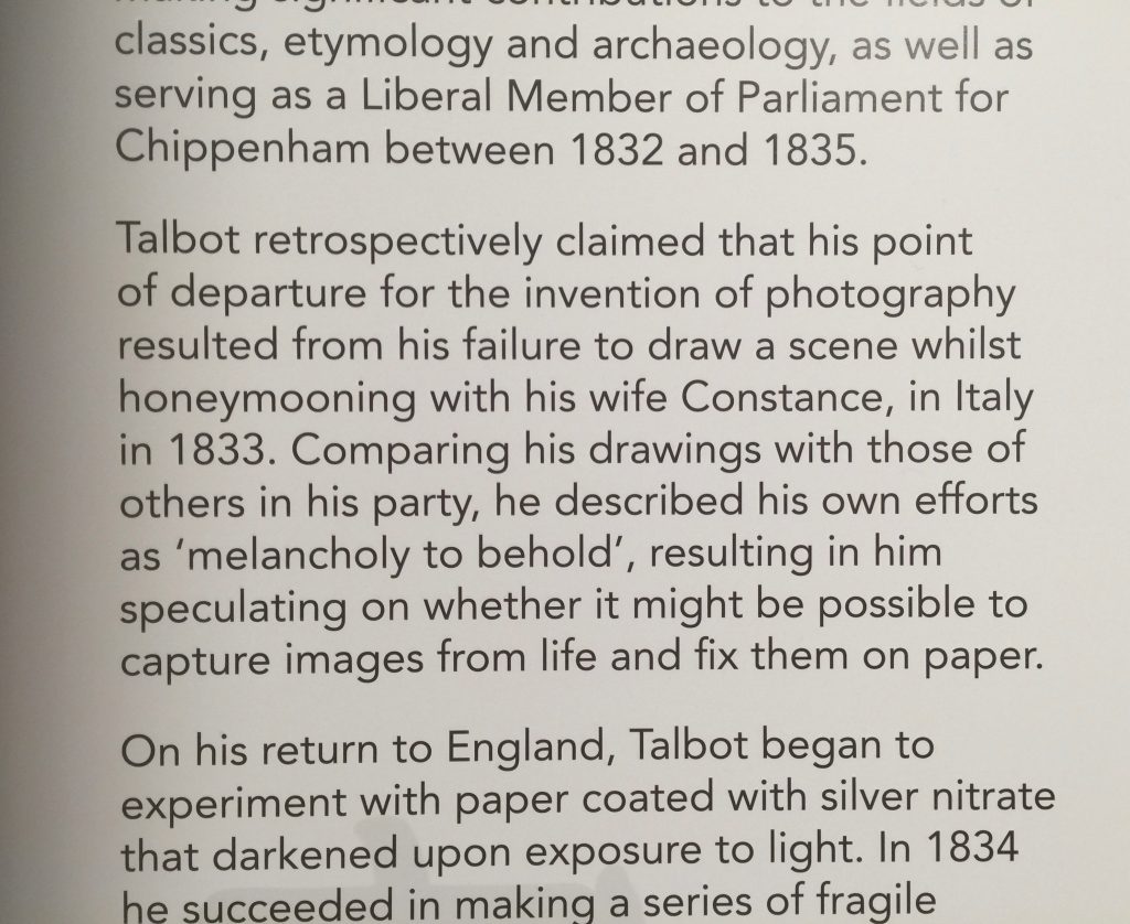
Speaking to Pete I enquired when the term photography was applied to describe this process of capturing images with light. He clarified my question by saying Fox Talbot and Herschel used the word photography to describe the process whereas Talbot used the Photogenic drawing description to describe the objects of the process. There is much more information in the exhibition, including Stereo images of the original room, the King Edwards building and a film by Ravi Deepres and Michael Clifford on the Camera Obscura.
The show is only on for a couple more days in Birmingham before it begins its journey from the birthplace of photography to its next venue Laycock Abbey.
Go see it if you can. If you can’t, here’s a good illustrative film :
http://www.birminghammuseums.org.uk/bmag/whats-on/mat-collishaw-thresholds
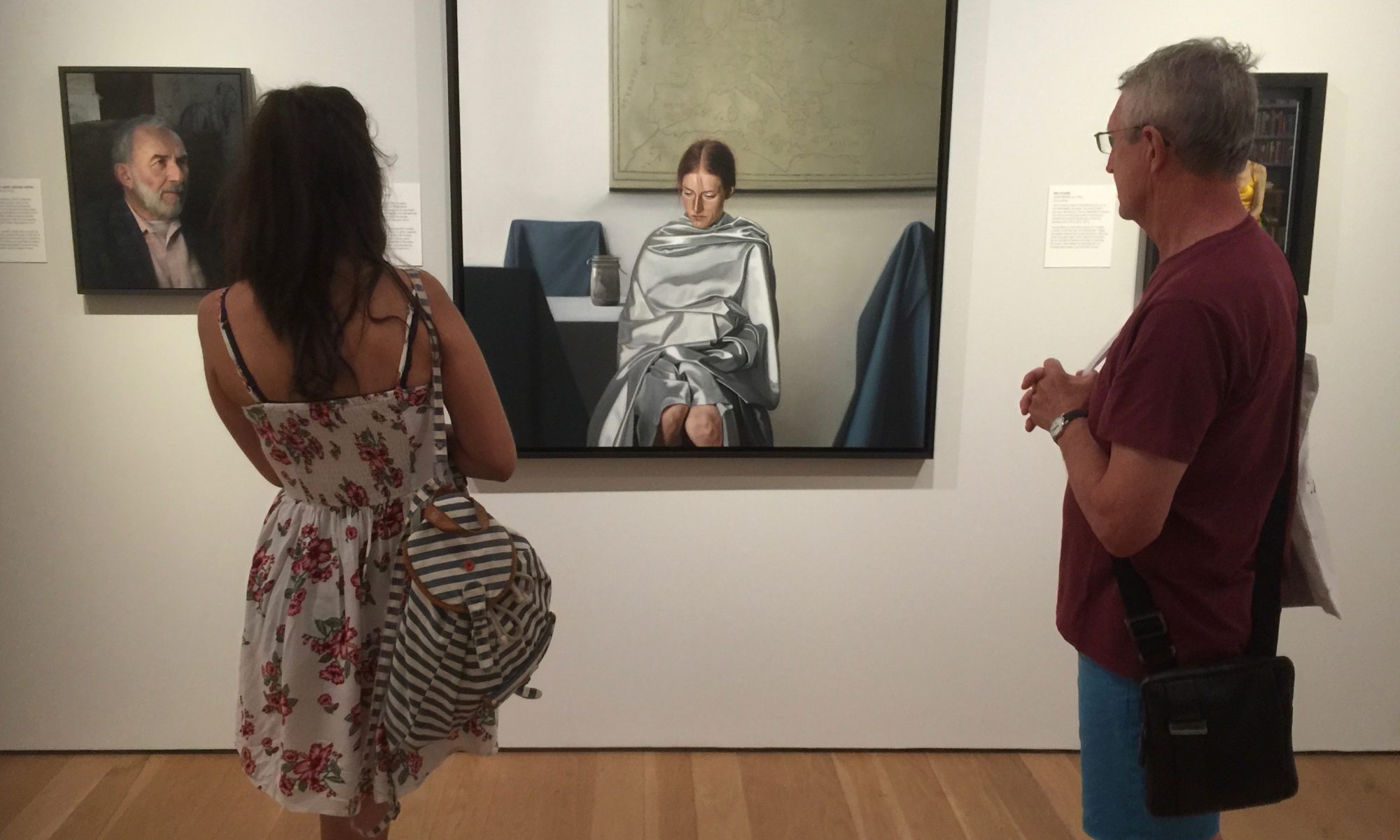

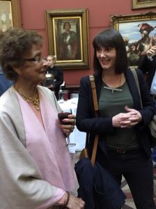
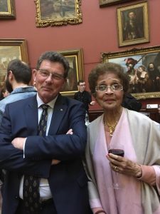
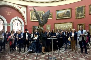
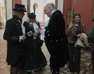
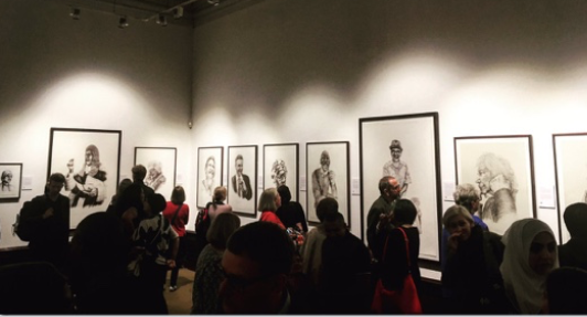
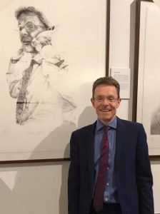
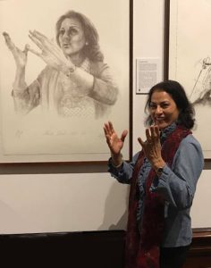
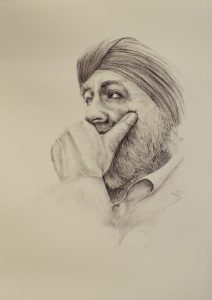
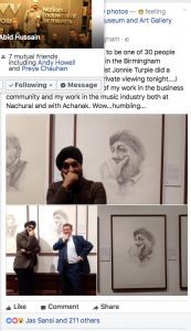
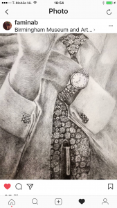
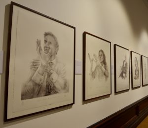
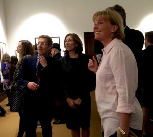
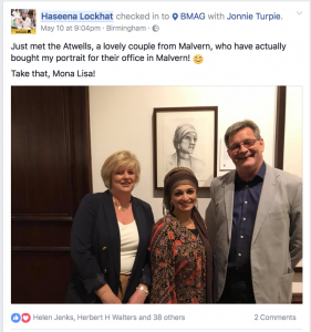
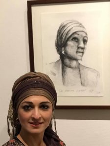
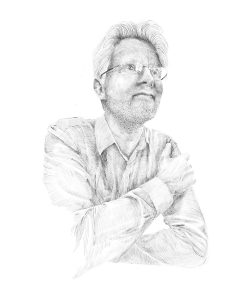
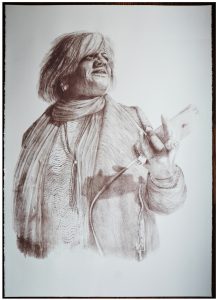
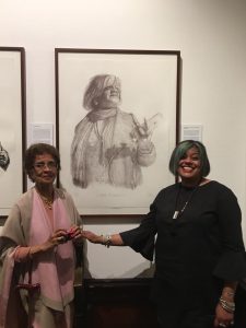
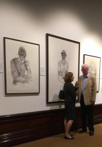
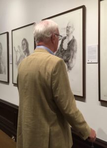
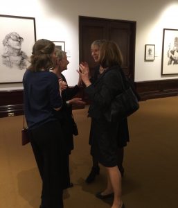
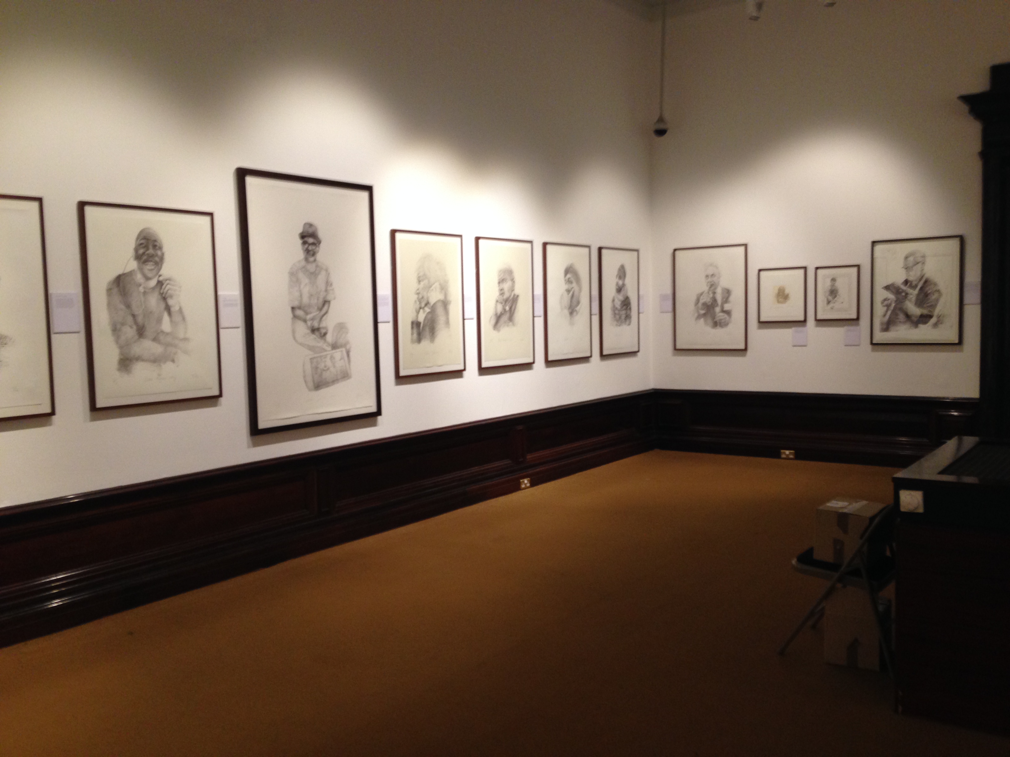
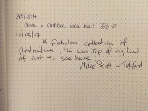
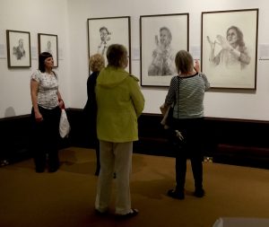
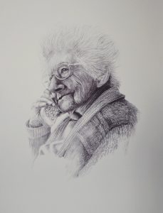
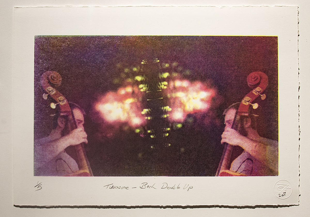
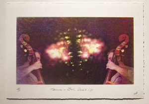
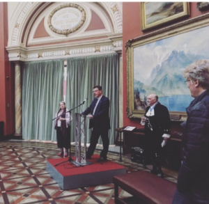 Dr Mcadam gave a warm welcome to the Shrieval gathering and the growing positive relationship between the West Midlands Shrievalty and the the Museum Trust as they both have historic value to the city and region. She was also vey happy to encourage the purchasing of prints from the show as all proceeds will go to supporting the Museum Trust. John Hudson gave a very warm welcome to the assembled audience and a brief insight into the role of the shrievalty in England and in the West Midlands. He pointed out that he was surprised to meet someone as well turned out as himself in black and silver. He was of course referring to Phil Hawkins from Hodge Hill who has a portrait in the exhibition as a worthy winner of the Bromford Estate local heroes.