Paperlike Drawing

Autumn Acorn bunch Landed in Ingoldsby Garden

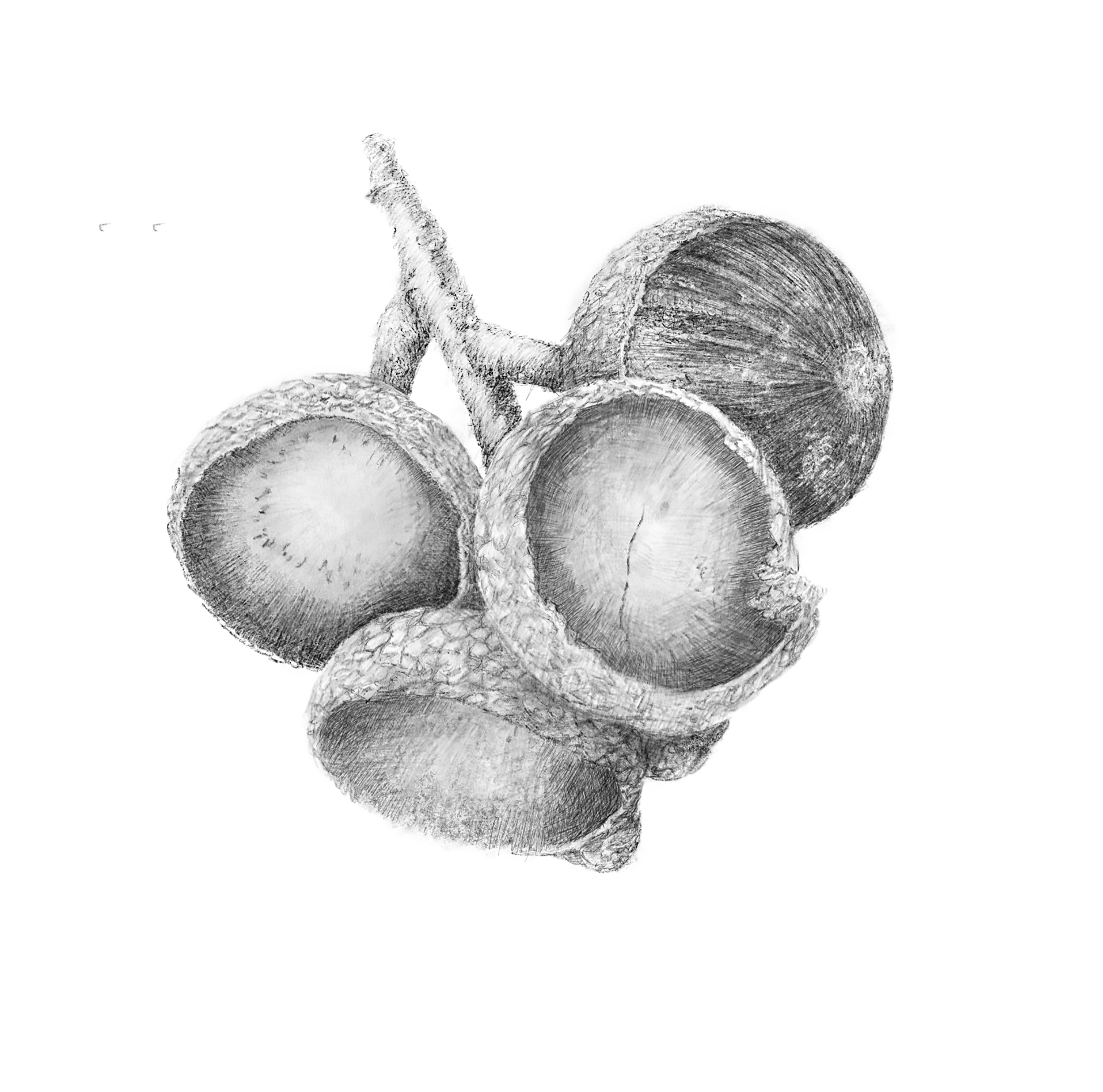
This drawing is 8th in the series of Fruit of Drawing. It includes three empty Autumn acorn cups and one still to be released, in search of warm winter leaves and grounds to germinate in the Spring.

This drawing was the opportunity to try and test a new addition to my toolset: Paperlike.  This is a sheet of textured film that adheres to the glossy iPad screen surface.

I have  spent many hours perfecting my drawing technique on the iPad.  First with various styli and finally with the perfectly matched Apple Pencil, which in tandem with the procreate app, with its multitude of variable brushes, is  perfected for the tablet surface. However drawing with these tools has always ‘felt’ materiality different to drawing on paper with graphite pencils. After all they are ‘digital’. I have developed drawing techniques and styles for the smooth surface which over time has made it possible to make rewarding digital drawings. The fruits of drawing series are all made using this approach.

Getting the balance between traditional drawing materials and contemporary digital possibilities is always of interest and like many other human activities technology moves on and the launch of ‘paperlike’ offered a new addition.

It was developed by Jan Sapper and funded through a £40K Kickstarter raise in 2017:  ‘ We optimized the PaperLike for maximum precision and control. The friction is perfect for long drawing sessions or taking notes in endless meetings. And yes, it also feels nice.’ with testimonies like: ‘There’s actually a lot more resistance between the tip of the pencill and the surface – it really changes the way the ipad feels” and “The nice texture and grip, makes it easier to get whats in my head on to the screen”.

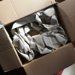
 There were a few not so positive reviews, mainly about the application of the film to the iPad screen and avoiding dust. I ordered it and it arrived in a relatively massive box.  
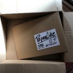
Once I got through the paper packaging to the A4 envelope I watched the video and decided to take the dust avoidance advice and fix the screen in the allegedly dust free bathroom.

I nearly succeed, but a couple of pesky bits of dust evaded my cleaning and polishing.  Before drawing I  scrolled around applications with my fingers and the screen certainly felt much more like paper with its paper like, rather than digital glass friction.

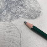
Using the Apple Pencil I tested out a variety of pencil/brushes to get a feel for what was possible.  My ‘favourite’ pencil brushes seemed to visually deliver a softer line, with more texture. Drawing was more tactile which I had hoped for. The screen has a rough rag paper coarseness which encourages a  ‘natural’ drawing technique with the drawn mark response more akin to an analogue pencil on paper relationship.

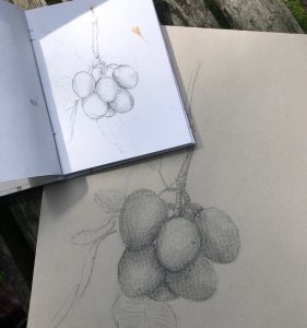
Before Paperlike arrived I had begun to draw the Acorn bunch and rather than start a new drawing I added new layers and began to draw with the new surface.

pre paper like
post paper like

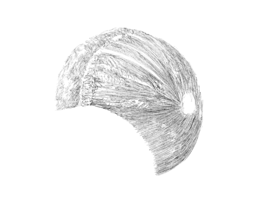
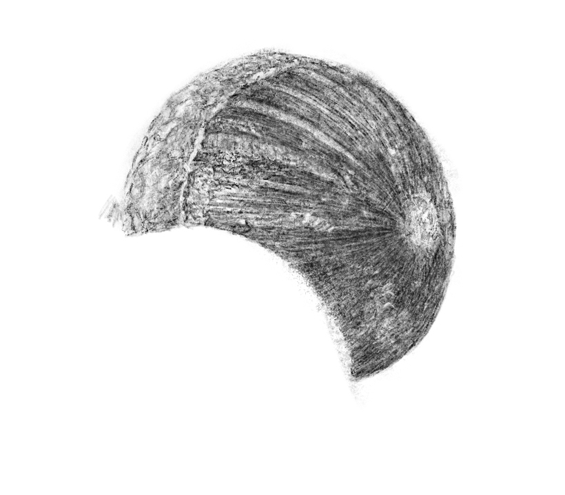
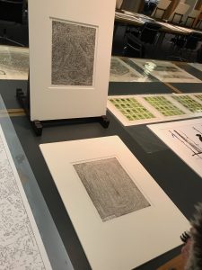
The two images are at different stages of completion, but there is a material difference between them. The first is less textured, the second, after getting used to the textured surface and a range of pencils, is less ‘smooth’ than the first.  As I experimented with procreate pencils I used HB, 6B, Blunt, Narinder and techical pencils. I had never used the narinder and technical pencils in previous drawings as they felt too fine and sharp for the gestural drawing I wanted to make for the fruits. I used the blunt pencil much less than in the previous drawings as it was too textured and difficult to control the spread softly.

All in all I enjoy the grain of the paperlike surface and the opportunity it has offered to draw on a less slippy surface more materially akin to a paper sketchbook, but with the digital opportunities of layering, reviewing and multiple choices of pencils. A step forward bringing digital and analogue drawing closer.

And it sounds different! The pencil sounds like it is drawing on a textured surface.

More Fruit, Portrait and Location drawings will confirm the value as I hope not to have to remove the film from the iPad screen.

More Paperlike details.

Acorn Life Cycle’s First Stage

The first stage of the acorn seedling’s life is fruiting. This is when an acorn grows on the oak tree, which happens through the spring and summer shortly after the tree has flowered in the spring. Different type of acorns can fall at various times. For example, toward the end of the summer or in early fall, fully grown acorns from white oak trees fall to the ground. Acorns from red oak trees fall during late fall or winter.

The Beauty of Uneaten Acorns

Acorns are heavier than many tree seeds and usually fall to the ground close to the parent tree. Acorns rarely sprout or germinate when close to the parent tree due to lack of light through the tree’s canopy. This function is performed by squirrels and other rodents that scatter, hoard and eat the acorn seedlings. Those acorns left uneaten have the chance to sprout and grow into an oak tree.

Acorns need the right soil conditions to germinate and sprout. Most germination of trees will begin during the early spring season. They require loose and moist and nutrient-rich soil in a location that gets plenty of sunlight and rainfall. Given these conditions, the acorn will start to germinate and grow a taproot that pushes deep into the surrounding soil. As the taproot grows down, the acorn sends a shoot upward. This is the first stage in the transformation of the mighty oak tree life cycle.

Reproduction is often aided by birds such as jays, which bury acorns to retrieve later, perhaps forgetting where they stored them.

IPMACT10- Two Hanging Prints

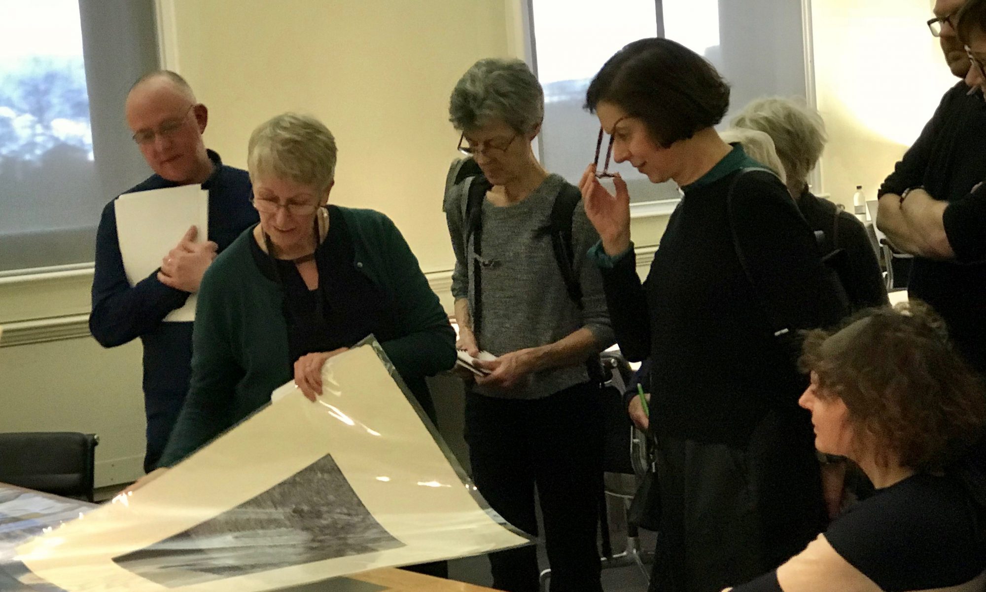
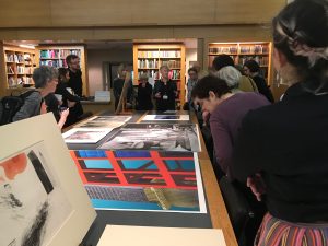
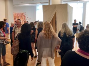
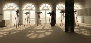
The IMPACT10 Salle 2 exhibition in Santander was a unique space amongst the Bienalle venues as it was soft carpeted and flooded with natural light. It also housed a wide range of print based exhibits. Many were large scale presentations and innovative in their use of walls, floors, screens and 3 dimensional spaces.
Two of these were works hung from the ceiling.  They were work by Kiochi Yamamoto and Ana Vivoda from Japan/USA and Croatia respectively.  Kiochi Explained that his original submission was a kite, but had been lost in transit.  He had made the hanging print artwork overnight from etchings he had with him and conceived of them being hung from the celiing. Two join them together he had boiled rice and used the mixture to glue the paper prints together.  5 Days later he replaced the impromtu piece with the kite. https://yamamotoprintmakin.com

To the right in the streaming sunlight from one of the traditional windows was a series of hanging prints composed of discreet photographic images and light coloured, but dense marks. This work was intriguingly beautiful and tiled Interactions. It attracted many viewers who enjoyed interacting with the 15 prints. Some were even drawn to touch the delicate works. The QR code carried the information about the Croatian artist : Ana Vivoda. I poped her name into Google and she came up in facebook. I messaged her to ask if she was still in Santander? “I am next door in the symposium” came the immeadiate reply. We met and Ana explained the motivation behind the self portrait was to give a number of impressions of herself, rather than a single image. She also explained her technique – very fine, hardly perecptible photographic traces of herself digitally printed that were added to with light ink through lino cuts. The balance of the inks, images, marks and rag paper hung with small clips and transparent lines came together to make a work demanding return visits and interactions.

https://www.facebook.com/people/Ana-Vivoda/100009032032667

Click here for Pictures of the pieces :


and two clips from Kiochi’s work are below

IMPACT10 Santander – ‘Circumstance of asking’

IMPACT 10 Santander

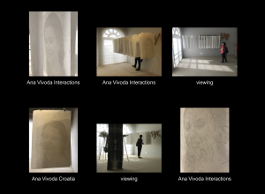
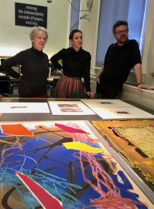
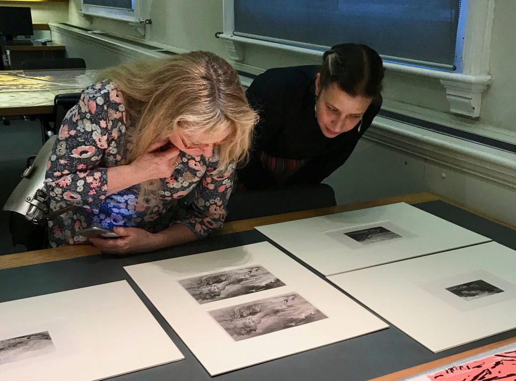
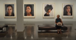
IMPACT10 title was Encuentro, ‘meeting’and there were many new and inspiring meetings of art and people throughout the week of exhibitions and symposia.  There were many print exhibitions from Goya to Yamamoto, Diggle, Single, Mitra Kupfermincand Ana Vivoda that it was hard to select what to view.  On Tuesday I selected Edinburgh Printmakers and their portfolio of artist prints with a stand out gestural litho by Ren Narbutt.

Ren Narbutt, Stone Litho printed at Edinburgh Printmakers
Fred from Tennessee viewing Barbie Kjar’s Tent Portraits

I turned round to see a tent! A long vertical canvas square reaching from floor to ceiling.  People were coming in and out, some entering and closing the two curtain ‘doors’ behind them. I wanted to see what artworks were enticing them in. Three drawn and printed portraits invited the viewer to go up close to the images, face to face with them. One Portrait was deep red giving the tent space a red glow. The drawings were evocative, simple and powerful, reflecting diverse characters.

I exited the portrait tent and watched how people looked at the portraits to their left, right and in front and how they entered inquisitively and exited with more intention than when passing by the many wall hung prints. The portrait tent seemed to afford a material viewing experience allowing the portraits more attention from the viewer as they had made a conscious decision to step inside. They had made a choice to view these drawn portraits and been rewarded for their commitment.


As I observed these goings on I noticed a woman was watching too. I asked her if the portrait tent was her work and she smiled : “Yeah.” In that unmistakable Australasian way of saying yes, in a ‘Yes of course’ sort of way.
We briefly talked about the tent and her three portraits within, which I said very much enjoyed and asked how do you go about the making the portraits?  “I meet them in the street, bars or venues and ask them if they would like me to make a portrait of them.” I was immediately impressed and interested and we talked some more before she had to talk with her other admirers. Unlike me, I asked her to stand in the entry to the tent for a photograph.

“Lets talk more” we exchanged contacts and when I saw her name was Barbie I could not help but ask: “Is your original name Barbara? Mine is Jonathan not Jonnie? Two ‘ie’s’ – A connection was made.


Barbie Jkar 

After a couple appointment hiccups, we met after we had viewed each other’s websites.  Barbie is a much more experienced exhibiting artist that I and I was full of anticipation of hearing her views on portraiture.  She had just mounted a show of 10 portraits in Melbourne. Surprisingly she was interested in how I had curated my recent High Sheriff portrait show. We talked for half an hour sharing each other’s drawing, print and portrait interests, art and personal experiences. We talked together freely and with ease, getting to know if our initial connection was to be fulfilled. Portraiture is something we are both focused on. We shared other artists of interest and tools of the drawing trade. Barbie is Tasmanian, and her Antipodean direct talking is mixed with an ability to stay quiet, pause from time to time to allow conversation to develop. We could have enjoyed more coffee and sharing, but then came the moment we had been building up to: sharing our approaches to the portrait subject:

“Some days I NEED to draw someone.  I know I want to meet someone whose face interests me. I go to places with ‘my looking eyes on’. I will be aware of people in a café, bar, or a music venue and my looking eyes will touch upon a face that I want to draw. There is a moment when it’s as if there is a Light around them. Like a spotlight illuminating their face. I am drawn to draw them.

‘Circumstance of asking’

“I approach them and get into conversation. I Tell them about me as an artist: ‘I draw people’s portraits and I’d like to draw you’. I show them work on my website. I share my previous portrait credentials and evidence of portraits made with people unknown to me at the beginning. I explain I hope to exhibit the pictures in the future, which may be a good opportunity to show friends and family. When I make this first approach I’ve not got to be intense. I am intense, but I’ve not go to exhibit that. I don’t want to scare them.  Through this ‘Circumstance of asking’I am hoping to establish a trusting relationship with a subject to make it possible for them to accept me as their portraitist.”

I can imagine Barbie approaching and engaging with a stranger as her ‘looking eyes’ would be replaced by ‘engaging eyes’ that look directly into the person she has selected, while she is balancing between responding and initiating discussion.  I can imagine her warm, genuinely interested character beginning the first stage of engagement.  However, she has an end goal in mind that is not far from her consciousness in this moment of asking. “Eventually I ask them if they would like to be drawn by me. There are very few occasions that the sitter or I, the artist stop the process and go our separate ways.”

“When it’s a go situation we agree a time to meet at the studio. When they arrive I make some tea, coffee and chat for 15 minutes or so. It is a chat, a further getting to know you and establishing a relaxed relationship before we begin, but I am also looking and assessing what would be the best, most representative, interesting position to place the sitter in. I suppose I am directing them.”

“Then we begin. We are face to face and I have ‘my drawing eyes’ on.  It is intense. While I draw we tend to speak about many things. Many times the conversations become quite deep. The sharing of the intimate space together and my concentration provides a situation of trust, where it feels ok to share thoughts, emotions and concerns.  After the portrait is completed, in one or two sittings, I have become close with the subjects. The intimacy of the portrait drawing session, when I can get quite physically close, along with the sharing of personal information makes it akin to a counseling session.”

It seems to me that when the process begins the fact that there is an end point/product, not an ongoing relationship, gives Barbie and the sitter a space to fill and feel safe together.

In a speedy ‘screen’ world where celebrity images abound and selfies are everyone’s opportunity to portray themselves, the focused artist and sitter relationship is very special. “

“My show of their portraits was wonderful. Everyone came and celebrated their images and the fact that they were real, on paper with the charcoal, graphite and conte in the gallery for all to see. The portraits are in the world to be shared and the subject to be ‘recognised.’”

I wish I had asked Barbie if we could record our conversation in order I could have quoted her verbatim and got the detail accurately correct, but I think this was the thrust of it.

We went on to talk about my approach, which is not as straight forwardly up front as Barbies’. However I do look to share my portraits of those people that my ‘looking eyes’ are attuned to and my spotlight has illuminated their faces and drawn me to first, smart phone photograph them and then to draw them.

The initial feeling we perceived when we met in front of Barbie’s portrait tent that we are on the same wavelength had been confirmed through our conversation. Barbie suggested we share a beer as the coffee ran out long ago and the sun was shining.

While Barbie got the beers in I reflected on my modus operandi. Our conversation has raised questions for me about whether my premise of discreet capturing of the subject through the smartphone could be developed. I am drawn to the possibilities of creating a ‘circumstance of asking’ that works for me, but I am not there, yet.

We kept talking and Barbie noticed similarities in our drawing selections: the focus on the head, hair, hands, and inclusion of elements of relevant clothing. Barbie tends to draw the torso never the whole body.

Chuck Close MOMA Sydney 2015

We talked about Australia, Melbourne and Sydney and the immense Chuck Close show at the Sydney MOMA in 2015. Barbie had seen it too and we discussed his approach(es) to portraiture, drawing photography and print. That show was a seminal moment for me as I saw again what printmaking could be.  It resurrected a calling to make prints.

Thinking back to my time in Melbourne I remembered I begun portraits in Melbourne that I had not shared with the subjects because I had drawn and printed them in retrospect, in the UK. Barbie wanted to see them and took the phone and its small screen under the shade of the table to see the portraits. She was interested/intrigued to see my choice of subjects on the Melbourne public transport system.  It felt good that someone of Barbie’s insight and shared artistic values enjoyed seeing portraits from her part of the world.

This 2 hour meeting of minds in the Spanish sunshine had established we had shared approaches to drawn portraiture.   Even though, and perhaps because we live at other ends of the world, I hope we can share more as we make images of people we are drawn to.


Jonnie Turpie September 2018

Fruits of Drawing Episode 2

Fruit of Drawing Part 2

Having revisited a 15 yer old Corsican walnut line pencil drawing and been inspired by the similar growing Figs structure in West Wales in the summer of 2018, I was surprised to come across ripening Damsons growing in a Birmingham garden.

Blooming blue, purple as their weight drew them ever closer to the ground below. Here we have another voluminous fruit with stems, branches and leaves supporting them to fruition. Like the surprise fig find, the damsons inspired more drawing. But unlike the figs when I reached for the electronic iPad, I was lucky enough to have been given two very different sketchbooks recently from a printmaking studio clear out. Although very different in size, paper, colour and quality I embarked upon drawing a selected bunch of 6 damsons with a 6B lead pencil before they over ripen, split and drop.


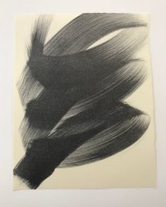
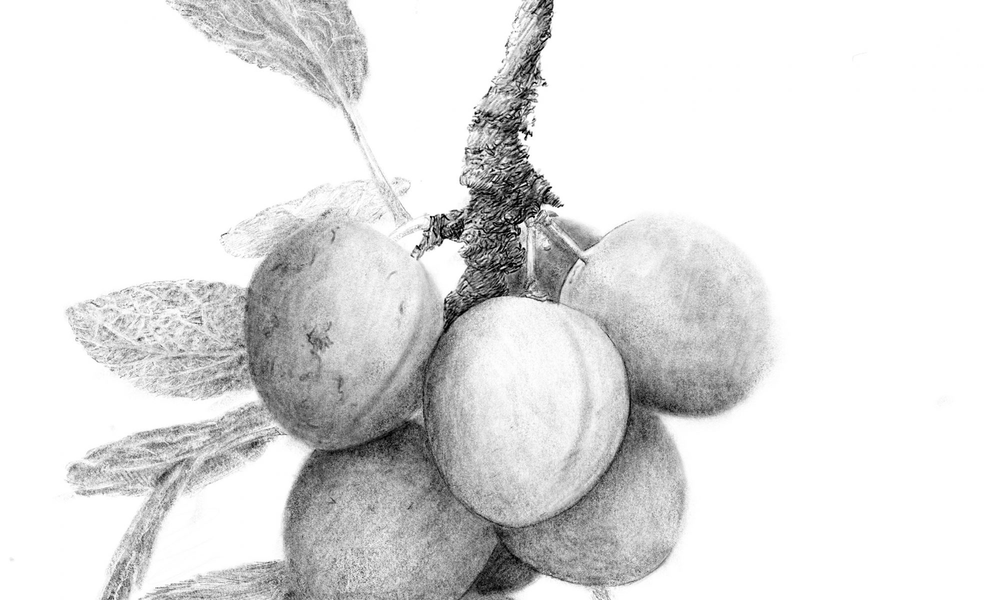
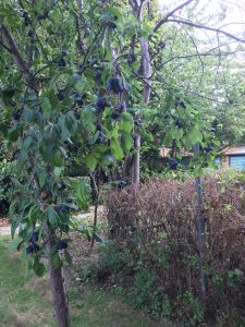
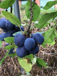
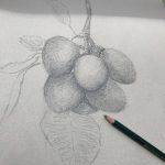
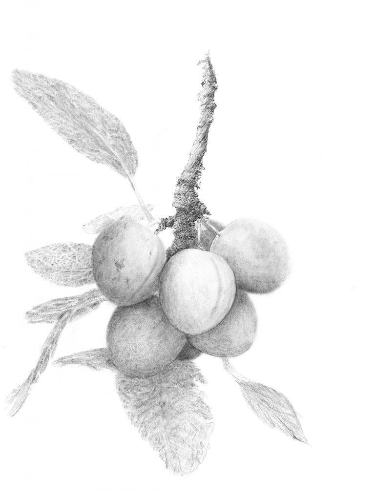
 The first drawing was in a small sketch/notebook with its own leafy design printed throughout. The first page was mainly clear for the drawing and I began by making a basic line drawing capturing the fruit’s composition on the A5 page. The 6B and the cloth like texture of the page allowed for a soft approach rather than a fine detailed representation.  It was enjoyable to feel my way through the fruits and their shapes, for although they all appear to be oval, they each have their own distinct shapes, which may not always be the uniform oval.  
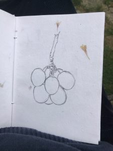
They may have grown together in a fashion that encouraged uneven growth, with the odd bump or straight edges within  the overall oval curves. The branch has its own round core with its uneven ridges of growth to support the ripening fruit. The end of the branch is the opportunity for the thin green stems to grow out to hold, connect and feed each of the relatively massive purple fruits. I wondered how they knew how and when to let go of their charges. Shading the fruit, branch and adding impressions of the leaves made a sketch rather than a drawing.

Picking up the A2 Gainsborough Designer Pad was a very different proposition because of its size, weight and the need to hold it high and draw while looking up.  However the major difference was the texture of the paper.   More a Felt dimpled finish. The larger drawing space allowed for more freedom to create shaped fruits and branch, but the rough texture had its own grain that became more prevalent as the lead built up.

A2 6b drawing
sketch using grained paper
small and large damson sketchs

The paper and pencil choice made for a textured impression of the damson bunch giving shape and volume to each fruit from a distance. However the vertical texture revealed itself on closer inspection. This is fine for an impressionistic drawing, however damson’s are a smooth finished fruit and perhaps there is another combination or method that can be applied to reflect the surfaces in the composition. Additional smooth paper and pencil selections could be found, however I could feel the tablet and Apple Pencil calling me to experiment with their capabilities. Before following that route I realised I had not been so observant on the A5 cloth book drawing to see the 7th damson hidden behind the foremost fruits which is included in the A2 drawing.  This smart phone photograph of the bunch from another angle that reveals not 6 or 7, but 8 fruits!

Click this link 6,7 or 8 damsons – for a clip beginning with a front elevation view and panning round to the profile reveals how many damsons are actually on the branch.


From papers to iPad drawing

Picking up the iPad I selected  a 6b pencil to draw the branch holding the fruits with all its knurled growths and protrusions. Parts of the branch were drawn over to create the smooth  lengths between growth stages. For the fruits I tried a ‘blunt pencil’ in the hope that broad strokes could create the smooth/velvet fruit skin finish, but it felt to brash. Switch to 6b. Much better for the range of tones needed to achieve each fruit and their position in relation to each other. The leaves needed to be given shape with the pencil shading by drawing at an angle to create width of mark, rather than line. The veins of each leaf were made with pencil line followed by eraser line to provide highlights.

Digital Damsons Drawing

The clip below captures the drawing process.

Auto tone digital damsons

In preparing the digital drawing for this article it was exported as a pdf (portable document format),  imported into  Photoshop and converted to a smaller jpg file for uploading here. However an auto tone function can be applied. The result is below. It is has much more contrast, which while viewing on screen gives a denser tonal range, greater the dimensions and volume to the fruits. I shall leave them both here for screen viewing and later print onto paper for comparison.

Auto Tone Digital Drawn Damsons


https://en.wikipedia.org/wiki/Damson

Excellent South Schools Show @School of Art

Annually Birmingham School of Art hosts an exhibition of school students art from 17 Schools across South of the City. It always a sunny HOT launch evening attended by many students, teachers and parents to see the high quality work being made by diverse secondary school talent.  The 2018 show excelled and the breadth of work captured the many faces of the city’s young people. Some slides from the launch:

IMG_2237
IMG_2190
IMG_2136
IMG_2145
IMG_2185
IMG_2123
IMG_2188
IMG_2148
IMG_2192
IMG_2243
IMG_2196
IMG_2169
IMG_2161
IMG_2242
IMG_2130
IMG_2245
IMG_2217
IMG_2249
IMG_E2226
IMG_E2219
IMG_2220
IMG_2149
IMG_2244
IMG_2175
IMG_2238
IMG_2206
IMG_2116
IMG_2199
IMG_2176
IMG_2156
IMG_2140
IMG_E2240
IMG_2251
IMG_2120
IMG_2252
South Network @Schol of Art
IMG_2157
previous arrow
next arrow

Every school included a portrait, painting, drawing, photograph or sculpture of  classmates, family members or respected people of many and varied cultures. From Swanshurst school’s  4 meter long series of portraits in charcoal to Bishop Challoner’s 2 meter high painted portrait’s on board images of young people proudly stared out. Traditional art skills abound alongside contemporary applications of colour and concepts to make the studio exhibition space burst with the enthusiasm, emotions and the vibrancy of the makers and their subjects.

Video of Swanshurst ‘WALL’

Go see for the next few days in the sun.  All these talented artists will have the opportunity to extend themselves with the new Foundation course at The School of Art beginning in September.


PMC V&A Print Visit

Members of The Printmakers Council were privileged to be offered the opportunity of a guided tour of examples of the Victoria and Albert Museum print collection in V&A Study Room lead by Head of Prints Gill Saunders and on this occasion ably supported by her curating colleague Tim Travis.

This 2018 visit is in response to the success of past V&A visits, and a unique opportunity to view prints selected from their archives. The print selection follows the recent PMC exhibition ‘Print City’, held at the Morley Gallery with selected prints related to cities and the urban environment.

The V&A collection of works on paper number over 1 million pieces of which about 500,000 are prints and the remainder drawings, watercolours and photographs. The V&A has been collecting contemporary prints for many years since its inception.

There is a slide show of our visit below. PMC Member Denise Wylie also captured the visit and has published on her facebook page .

V&A print room visitor book
the arrival - David Hockney - sign of what's to come on the visit
new exhibition road entrace
ready to go
getting in
gill saunders head of prints introduction
first print is london's kerning
londons kerning
no lines only letters
chris ofili
concentration
inspection
smart phone capture
russian manhole cover stamps
tim travis describes prints from Russian revolutionary artists
canary construct
digital print-Tom Noonan
detail
bag for life in support of the homeless
plastic bag for life
drawing and print
whistler prints
note taking
Hockney's rakes progress
the wallet begins to empty
the drinking scene
meeting the good people
Gill Sounders Head of print
urban prints
drawings and lithographs
Gill points out catalogue number
work on moscow metro
Tim Travis Curator
Robert Gibbings Lino cut
London Bridge today robert gibbings
wood cut southwark Bridge Robert Gibbings
W Richardson
Leonard Potter colour Lino cut prints
Leonard Potter
Leonard Potter
Denise documenting the visit
Nevinson, Christopher R
Nevinson
Nevinson
Nevinson
Nevinson, Christopher Richard Wynne
woolworth building original drawing Joseph Pennel
Nevinson, Christopher R
print
Shenadoah
Martin Lewis mezzotint with glow
unworked plate to achieve light glow
detailed viewing
Tim Travis
Tim describes Notting hill series
notting hill housing trust prints
the series
nottinghill
notting hill street
Justin De Villneurve
Gill explains background
denise with phone portrait
meanwhile the cataloging continues
green label cataloging
Denise
impressive
title detail
corner detail
wrecking ball
Guy checks the hogarth book
Gin Lane engraving
detail
detail
permanently high
viewing last prints
Q & A
drawing
drawing
from mezzotint
mezzotint
IMG_3799
free viewing time
sharing a special Piranesi find
final touches
later as we leave
Catherine_bray_with_board 10x8
Strand & Whipman Manhattan Ashmoleum 10x8
Tall American Tate Britain All2Human10x8
Edin modern art_Michael_armitage10x8
Julia Stewart ikon Bock 10x8
Edin modern art kilted 10x8
Hayward_Hearing Gursky 10x8
Victorian_Giants NPG10x8
Ai Weiwei RA thinking waiting10x8
Rauschenberg Tate10x8
previous arrow
next arrow
 
Shadow

Gill began with typographical map of the city: London’s Kerning, which is a detailed street map with no delineating lines but each street is defined by its lettering. It was commissioned from NB: Studio (designer) by the International Society of Typographers in 2006

no lines only letters. London kerning

She then went on to highlight two prints by Chris Ofili made in Barcelona following his painting graduation show from the Royal college of Art where he met V&A curator Rosie Miles, who asked if he had made any prints.  He had not, however Rosie said that if he ever did let the Museum know.

Following graduation he saw some ancient rock drawings in Zimbawe made by artists in a trance like state.  He visited Barcelona and took himself into a similar trance and began drawing city landmarks on etching plates and produced 10 prints as a spiritual response to the city. These are two of them. Gill mentioned that attending degree shows was an opportunity to purchase works before they become too expensive!

Tim Travis took over to tell us about contemporary digital prints, including a monoprint by Russian artist Gluklya showing a monument to unknown workers, and a large-scale digital print by Tom Noonan.

russian manhole cover print
russian manhole cover stamps

He also introduced a unique Russian print featuring manhole covers included in a series of stamps titled ‘the best Sewerage for the best people’.  Each stamp has a subtitle dedication from the artists across the world that inspired the artist Alexander Kholopov while unable to travel out of Moscow. Images were shared across 70 countries via mail. An early example of mail art and a precursor to art and social media.

Gill showed us 4 of David Hockney’s series of 16 Rake’s Progress etchings, made while studying at the RCA when it was next door to the V&A. Guy Butters commented that Hockney prepared and printed his own plates and word has it that one of the reasons he took to print was that paper and materials were free at the time, unlike the expense of canvas and paints.  Gill suggested his prints may be even better than his paintings!

A surprising print was made on a plastic bag, part of a project to draw attention to the issue of homelessness in the city: Franko’s B’s A Bag for Life. Perhaps printed on throw away material, to chime with attitude much of society has to its homeless members.

We saw prints by WW1 war artist Joseph Pennell and prints of apocalyptic biblical scenes by 19th century painter John Martin.  Tim told us of the range of representation of the City by artists throughout the 19th century. Sometimes romantic, others reflecting anxiety about the spread of industrialisation and expanding metropolis, while other created images of cities of the imagination. In the 1980s Brodsky & Utkin were artists at the Moscow architecture institute. They worked so closely together they were awarded one diploma in their joint name. Moscow was supposed to be the ideal city and Stalin’s contribution/ legacy was the metro, whereas Khrushchev’s project was new housing which were all built on old historic sites. Tim commented that ‘houses die twice’. 1. When people leave them 2. when demolished. At the time Russian printmakers had to print when they could as materials were not freely available. Etching paper was not always available and multiple copper plates were made and printed later when paper became available.

Gill took us through prints by Whistler of the Thames.  A wonderful Hogarth book of engravings showed urban settings including Beer Street and Gin Lane illustrating the effects of alcohol on less wealthy city dwellers. Also on show were Victorian views of upmarket society entertainment at Vauxhall Gardens and Robert Gibbings’ wood cuts of London bridges, as well as colour lino-cuts of city transport, workers and life in the 20’s and 30’s by artists of the Grosvenor School.

One from this group of prints was by the artist Leonard Potter.  He was a late-comer to print having worked in stained glass, but in the 1930’s turned to colour lino-cut. Gill remembers receiving a call from reception one afternoon a few years back:  “Mr David Potter to see you”. Not knowing a David Potter, she nevertheless less went to meet the unknown visitor and met an elderly gentleman holding a battered carrier bag. Mr Potter said “you might want these” and brought out 3 colour prints of “my father Leonard’s work. We thought you might like to have them.” A truly generous and truly wonderful gift.

Following on from lino cuts we were shown a stunning collection of Christopher Nevinson’s City scenes including a 1918 Futurist influenced semi-abstract mezzotint with rich, inky black velvet shadows.

Ash Can School artist Martin Lewis’s 1939 drypoint and sandpaper aquatint Shadow Magic featured a dark urban scene with a bright glowing light bulb achieved by leaving one small area of the plate unworked.

Tim brought us up to date with a series of colour screen prints by 12 artists working with an Royal College of Art partnership to support the Notting Hill Housing Trust refurbishment in 2003 including a print of (local resident?) Justin de Villeneuve.

Gill concluded the expert and insightful tour by showing a collection of abstract prints responding to the city experience.

As we reached the end of our tour of four extended tables of multi genre printmaking Gill and Tim took questions about the prints we had seen and the city concept that had inspired their selections. We were encouraged to spend more time up close with any of the prints with a generous period of free time in the room which members enthusiastically took up.


Gill also pointed out the print by Liz Collini specially commissioned for the Print Room with its text: “Among the indescribable sounds of paper, moving.”

Do look at PMC Member Denise Wylie’s excellent review of the visit on her facebook page .

The Print Room is a study room where original prints can be viewed, after looking at the online catalogue and booking in advance. Gill and Tim encouraged PMC Members to make appointments and visit to see the most wonderful and wide ranging collection of extraordinary printmaking.

All the prints can be viewed on the V&A collection site: https://collections.vam.ac.uk/

Thomas Bock

Thomas Bock   Ikon gallery December 2017


Today in Birmingham’s ikon gallery saw the long in the curating first exhibition outside Australia dedicated to the work of Thomas Bock (c 1793 – 1855). As ikon director Jonathan Watkins and Tasmanian Museum and Art Gallery director, Janet Carding say in their forward to the beautifully and insightfully illustrated catalogue ; ‘It comprises a selection of drawings, paintings and photographs that demonstrate not only the artist’s technical skill, but also sensitivity to a wide range of subject matter including portraits of Tasmanian Aborigines, his fellow criminals as well as free settlers in Hobart Town, nudes, landscapes and every day scenes, occasionally giving touching inside into his domestic life.

Bock was one of the most important artists working in Australia during the colonial years. Born in Birmingham, trained there as an engraver and miniature painter, in 1823 he was found guilty of ’administering concoctions for certain herbs …… with the intent to cause miscarriage’ and sentenced to transportation for fourteen years. He arrived in Hobart the following year where quickly he was pressed into service is a convict artist, engraving banknotes, illustrations for a local almanac and commercial stationery. An early commission was a number of portraits of captured bushrangers, before and after execution by hanging, including the notorious cannibal Alexander Pearce.

Alexander Pearce, serial murderer, executed and recorded by drawing

In a short space of time, Bock’s life was turned upside down. Once a respectable artisan in his early 20s, with a good address in a booming industrial town, he now found himself at the edge of the known world in the company of compatriots who were as desperate as they were depraved. There are no surviving diaries that document his personal journey, but Bock’s artistic output on arrival, through conditional absolute pardon and until his death – marked by an obituary but described him as artist of a very high order – is a rich seam of observation that was at once subtle and astonishing.

Most significant in this respect is a box series of portraits of Tasmanian Aborigines, commissioned by George Augustus Robinson during 1831-35, now in the British Museum. It is a master set, from which a number of copies were made. The drawing throughout is very fine and the likenesses probably very true, and having them at the heart of this exhibition will effectively convey the tragedies suffered by Indigenous people through the British colonisation of Australia. The sitters – including Trukanini (c1812-76) have a demeanour that conveys both pride and despair. For British audiences on the whole this work will be a revelation; for Aboriginal visitors to the exhibition in Hobart – who know the sad narrative only too well – it will be a rare and poignant opportunity to see firsthand such early pictures of their ancestors.

The exhibition and history reflects a literally amazing story of a Birmingham born trained artist and convicted criminal who sketched his passage from Woolwich in July 1823 to Tasmania in January 1824. The sketches begin with a family, and a view of the city, both probably his own. They follow the English, Cape Verde and South Africa coastlines as he reaches Hobart and is immediately put to work for the Bank of Van Dieman’s Land engraving notes.

The exhibition and the walking talk by Jane Stewart of the Tasmanian Museum and Art Gallery and Tasmanian Artist, writer and historian Julie Gough took us through the works on the wall. Jane explained  the depth of history, skills and talents of Thomas Bock and concluded at a glazed box holding the portrait of a young Tasmanian woman ‘taken in’, from Flinders Island of incarceration, by a British serving family in Hobart to be ‘civilised’. The Franklins commissioned Bock to paint a portrait of Mithina (Mathinna) in the red dress. There is much history to this image which Jane and Julia shared with us, including the fact that the original painting was framed by an oval mount which removed Mathinna’s feet from view. On purpose we do not not know, but the portrait is now exhibited in a frame showing her whole body.

Director Watkins also introduced another glazed case by lifting the leather cover to reveal 3 daguerreotypes taken by Bock only three years after the process was invented in France. It is claimed that Thomas Bock was the first person to introduce the technique to Tasmania.  He passed on his photographic business to his step son Alfred who in turn introduced the Carte de Visite to Hobart. The exhibition does not include an image of Thomas Bock, and one is extremely hard to locate, perhaps. because of Bock’s very real criminal history in Britain. However the Australian Dictionary of Biography holds a photograph by Alfred, along with his Biography which I include here as I ‘missed’ seeing him alongside the images he created.


Finally Julia walked us round the gallery to furnish us with the historical context to Bock’s artworks. She was aided by, appropriately enough, a miniature projector with her slide show being projected on the wall spaces between the frames. Director Watkins showed a steady and stable hand to keep the beam straight and true. Much like the exhibition as a whole that delivers revelations about a little known, until now, Birmingham, British artist and his role in reflecting the Indigenous peoples of Tasamania.

Slide Show

The exhibition is on until March next year and there are a range of talks this week culminating in a symposium on Friday 15th:

Menzies Centre for Australian Studies & Ikon

Thomas Bock Symposium Convicts, Race, and Art

This one-day symposium is a collaboration between King’s College London and Ikon.

Bock was one of the most important artists working in Australia during the colonial years. He trained as an engraver and miniature painter in Birmingham before, in 1823, being found guilty of “administering concoctions of certain herbs … with the intent to cause miscarriage”, for which his sentence was transportation for fourteen years. Bock arrived in Hobart Town, Van Diemen’s Land (present-day Tasmania, Australia) the following year, where he was quickly pressed into service as a convict artist, engraving bank notes, illustrations for a local almanac, cheques, commercial stationery and so on. An early commission was a number of portraits of captured bushrangers, before and after execution by hanging, including the notorious cannibal Alexander Pearce. Bock’s portraits of Aboriginal Tasmanians are some of the most important in Australian art, including that featured here of Mathinna, daughter of Towterer and his wife Wongerneep of the Lowreenne people.

Experts will contextualise Bock’s life and work, while engaging in debates about ‘art in a time of colony’, the representation of Australia’s Indigenous peoples, and the politics and experience of transportation from the Midlands to colonial Australia.


Programme

10:00-10:30 Registration, Anatomy Museum, Level 6, Kings Building

10:30-1045 Welcome by Dr Ian Henderson, Director MCAS

10:45-12:30 Industrial Birmingham to Colonial Van Diemens Land


Dr Malcolm Dick, University of Birmingham

Thomas Bocks Birmingham: Industry and Culture in the city of a thousand trades

Professor Judith A. Allen, Indiana University Bloomington

Thomas Bocks conviction: Men, and the rise and fall of the new capital crime of abortion, 1803-37

Dr David Meredith, University of Oxford

On the transportation system and Van Diemens Land


12:30-13:30 Lunch

13:30-15:00 Convicts, Art, and Knowledge


Professor Clare Anderson, University of Leicester

Convicts and Penal Colonies in 19th-Century Science and Collecting: A Global Perspective

Professor Khadija von Zinnenburg Carroll, University of Birmingham

Thomas Bock and Edmund Clark: Savagery and Redemption in Ikon’s criminal portraiture, colonial and contemporary

Dr Ian Henderson, Menzies Centre King’s College London

Green Arcades Project: Art and Sociability in Nineteenth-Century Hobart Town


15:00-15:30 Afternoon Tea

15:30-17:00 Bock and the Tasmanians


Jane Stewart, Tasmanian Museum and Art Gallery

On Bock and the history of art in Tasmania

Dr Gaye Sculthorpe, British Museum

Thomas Bock and the mystery of Trukanini’s necklace

Dr Julie Gough, Artist

The race of representation: What the works by Bock and his colonial contemporaries offer on the circumstances of Tasmanian Aboriginal people

17:30-19:30 Reception for Ikons Thomas Bock Exhibition

18:00 Jonathan Watkins, Director, Ikon Gallery on the exhibition


Image: Thomas Thomas Bock Mithina (Mathinna) (1842) Watercolour Presented by J H Clark 1951, AG290

Courtesy Tasmanian Museum and Art Gallery


.


Printmakers Council City and Mini Print

The Printmakers Council was formed in 1965 a group of artists including Julian Trevelyan, Michael Rothenstein, Anthony Gross, Stanley Jones and Agatha Sorel who saw the need for a society that would promote new developments within printmaking. Since then it has consistently promoted the place of printmaking in the visual arts. More about the history of the Printmakers Council here

In 2017 the Council invited artist printmakers to submit works for the Print City and Mini Print  exhibitions which opened on November at the Morley Gallery in Lambeth London.  The exhibits showed the breadth of UK printmaking including silkscreen, etching, linocut,  lithography, solar and plastic engraving. I submitted a mini print  (19×19) of an inkjet print on pastel paper – Welsh Bowl with Mermaids Purse, Sheep’s Wool and Rabbits Tail.  The Mini Prints are a portfolio that will be held by the V&A Print Collection. I met Michael Pritchard from Staffordshire who had his digital prints in the city exhibition that sat alongside plastic engravings by Louise Hayward and Guy Butters Underground Surveillance that hung in on of the windows which are included in the slide how of iPhone pictures from the opening night.

Scottish visitor
City Print full house
close inspection
Welsh Bowl Inkjet print- ejt
mini prints
IMG_5553.jpeg
4 mini prints
plastic engravings
kipling estate LH
louise hayward underground.jpeg
michael pritchard digital.jpeg
Committee Convo
Rebuilding the Built
IMG_5585.jpeg
underground surveillance Guy Butters
Morley Gallery
Imperial war museum gate house
Imperial War Museum Frontage
previous arrow
next arrow
 
Shadow
The gallery is nearby The Imperial War Museum which was particularly dramatic that night with a bright moon low in the sky.
Imperial War Museum Moonlight Gate House

Bahrain Artists in Birmingham @ulafaa

The rise of Maliha @ecstaybash

I dropped by the IPS ( International Production Space in Birmingham School of Art)  that flowed from pieces from Bahrain Artists presented by the Bahrain based Ulafaa Initiative in the foyer.  It is a rewarding show with insights into how young artists are making their voices seen and heard locally and internationally.  I asked the curator Tamadher AlFahal about the show’s origins and she invited me to the talk she was presenting (as part of her PHD) that evening and an open invite to a further panel discussion about the cultural production of the Arab Gulf that is happening on the 19th @ 5pm in the IPS :’AS NOTED/UNNOTICED’ a part of “I AM KHALEEJI”; a series of events and happenings that offers prelude to the contemporary art scene of the Arab Gulf.

Thumbnail 1
Thumbnail 2
Thumbnail 3
Thumbnail 4
Thumbnail 5
Thumbnail 6
Thumbnail 7
Thumbnail 8
Thumbnail 10
free Hugs campaign
learning
slow down female walking
three prints
IMG_4172
my
IMG_4178
IMG_4188
IMG_4180
previous arrow
next arrow
Shadow

From the discussions  it is clear the art scene “within the Arab Gulf (or GCC) has been through a state of flux. Typically exposed to Western audiences, and the greater art world, as a strongly diluted stereotypical image of the Middle East. The Arab Gulf’s distinctive art identity remains undervalued.

This project addresses the misconceptions of the contemporary art scene in the Gulf, it offers an alternative view that is diverse, unique and vernacular in attempt to understand its complexity and dynamics.  Specifically focusing on shedding light on the Gulf art scene as a distinctive voice within the Middle East. “

Issues of identity, religion, gender are clear in the work on show, but the range of video, photography, graphic and printed artworks are strong in their own right.  There are plays with sign posts (literally) and the two photographic/print based pieces – The rise of Maliha @ecstasybash and My Ghutra is Me @stefanistan deal directly with issues of personal image and identity in clever, creative and insightful ways.  ‘Maliha : a Name meaning having beauty, kindness and strength’ and ‘Ghutra’ the traditional male headress and as one of the subjects told the artist : ‘the eyes are the window on the soul, but first tell me how you wear your ghutra and I will tell you who you are……’ Both pieces are portrait based although the whole portrait is not shown in either works. 

@ecstasybash’ instagram bio is understated : “Photographer , Slightly Artistic, mildly photographic”.  Her website also provides further insight into the inspirations for The rise of Maliha.

The show is also referred to By the Book @ulafaa


moon stories

moon stories, inkjet print #2/5 2017
Museum Enabler Steve S enjoys the print drawing of him reading moon stories
Museum Enabler Steve S and Jonnie Turpie shake on it


Museum of the Moon

Museum of the Moon is a new touring artwork by UK artist Luke Jerram.

Measuring seven metres in diameter, the moon features 120dpi detailed NASA imagery of the lunar surface. At an approximate scale of 1:500,000, each centimetre of the internally lit spherical sculpture represents 5km of the moon’s surface.

Moon Story, Drawing and social media.

The original drawing was begun when the artist visited the Museum of the Moon exhibition and spotted a ‘moonlight’ in the corner in the dark expanse housing Luke Jerram’s massive moon. On a closer view the moonlight was a table lamp beamed on a book being read by Steve to an entranced family. The illuminated reader and family provided a strong composition to base a drawing on. The artist took iPhone pictures, transferred them to an iPad, into adobe procreate and using an apple pencil the drawing was created through a number of states. An early version was posted. on Instagram channel where  Museum Manager Jessica spotted it, showed it to Steve who was surprised and impressed. Jess used Instagram to contact the Artist to let him know Steve would like a copy if possible.

Once the drawing was finished proofs were made on a high quality Cannon inkjet printer on to a range of papers before an edition of 5 were printed on 300 gsm aquarelle off white paper. Two months on from the Saturday encounter in the Museum of the Moon the 2nd print of the edition was presented to Steve who along with Jessica enjoyed seeing the mounted fine print. Of course it quickly appeared on the @thinktankmuseum feed.

Thinktank


Social media & sharing icons powered by UltimatelySocial
error

Enjoy this blog? Please spread the word :)

Instagram