
Restricted Realities
In previous weeks I have applied a format beginning with Covid virus updates. This week covid will be relegated to last on the list and a reflection on artistic responses to isolation will lead the way. Take Care.
Lookout Lockdown – Restricted Realities
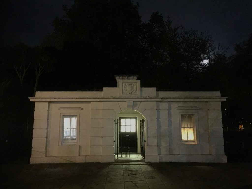
Lockdown has encouraged many weeks of reflection, on amongst many considerations, the local environment. If one is lucky enough to have a garden then the natural world of animals, birds and foliage has become more apparent, or we have become more aware, than before covid. However the darkness and quietness of early mornings without the demands of a structured day ahead has led to slower rising. Hopes of getting up and out to work in the fine art silkscreen print room are overtaken with the restricted reality of lockdown and to ideas of digital drawing conceived as an amalgam of photography and digital printmaking that can be approached in isolation.
The self isolating bedroom has thick wall to ceiling curtains, pulled tight in the evening that create a disorientating waking into darkness. When the curtains are pulled open light enters the room and reveal looming trees of green, wafting in the breeze that become mesmeric. Confirmation that they and the outside world is still there is welcome. Seclusion is the nature of lockdown isolation. Outside is seen from inside. A quickly taken smart phone photograph of the view looking out though the window does not capture the ambience of a room that is usually left, once awake. The world is still there and the air moves, with or without the virus.
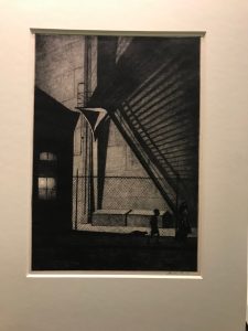
Restricted lockdown reality makes one even more inquisitive of unaccustomed views seen by peering out of the prison window with its horizontal and vertical muntins. Looking out inspires the making of images to express the physical and emotive experience of isolation. Responses to the outside world over lockdown weeks has led to drawing out from photographs of the environment with increasingly non figurative window frames. Naturalistic drawings remain centre stage as the frames around them change, but retain their containing structures. The first drawing of the weeping tree in a trapezoid frame took many weeks to complete. The act of drawing became a meditation on the nature of the weeping foliage. It was contained by a stepped back simplified image of the window frames. In contrast to the detailed literal drawing thick dark ‘bamboo’ lines were over drawn creating a new dramatic frame to the forefront and on top of the greyed background. The addition of colour, in similar technique to under printed silkscreen layers, defined the contained drawing to the exclusion of the all other window framed images, leaving the focus on the one frame.
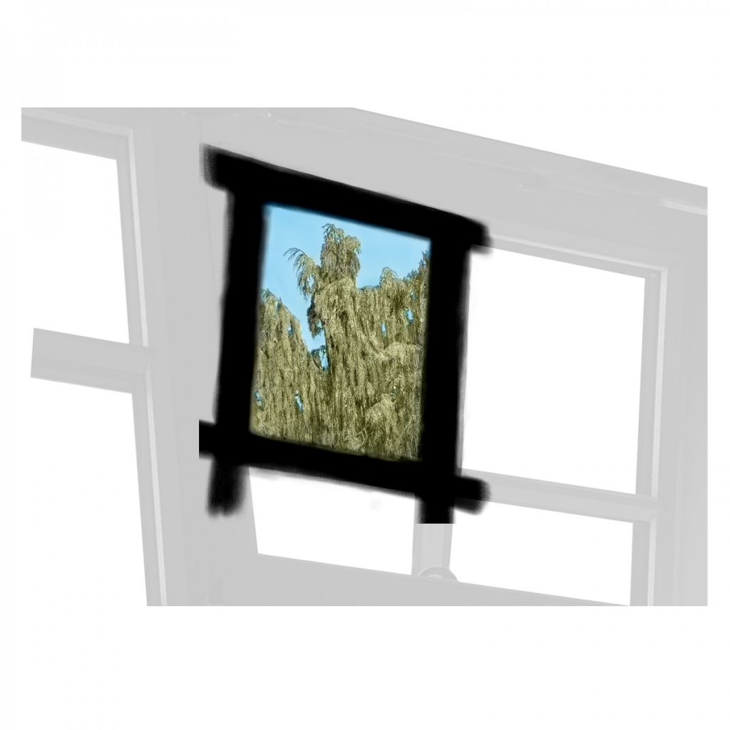
The tree is: Cupressus nootkatensis. More in Lock Down 4: http://printsanew.jonnieturpie.com/2020/04
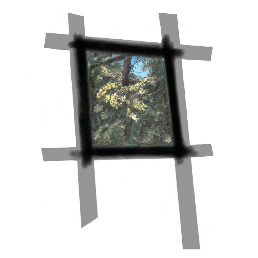
With LL#1 complete additional images appeared in waking mornings. By shifting viewpoint to the right the highlighted leaves on the maple and plane trees next to the weeping tree became the focus for LL#2. A similar process of drawing and composition was adopted. However the literal image of the window frame was rejected and replaced with a simple structure to hold the trapezoid drawing. This became a much more abstract framework in the style of a silkscreen print with the application of flat colour in contrast to the drawn and coloured central naturalistic image and Bamboo black border. In following weeks a single growing creeper appeared on a lower window frame and was drawn with a simplified frame structure and the black bamboo over drawn frame. Latterly the weather changed and the rains came which inspired LL#3. The window glass no longer transparent, but holding the raindrops as patterns of light against the dark trees in the background. The cell coming closer and curtailing looking out. #LL4 took the same format of central drawing with bamboo black frame, however this is imposed upon an abridged framing structure. The central drawing is rectangular which emphasises the skewed angle of the framework. The drawing has white surrounds between it and the frames rather than being butted up against them, and hangs like a mirror rather than integrated into the frames. The framework edges are straightened off in the photoshop programme used to compose the multilayered image. Straightening is made with lines of white which have fine dark outlines. The effect is that each edge is ‘taped’ which is a very different approach to previous images that float unsecured on a plane . On the computer screen the taping is an abstract contribution to the image, but when printed it pins the frame and drawing to the paper, in contrast to the prominence of the drawing of the patterned rained upon glass.
# full tree 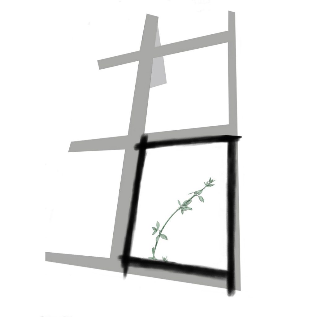
# new growth 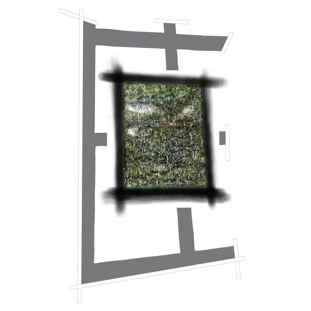
#rain
14 weeks into lockdown the first four prints are completed and must be finally titled. ‘Lockdown Lookout’ was the original choice implying intentions to make images that inspire positive images made from the negative restricted experience of Lockdown. On review of the images, ‘Lookout Lockdown’ seems more appropriate as the intention is to put lockdown in its place and not be restrained by it.
Considering these titles raises questions on the imposition of Lockdown. Are we imprisoned? Are we being punished? Are we prisoners in caves gazing at framed exterior environments, unsure of what we are seeing? Unlike Plato’s cave we are not looking at illusory shadows, but although what we see is approaching a reality we are familiar with, the context in which we are looking is unfamiliar. Not free to see, but restricted by an agreed communal response to a threat. We do not converse with others. We receive worldly knowledge through media channels, television, radio, social media. Is our incarceration going to arm us with new knowledge to re-enter the worlds we knew, empowered to contribute to enhanced social understanding of a new world? These are contemplative questions considered as the drawings are made to reflect the visual realities presented in locked down waking moments. Having voluntary agreed to participate in imprisonment, to protect wider society we yearn to escape to return to a freedom of our western normality, where the air between the wafting tree and waking cell is not unknown and threatening.
digital drawing #BLM
Looking Ahead Link