 I had wanted to make a drawn silkscreen portrait of Yuchen for a while and embarked upon it in August 2018, as a portrait would be a gift to remember her time in the School of Art when she returned to China. I made the drawing and print tests while she traveled to European cities where she would see the work of great EU artists and also make watercolours in each city and share to Instagram.
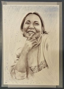
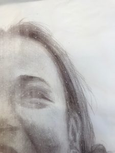
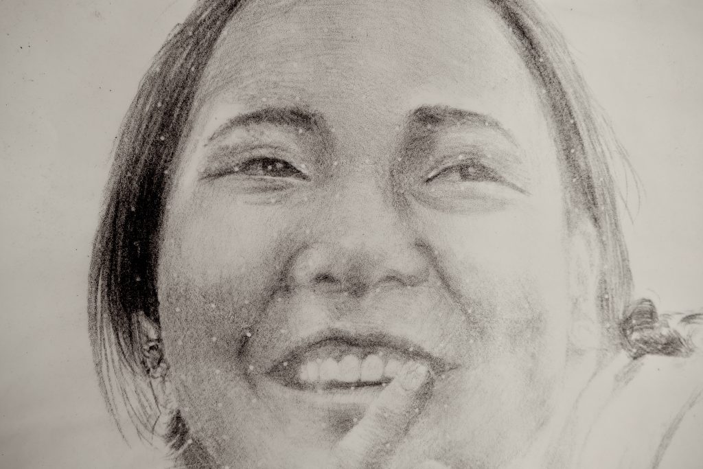
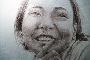
I had never drawn a portrait of a Chinese person and was excited to see what drawing technique might work. I choose to make an A2 drawing on mark resist using the graphite pencils. I selected a photograph to work from that I had taken when we and Didi Xiao had met to talk about Chinese festival possibilities. I had taken other photos over the months, but this encapsulated Yuchen’ bright, happy and thoughtful demeanour.
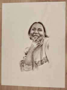
I focussed the drawing on her head, up stretched hand and elements of her jumper, including the strip of graphics. The folds of the jumper on her shoulder I let disappear onto the white of the paper.
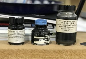
Having drawn the portrait I considered what additional marks might enhance the image and point to her artistic taste and skills. I had recently tested graphite powder, graphite suspended in water, litho touches, Indian inks and a special concoction ‘Vine Black’.
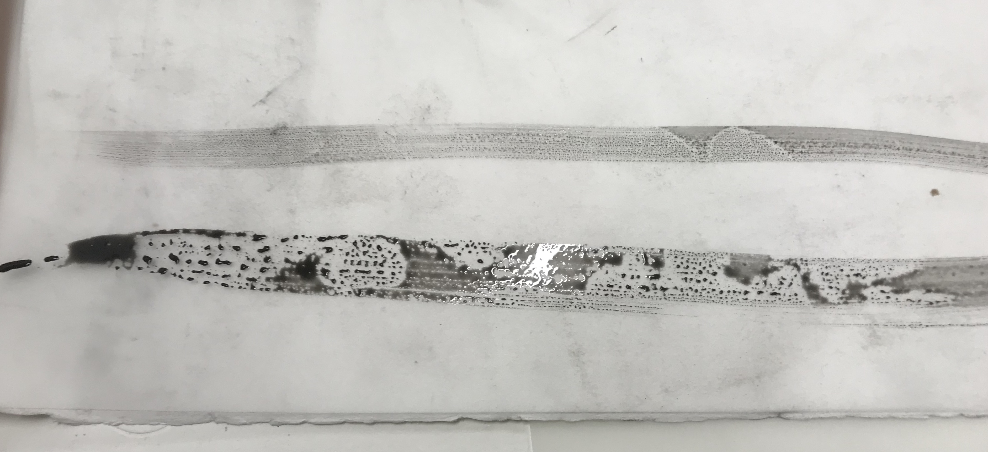
Vine Black is calcined charcoal pigment made from grape or vines, with a long history of application by artists. The pigment is suspended in a gum arabic solution. I noted that the vine black retained its depth, but quickly dispersed into beads of pigment rater than even brush marks on the mark resist. This reminded me of Yuchen’s watercolours and stone litho drawings of octopus. I freely brushed some light beaded marks around the edges of the paper to give an indication of the mark making. Visually it felt a little bit of an afterthought, but worth pursuing to screen print as they could be stopped out.
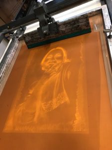
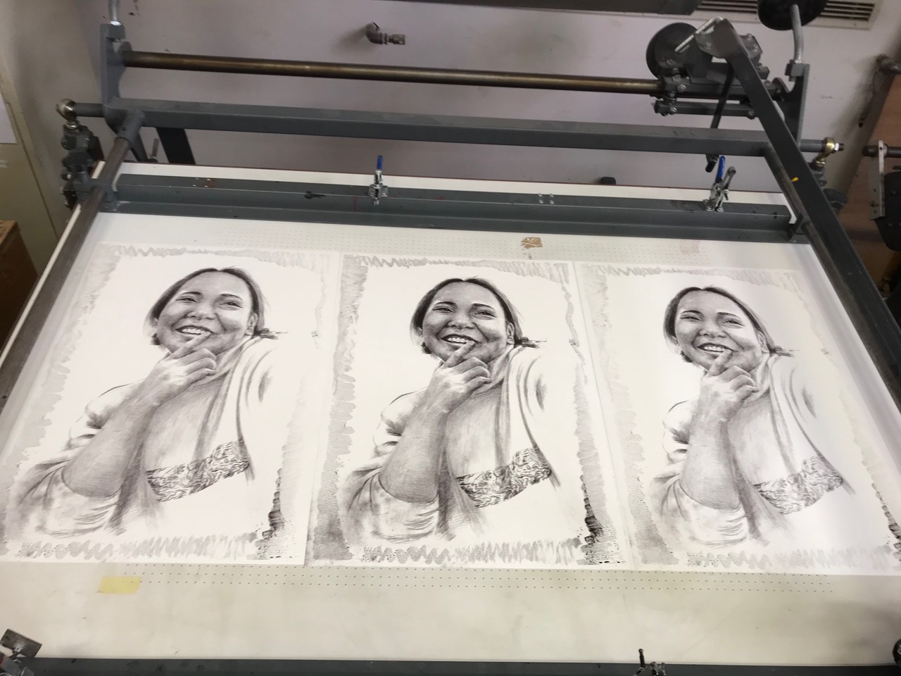
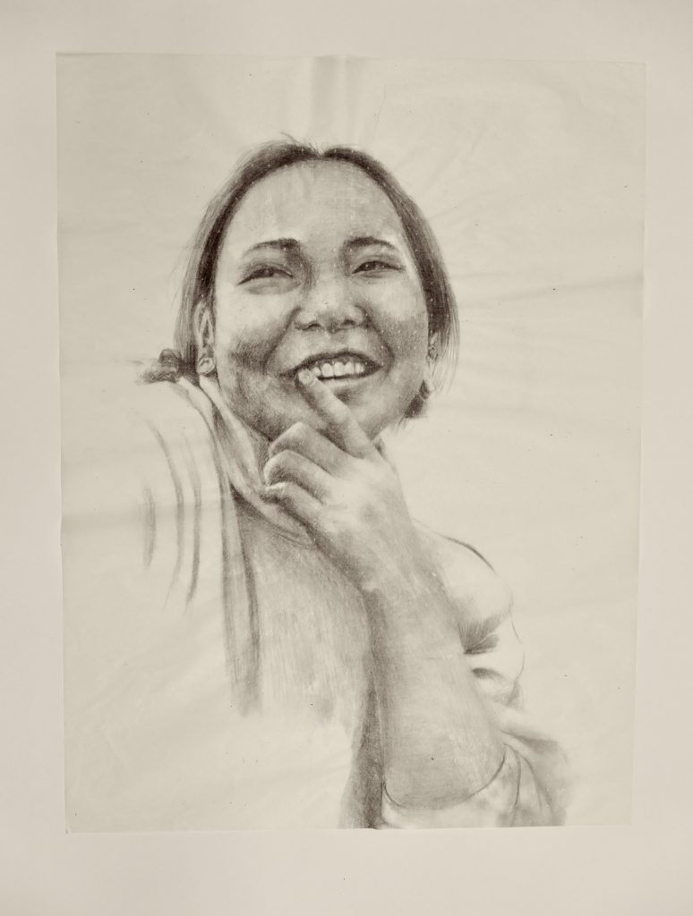
I selected a 165 screen mesh, exposed for 10 light units, washed out and dried ready for printing. The black with red and indigo ink mix was used to make first pull.
3 pulls were applied to build the ink level. The portrait worked well. The screen had held the graphite marks across the image with a good tonal range.
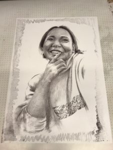
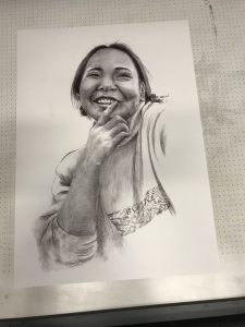
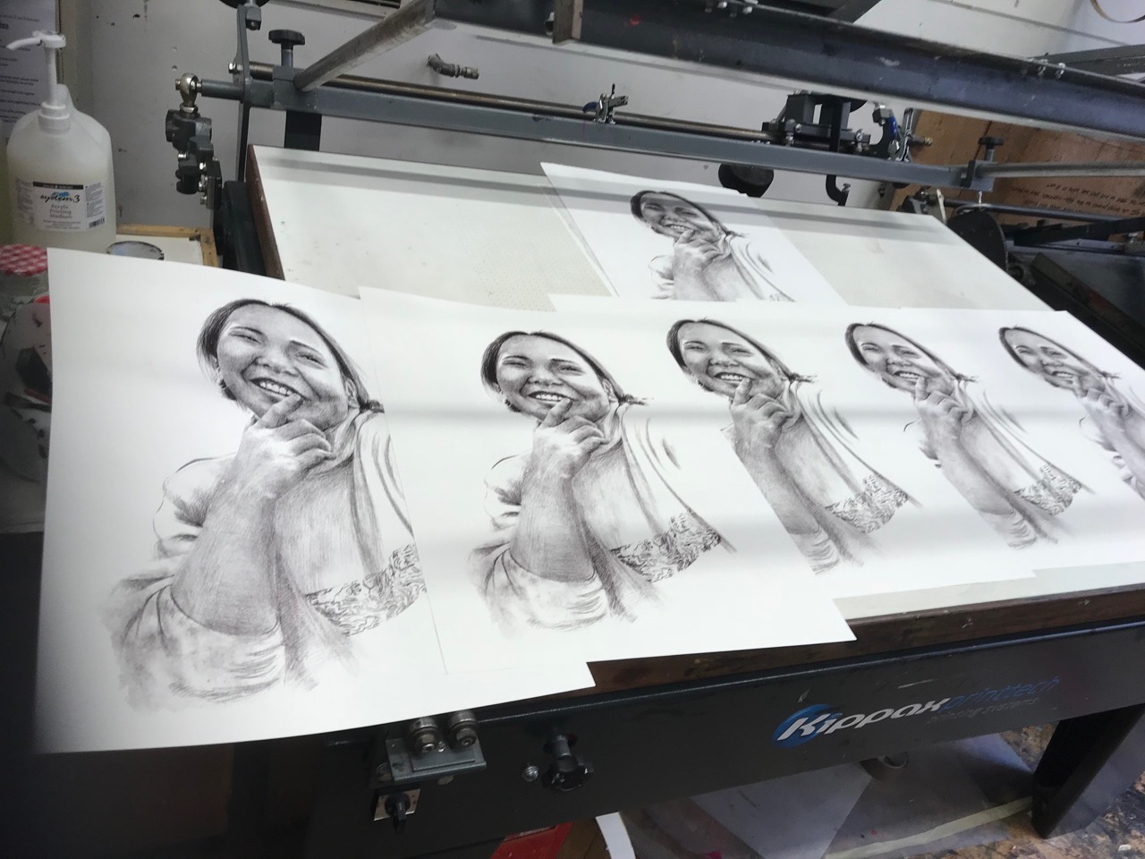
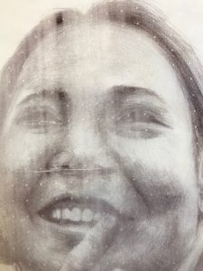
However the beading marks around the edges were not substantial enough to make a valuable conceptual or visual contribution to the portrait. I stopped the beading out and reprinted the portrait on the white paper to stand on its own. This worked well.
Overnight I reflected on the beading. Perhaps I had not been assertive enough. I returned to the studio, reviewed the ink tests I had carried out and decided that a more overall beading might work. From memory I made an outline of where I thought her head and body sat on the A2 print and quickly made beading brush strokes with varying degrees of dilution and breadth of stoke. I brushed the areas, that from memory, were not where the portrait was drawn and printed. I applied the beading mix on all sides of the sheet, but emphasised the brush strokes on the bottom left and mid left, let it dry and laid the beaded film over the portrait print. The beading overlapped the portrait in places, but that might just work rather than being precisely matched to the portrait edges.
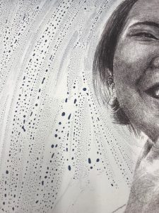
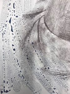
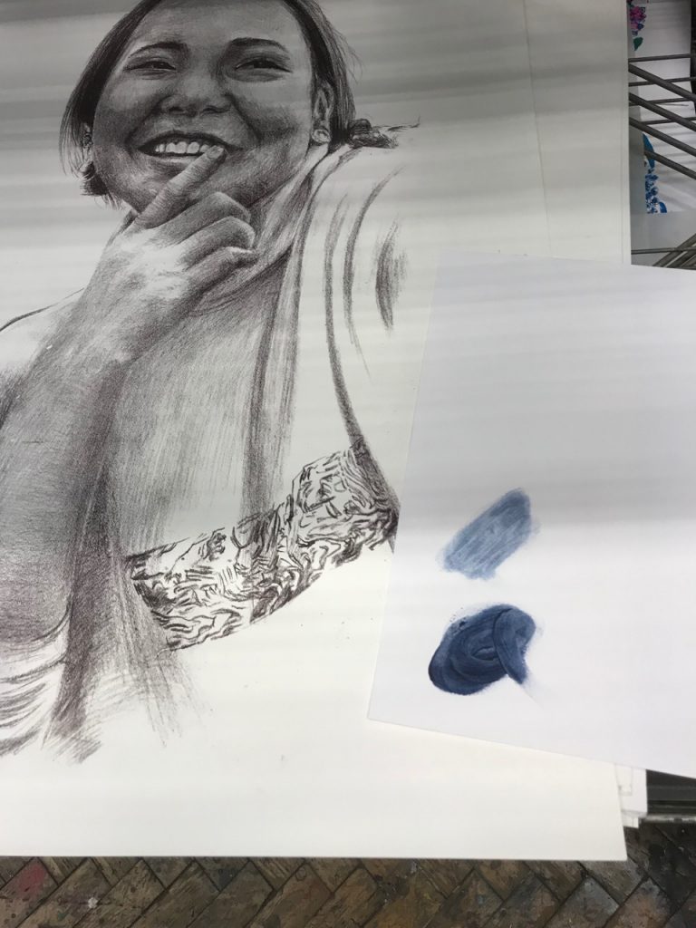
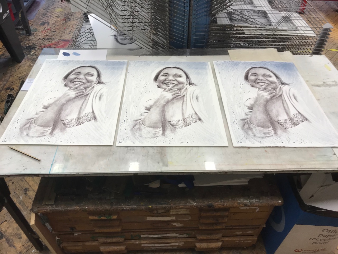
I exposed the beading film with 8 light units to retain the contrasting image. Rather than use the same ink as the portrait I vered towards a blue, once again to reflect on Yuchen’s water colours.The integration of the blue beading with the black brown portrait worked well and responded to the intuitive decision making along the way from drawing to final print. The exposure had not been overall and the top of the beading layer had allowed the highlights to retain some grain of the film as it had been under exposed (probably because of an uneven spread of the light screen exposure unit source), but this added depth to the portrait and further material marks. These ongoing tests of new textured, drawn, painted backgrounds with reference and relevance to the subject are building methodologies that can be applied and rarefied.
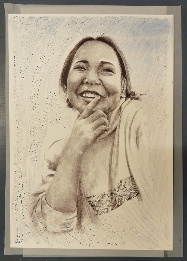
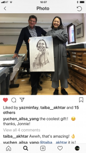
On Yuchen’s return from her European travels I invited her to the print room as I had a surprise present for her. I asked her to close her eyes and laid out the three prints on top of each other in the order I had made them. When she opened her eyes she was visibly surprised and excited to see her portrait. I lifted the first print to reveal the ‘clean’ portrait and then the beaded version. With all three portraits next to each other we discussed the approach to the portrait making and the use of the vine black beading. I was so rewarding to see this happy and excited response to her portrait and I asked her which one would you like: “I would like this one, because I like the beading marks.”
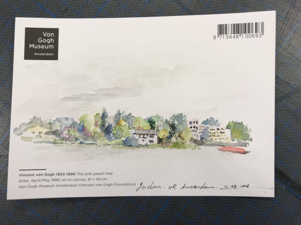
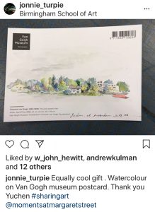
Yuchen then gave me surprise present : a watercolour she had painted in Amsterdam on the back of a Van Gogh Museum postcard. How wonderfully kind.
Later we returned to our Instagram channels:
Another departure: taking the opportunity to enjoy Material Encounters* in the formation of a new portrait image.
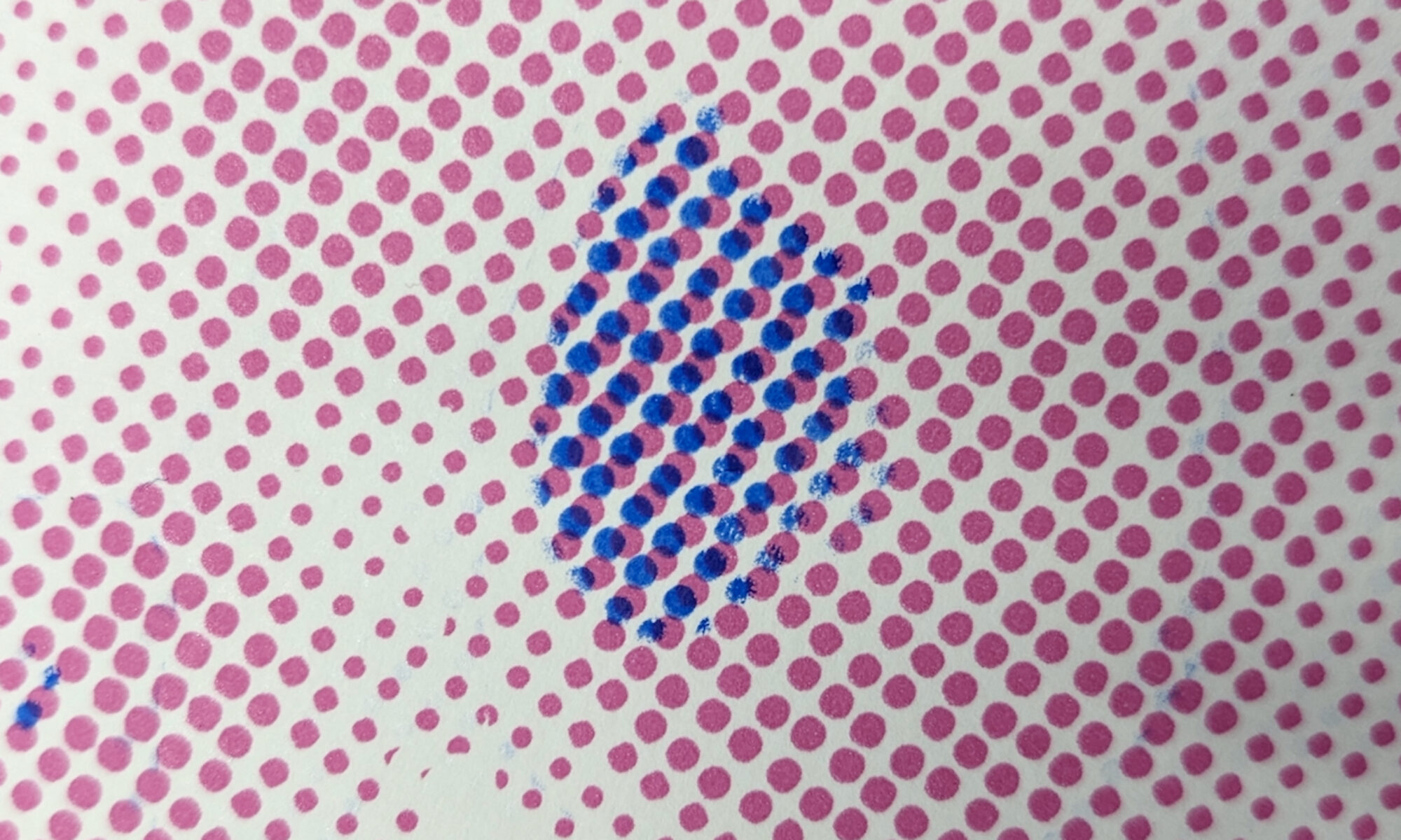
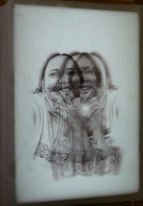
When preparing to screen print I make the first test pull on newsprint or tissue paper. The tissue paper creates a ‘flimsy’ image on flimsy material. On this occasion the vacuum holes on the screen bed pulled the tissue into them and therefore the ink did not reach the tissue and left them blank. This gave a patterned effect on the portrait not unlike the digital image on faces that are being mapped for facial capture masking.
Perhaps hanging the 4 portraits together might be a plan for future exhibition
Dr Catherine Baker reviewed this approach and suggested the chance effect gave more to the portrait than the ‘rather disjointed’ 2nd beaded layer. Perhaps I might pursue this surprise accident as it might provide a new and valuable technique.
I dedicated a full print w’shop session to experiment and investigate this ‘vacum dot’ opportunity. Thinking through the elements that might make the dots more effectively to come through: in particular thickness of ink, squeegee pressure, type of paper, position of the tissue paper in relation to the vacuum air holes.
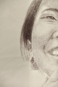
The tissue dot prints were adding a new complexion to the portrait. More modern. More questioning of the figuration. By varying the positioning of the paper the dots could appear on the darker areas of the image to enhance their visibility.
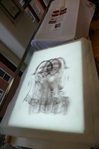
Very fine Gampi Paper was tested which gave a similar white dot effect. The paper though was more delicate and provided a subtler effect that the basic ‘grey’ tissue paper. More experimentation is required with this paper to assess the additional values it may bring. Just working with the paper brings a more delicate and careful ‘feel’ to the process. My research had shown that the chance vacuum dot matrix visual effect could be replicated in predictable ways. However having proved this to be possible for future prints and rather than proceed to making a new print I was drawn to the material difference printing on light weight semi transparent paper brings to the final portrait. It may be framed in a conventional way behind glass, but the physicality and fragility of the paper and the portrait now on its surface gave motivation to investigate where this observation might take the exhibition of the work.
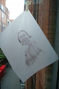
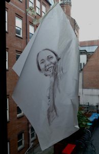
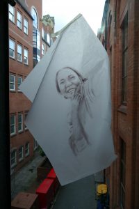
As the prints were now on a transparent medium they were hung flat on a studio window. The back illumination of the image encouraged the portrait to ‘float’ on the paper. The dot matrix was more prominent on closer viewing.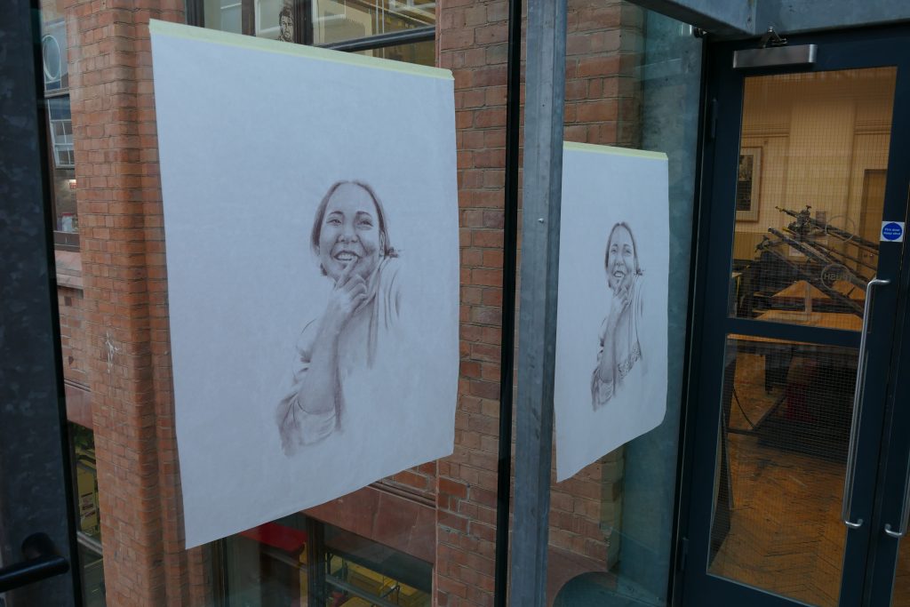
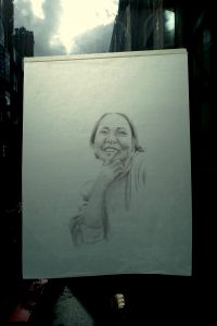
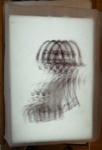
And then hung irregularly on the window, which brought another interpretation. The portrait sits on the paper and is illuminated from behind. This is getting back to the mark resist film drawing original. A transparent film for the portrait to lit. It also brings a three dimensional ‘unframed’ presence to the image and the material it is held within.
Another light source was the Lightbox which provided a soft border to the prints. Then laying prints upon prints gave a repeat patterning.
Finally for this period of investigation that began as drawn silkscreen portrait printed on to flat white paper, moved through additional layers of beaded marks and inks; print on to tissue paper and a vacuum dot matrix onto transparent papers hung on windows and material layers of prints the above clip captures the handling of the tissue print from floor to bench and the smoothed image.
- Material Encounters Research Centre
MATERIAL ENCOUNTERS intends to extend and interrogate the boundaries of materiality within the context of contemporary art. The centre provides a critical intellectual space for the exploration of embodiment, subjectivity and aesthetic practices as they are encountered through material and theoretical investigations. Central to the discourse between the researchers is a shared commitment to examine the possibilities and unknowns of matter as a critical meeting point between thought, intention and the expectancy of what might transpire. The centre researchers occupy a broad territory across contemporary art theory and practice embracing cultural exchange and collaboration with scholarly partners both within and beyond the academic environment. This diversity facilitates a thought-provoking and richly discursive situation contributing new thinking and insights to an international community of researchers in contemporary art.