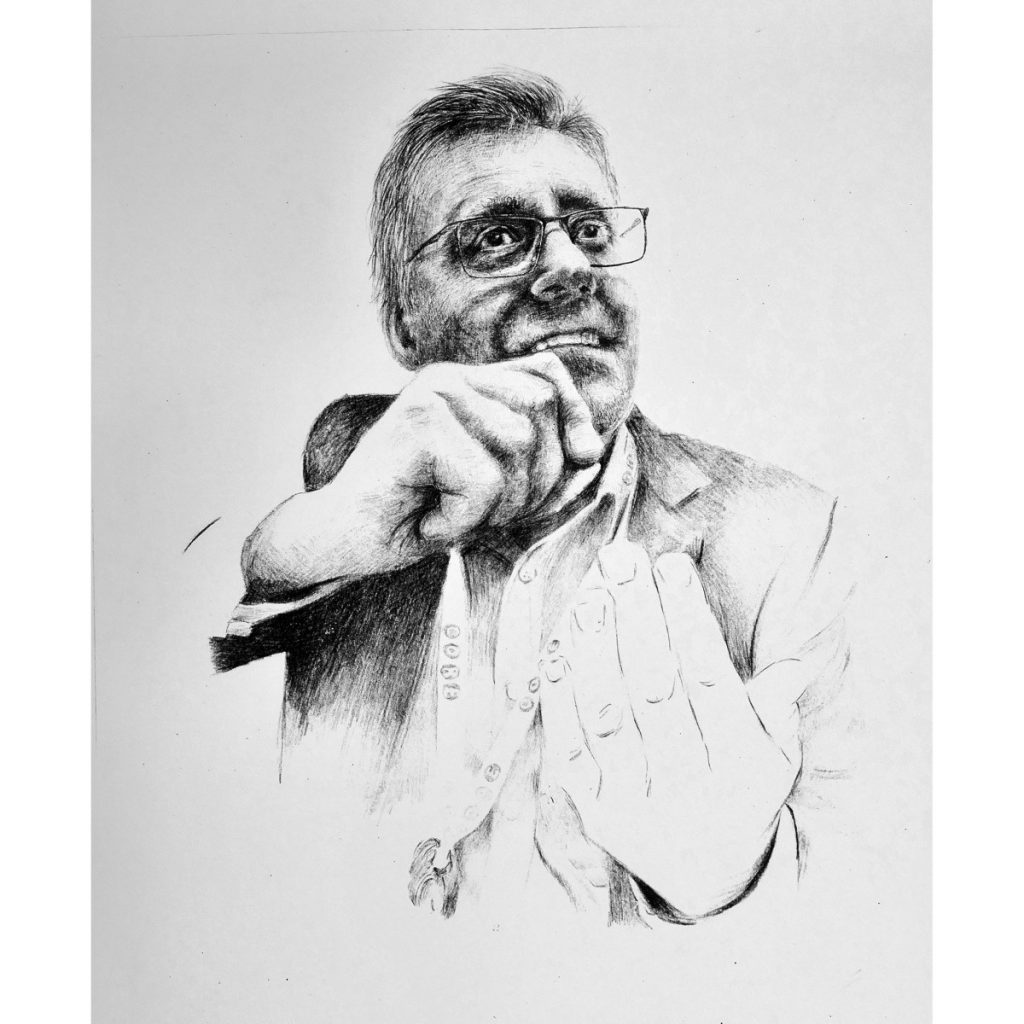
The smart phone photograph selected to begin the portrait is of Adrian vigorously expressing himself by gesticulating with both hands. The intention is to make a portrait reflecting his bright-eyed enthusiasm for education and his dedication to the future of the children in the schools he leads.
I decide to leave the foreground hand without detailed information. The eyes look out over the other hand, which is drawn in detail. The gesticulation of the foreground hand is described by 8 lines. The intention is to draw attention to the face with hand in front towards the top half of the portrait, while retaining the effect of the lower hand, without it detracting. This encourages the viewer to experience the image develop from the bottom to top.
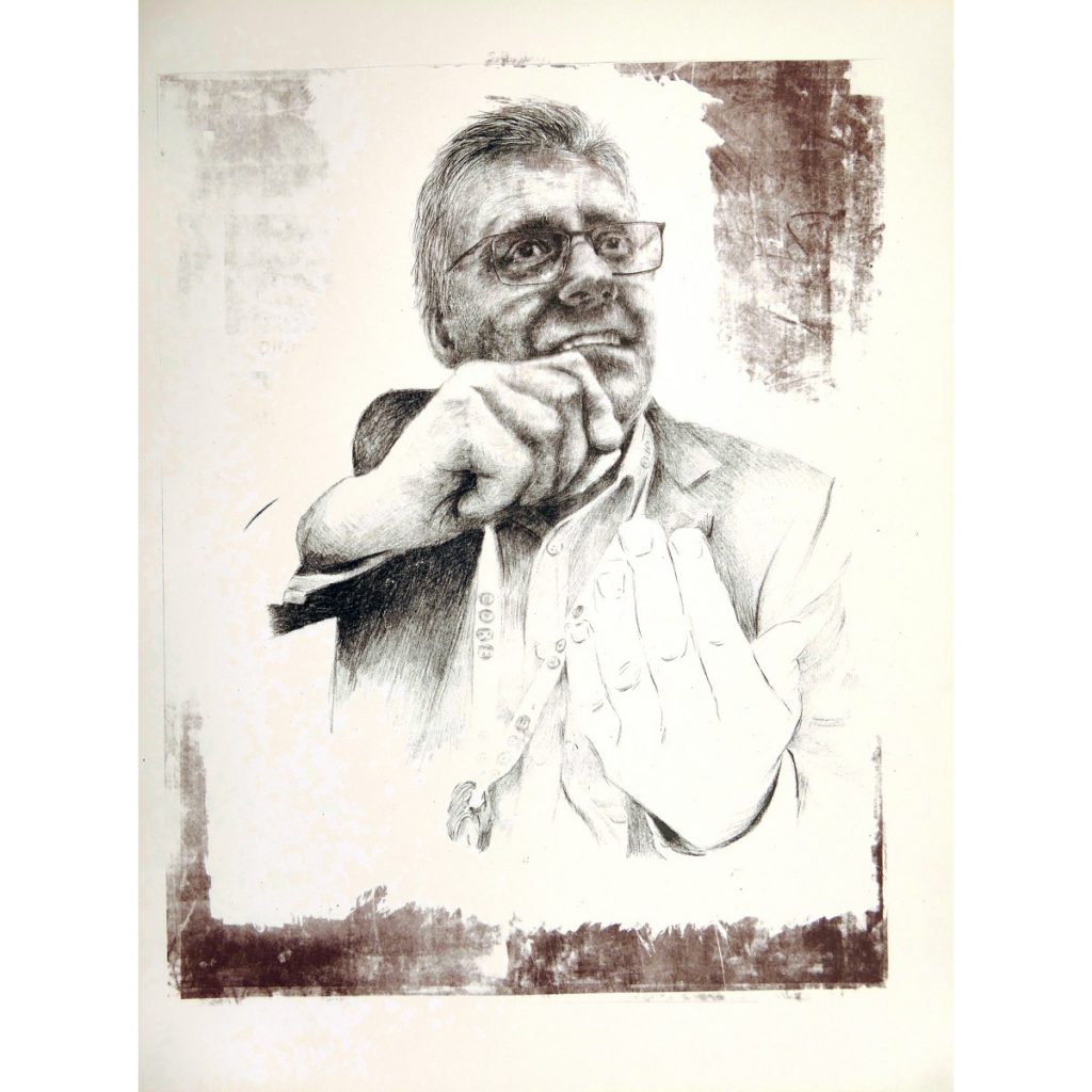
Referring to notes on 165 mesh exposures 9 light units was selected. However the result was very under exposed The 165 screen was washed out and re-exposed: With my finger hovering above the led timer button in the darkness of the exposure room I was guessing what exposure would be most effective in achieving a screen holding the breadth of detail. Will it be 12”15? 14 seconds? 13 is selected. A 30% longer exposure that previously. This delivers a much better exposed result.
Printing the 165 Drawn image with a range of pulls to achieve an edition of 4 was a challenge as the ink began to settle in the screen. The first print being the darkest and the 4th with less contrast and less ink. However this is good result in terms of previous portraits and reflected the Adrian in a positive light. The drawing with the outstretched hand to the fore worked well and established the portrait developing from bottom with less detail to the head with detail retained. However after initial viewing the foreground hand is perceived as contributing to the expressiveness of the subject’s commitment.
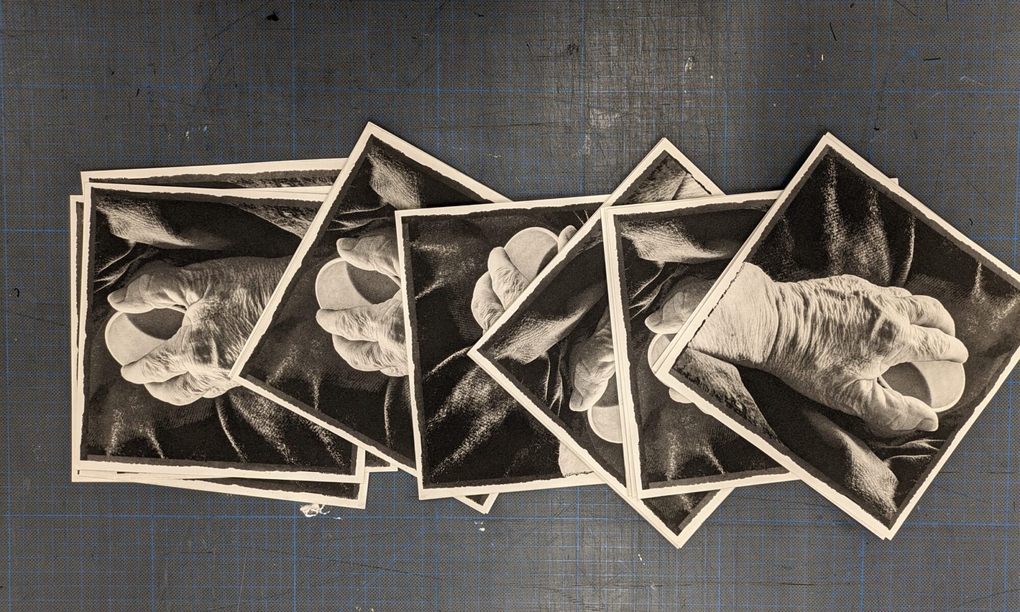
However the 190 mesh print I had also tested and discarded, had not been washed out and on viewing the print made from it, there seemed to be more detail in the parts of the image that were reasonably exposed and printed. This was in contrast to the underexposed areas that, when printed were bereft of detail and a detraction from the portrait drawing. The useful areas were retained by stopping out the swathes of under exposure. This may bring additional detail to areas of the portrait, hair, forehead, and jacket. In addition areas surrounding the portrait could be retained to provide textures reflecting the print process and create an irregular frame. Could this be another ‘chance encounter, born of being vulnerable to the making, in the making?” [foogallery id=”6116″]
190 test prints was also made on newsprint. The resultant images were useful in that they showed that different inking provided more or less detailed information, to the point that the image was referring back to the original photographic image, even though it was a drawn interpretation. This is due to the fine screen mesh delivering much more detail than even the 165 mesh. These range of test prints allowed for consideration of a new range of interpretations and a decision to stop out more of the main image while retaining the surrounding marks was taken. This stop out was made with a stipple brush so a 2ndcolour could be printed on broken emulsion areas of the head and body. Ink was mixed with additional red pigment to bring a duotone quality to the monotone original print.
The decision as to whether the mono or duotone is most effective will be made when the portrait is shared with the Adrian.