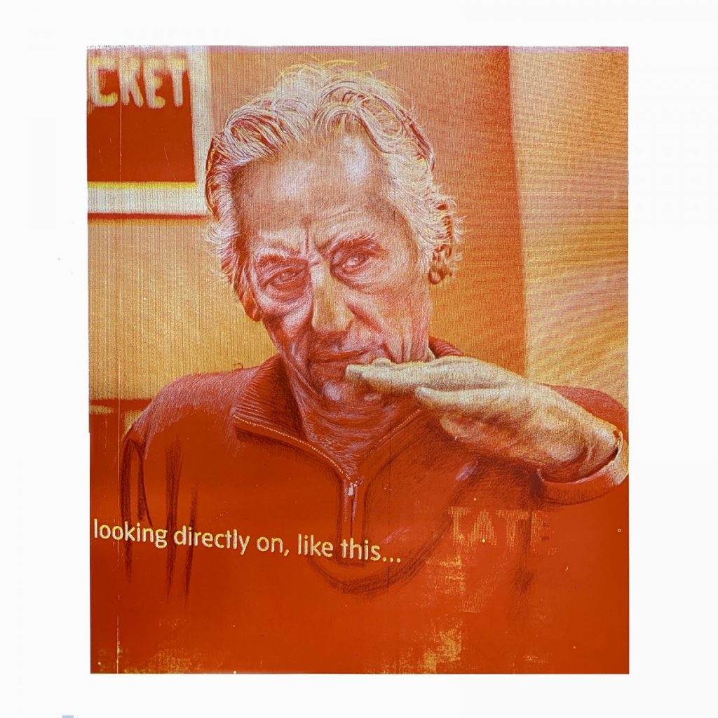
In this research serigraphic portraits are made from a synthesis of graphite marks, digital pixels and water-based ink deposited on paper surfaces.This portrait is a silkscreen portrait of the American artist Ed Ruscha, pronounced ‘ed-werd-rew-shay’, as defined by the artist in an early business card. Over forty years ago, Ruscha pioneered ‘cool’ artist’s books of Sunset Strip, Gasoline Stations and his defining ‘Standard Station’ silkscreen prints.
Ruscha’s body of work was recently exhibited as an Artist Room at Tate Modern. Outside the exhibition, a flat screen displayed a short subtitled video interview. The scenes of Ruscha communicating, was motivation to photograph the passing images. On review, one frame stood out as emblematic of Ruscha’s raison d’être:his hand held horizontally as he looked intently across it, while the subtitles reads: ‘looking directly on, like this.’ The digital image with its video rasta pattern and subtitle encapsulated what has driven the artist from analogue 60’s America to the digital media environment of the twenty-first Century, and inspired the making of this drawn and printed portrait.
My portraits are usually initiated from face-to-face meetings with artist and subject known to each other. In this instance we have not met. The Rushca’s image is, rather, in the public domain as an interview displayed for public understanding. This mediated experience provides a basis and opportunity for a multi-layered portrait. Materially, the starting point is a smart phone digital photograph of a single video frame, which up to this point is virtual, ‘seen and worked on in the digital screen, and stored within the computer as data’ (Love 2015: 218).
The transference from virtual to the physical drawing space requires decisions around aesthetics and context, decisions such as the following. Which of these should be retained, and which eliminated – the video rasta patterning (signifying recording); the screen manufacturer’s logo, distinct from the screen surface; the logo below the subject’s hand; the typography in the background? Should the predominantly red-orange colouration be embraced?
Rushca’s face, eyes, hand, subtitle and video patterning are central to pursuing a silkscreen portrait. Initially, the approach was to create a background of liquid carbon powder mix, out of which the subject was drawn using an eraser. The drawing was printed at scale with black ink on white paper, but was deemed to be unsuccessful. In my view it failed to provide the intensity of the Rushca’s focus. This could be a creative impasse. However a radical approach was conceived: to print the photographic, electronic video image in colour and hand draw the subject to be over-printed in black and white.
The photographic video image was printed in crimson followed by a second print of process yellow. Slightly off-register, the two colours are visible at the edges of their mass and create an imprecise, but vibrant, ground for drawing. The subject is brought to the fore through expressive drawn marks, in contrast to the comparatively flat background. To delineate the shadows, a screen positive is drawn with a graphite stick on drafting film laid over the screen-printed image. Beyond the eyes staring intently over the hand, a definitive element is the subject’s white hair flowing from his skull. The whitened hair indicates age, but the hair-style is from an earlier era and is smartly retained, which gestural drawn marks enhance. A second positive is drawn to provide a layer of highlights. This is not an easy task as drawing with dark graphite to create lightness requires reversing imaging perceptions ie. dark drawn graphite marks which become printed light highlights as white ink is deposited on the red/orange dark background.
Once the drawn layers have been printed with their respective black and white inks, I considered that the portrait has gained presence. The subtitle is prominent but will benefit from additional printed drop-shadows. The face demands further drawn modelling and the shadow of the outstretched hand requires added definition, as does the anatomy of the neck as it meets the zipped jerkin; a further graphite layer is drawn, and printed. The final layered portrait achieves potency worthy of the subject. The colouration references Ruscha’s defining use of silkscreen and bright colour. The video rasta locates it in a contemporary media context. The gestural hand drawing defines the subject from the digital, mechanical means of representation. This conjoining of modes of representation is what Jacques Rancièredescribes as a pensive image in which media powers are blended and ‘exchange their peculiarities’ (Rancière2011: 125).

Fig.1. E J Turpie. Ed Ruscha: ‘Looking directly on, like this….’ 2019.
Bread and Butter paper. A1 4 colour drawn and printed Silkscreen.
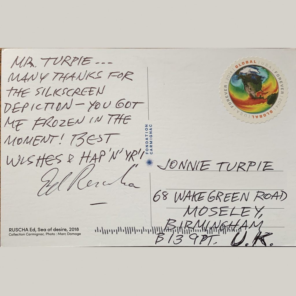
Satisfied that the portrait represents Rushca, it is important to share it with him for his response and offer to gift the first edition. Ed Ruscha is based in LA. Through a process of investigation and generous introductions, an email including a jpg of the print reaches his studio director, who prints it for him and suggests I send an edition of the print, if I so wish, direct to the artist. A print is couriered with a personal letter of explanation of the motivation to make and share the portrait. Later, the studio director confirms the portrait had arrived and ‘actually Ed has sent you a post card. He was appreciative’.

Fig.2. Thanks Postcard 2020.
The card arrived in the post with a hand written message with customary capital letters: ‘Thank you for the silkscreen depiction. You have got me frozen in the moment’, signed in contrasting handwriting. A most humbling approval.

