A Portrait, with Beading, dots and Tissue Trials.
A Material Encounter with Paper, Ink and Chance, leading to Decoration or change in meaning.
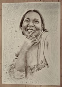
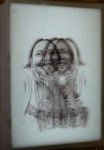
I had wanted to make a drawn silkscreen portrait of artist Yuchen Yang for a while and embarked upon it in August 2018. I had never drawn a portrait of a Chinese person and was excited to see what drawing technique might work. I choose to make an A2 drawing on mark resist using graphite pencils. I selected a photograph to work from that I had taken when we, and Didi Xiao had met to talk about Chinese festival possibilities. I had taken other photos over the months, but this encapsulated Yuchen’ bright, artistic and thoughtful demeanor. I focused the drawing on her head, up stretched hand and elements of her jumper, including the strip of graphics. The folds of the jumper on her shoulder I let disappear onto the white of the paper.
Having drawn the portrait I considered what additional marks might enhance the image and point to her artistic taste and skills. I had recently tested powdered graphite; graphite suspended in water; litho touches; Indian inks and a special concoction ‘Vine Black’.
Vine Black is calcined charcoal pigment made from grape vines, with a history of application by artists. The pigment is suspended in a gum arabic solution. I noted that when the vine black was spread by brush it quickly dispersed into beads of pigment rather than retaining the even brush marks on the mark resist. This reminded me of Yuchen’s watercolours and stone litho drawings of octopus. I freely brushed some light beaded marks around the edges of the paper to give an indication of the mark making. Visually it felt a bit of an afterthought, but worth pursuing to screen print as they could be stopped out if irrelevant.
A165 screen mesh was selected, exposed for 10 light units, washed out and dried ready for printing. A black with red and indigo ink mix was used to make first pull. 3 pulls were applied to build the ink level. The portrait worked well. The screen had held the graphite marks across the image with a good tonal range.
However the beading marks around the edges were not substantial enough to make a valuable conceptual or visual contribution to the portrait. I stopped the beading out and reprinted the portrait on the white Canaletto paper to stand on its own. This worked well.
Overnight I reflected on the beading. Perhaps I had not been assertive enough. I returned to the studio, reviewed the ink tests and decided that an overall beading might be more effective. From memory I made an outline of where I thought her head and body sat on the A2 print and quickly made beading brush strokes with varying degrees of dilution and breadth of stoke. I brushed the areas, that from memory, were not where the portrait was drawn and printed. I applied the beading mix on all sides of the sheet, but emphasised the brush strokes on the bottom and mid left and let it dry. In the print room the beaded film was laid over the portrait print. The beading overlapped the portrait in places, but that might just work as an integration of beading and portrait rather than being precisely matched to the portrait edges.
The beading film was exposed for a short 8 light units to retain the contrasting image. Rather than use the same ink as the portrait I vered towards a blue, once again to reflect Yuchen’s water colours. The integration of the blue beading with the black brown portrait complimented each other and responded to the intuitive decision-making along the way from drawing to final print. The exposure had not been overall and the top of the beading layer had allowed the highlights to retain some grain of the film as it had been under exposed (probably because of an uneven spread of the light screen exposure unit source), but this added depth to the portrait and further material quality of marks. These ongoing tests of new textured, drawn, painted backgrounds with reference and relevance to the subject are building methodologies that can be applied, rarefied and reapplied.
On Yuchen’s return from her European travels I invited her to the print room as I had a surprise present for her. I asked her to close her eyes and laid out the three prints on top of each other in the order I had made them. When she opened her eyes she was visibly surprised and excited to see her portrait. I lifted the first print to reveal the ‘clean’ portrait and then the beaded version. With all three visible we discussed the approach to the portrait making and the use of the vine black beading. It was very rewarding to see this positive and excited response to her portrait and I asked her which one would you like: “I would like this one, because I like the beading marks.”
Vacuum dots and Tissue Trials.
The recent article outlining the investigation and experimentation with visual additions to a ‘clean’ (figurative, conventional, mimetic) drawn printed portrait has led to a second investigation: Vacuum dots and Tissue Trials.
I was satisfied with the final drawn silkscreen printed Yuchen Yang portrait. This was enhanced as a number of peers who viewed the portrait commented on the quality of the drawn image and the positive reflection of the subject. The ‘clean’ portrait stands on its visual merit. The print with the additional blue beading brought a supplementary visual quality to the portrait that ‘said’ something more about the subject and her artistic practice. The subject certainly saw this as she chose the beaded portrait for herself. However Dr Catherine Baker commented that the beading was a tad disjointed and not fully ‘of’ the portrait.
These departures into visual mark making that go beyond the figurative realism of the drawn portrait are worthy of pursuit to investigate whether they can bring ‘more’ to a portrait, and take the portrait in a more valuable direction. Ie. reflect more of the artist’s perception of the subject’s personality in the image. Alternatively additional marks and surfaces may be to the detriment of the original clean drawn image. The following development of the process was an opportunity to enjoy a range Material Encounters* in the formation of a new portrait image.
Practice Chance and Experiments
The beading approach was a conscious decision to add marks to the portrait. However an unconscious, chance occurrence took place during the printing process:
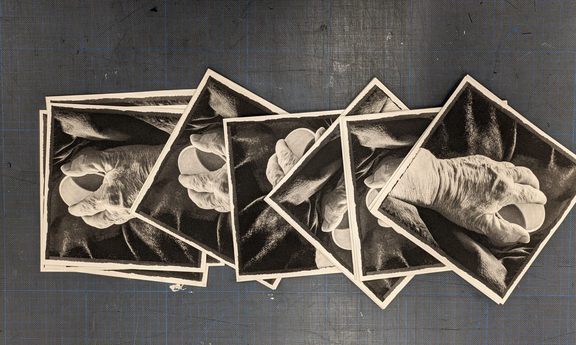
When preparing to screen print I make the first test pull on newsprint or tissue paper. The tissue paper creates a ‘flimsy’ image on flimsy material. On this occasion the vacuum holes on the screen bed pulled the tissue into them and therefore the ink did not reach the tissue and left them blank. This gave a patterned effect on the portrait, not unlike the digital tracing marks on faces that are being mapped for digital facial capture for motion capture in movies or VR.
The dots did not feel like a mistake on Yuchen’s face. They were not harsh digital dots, nor a sharp uniform mathematical matrix giving a digital facial manipulation effect. The tissue dot prints were adding a new texture and potential interpretation and interest to the portrait: more modern, more questioning of the figuration. The soft dot effects seemed in keeping with the subject’s Chinese heritage and interest in Japanese digital visual culture. The chance vacuum dot offered the opportunity to experiment further with materials, marks and meanings.
I dedicated a print session to experiment and investigate this ‘vacuum dot’ scenario and what else it might throw up for consideration. Firstly I had to prove the dot effect could be printed repeatedly, not just by chance. Thinking through the elements that might make the dots more predicable it seemed that the variables would be the consistency of ink, squeegee pressure, type of paper, position of the tissue paper in relation to the vacuum air holes.
The first experiment was to make very thick and sticky ink mix with little medium and retarder to keep the ink from being the usual thin and ‘watery’ consistency. The thick and sticky ink stayed in the silkscreen mesh only hitting the paper at its surface. The ink did not reach down into the dot recesses in the thin and light tissue created by the downward vacuum pulling.
Lifting the screen-printing frame to review the results was a delicate procedure as lifting it too far from the bed would release the vacuum and the dots would shift position. The first pulls were very light to gauge the effect. By slowly building up the squeegee pressure the best balance between ink deposits and clearness of dots was achieved to the point that one calculated pull could be repeated again and again for the best result.
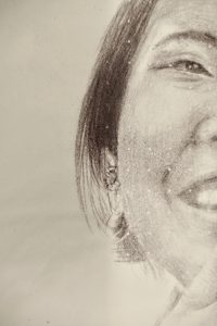
The most effective result was when the portrait image was strong enough to register on the viewer’s eyes, while contrasting enough for the clear white dots to be perceptible by the viewer. From a distance the portrait looked like a ‘conventional’figurativerepresentation, however on closer viewing the matrix of dots became apparent, bringing a different/additional interpretation of the image. No longer is this a ‘straight’ figurative drawing, but a drawn printed portrait with additional patterns included by the artist. They have been selected to be there, they are not a mistake. They are there for a reason. They must be adding to the portrait.
Question : Is this a change in meaning or simply a decorative embellishment?
A further variable was the position of the paper. By varying the positioning the dots would appear on the darker areas of the image and enhance their visibility. Alternatively the paper could be positioned to provide a range of dot perceptions with less focus on the regular pattern of the vacuum dots from the hard screen bed. Once again this brings additional aesthetic choices to the portrait. More pattern, or less? More dots or less frequently appearing? More apparent through contrast of white empty circular pockets with the ink laden shapes and shadows that make up the face’s unique contours and recognisable elements.
Question : Which image / portrait will be selected as the defining portrait of the subject?
Or is this portrait to be made up of a genuine series of investigations centred on one image of a human being that does not claim to be the ‘single truthful’ representation capturing and reflecting a multifaceted human personality?
The photograph from which this image has come from was a single image, but was selected from a number ‘taken’ at the same time, which in turn was selected from many others taken over a long period of time when getting to know the subject. The selected image was made because I felt it to be the most genuine reflection of the multifaceted young Chinese Artist as the basis for the drawn and printed portrait.
The question raised above as to whether additional marks made to a figurative drawing add meaning or are simple decoration is worthy of further analysis. On reflection it has made me consider what is the rationale behind the making of a drawn portrait. A memory; a token; a celebration; an accurate depiction; a record or a ‘lasting memorial’. This last criterion was voiced by Albert Durer when declaring his intention to engrave a portrait of Martin Luther in 1520. According to David Hotchkiss Price the point of Durer’s portraits was to ‘preserve the appearance of people after they had died’. (1)500 years on I am asking the question: what is the motivation to make drawn and printed portraits? With the prevalence of photography and the iniquitousness of smart phone selfie portraiture there is no reason to preserve likeness for people when they have died, Facebook and Instagram can achieve that for everyone.
However in the 21st century the bespoke drawn portrait has a valued place in a screen world of photographic images of people, as it has uniqueness to it born of the eye and hand of the drawing artist. It is a piece of art, not necessarily an accurate recording of the subject, but an interpretation of the subject through hand, eye, brain and pencil.
This takes us further in the question of meaning versus decoration. In the mid 20th century United States photography had established itself in mainstream life and abstract expressionism had been ushered in as an alternative to traditions of figuration and recording of the physical. This was a moment when the early 19thCentury introduction of photography’s ability to record human likeness displaced the traditional role of the artist, was fully realised. The visual artist and their methods, insights, attitudes, techniques, interpretations came to the fore. ‘How’ the artist made the work and how it’s making was expressed in the artwork became as important as the likeness or end result. While abstract expressionists left any sense of mirroring reality to one side a number of artists stayed with figuration while experimenting with technique.
Stephen farthing in his article Recording and Questioning of Accuracy(2)points to 1968 and the early self portrait of Chuck Close and the ongoing re interpretation of the artist’s face over 40 years as understood by curator, Siri Engberg:
“In reviewing these works together, we not only see a single face changing over time, but also witness the artist’s evolution in his constant quest to reinvent the means by which an image can be built.”
It seems in this work the artist is seeking not to use their artistic skills to record a likeness with accuracy to preserve for the future, but to follow and display their cutting edge experiments in contemporary art.
This style over content dichotomy brings us to an even bigger question than the one we began with. But before pursuing its relevance, later in Farthing’s grappling with accuracy and recording he makes a useful observation for the original question of meaning and decoration. P145 : “ It might seem reasonable to assume that drawing made in the presence of what they depict would emerge at the top of the accuracy scale. But in reality this is not always the case. Accuracy is not just a question of skill it can also be affected by honesty, free will and genuine mistakes.”
This is the point at which I am in the making of my drawn printed portraits. A bridge over which one might travel to embrace mistakes to benefit the ‘accuracy’ of the representation of the portrait subject. All within the terrains of honesty and free will, bringing subjective interpretation to bear, not an objective wholly accurate depiction.
So the visual additions may not be ‘simple decoration’, but a part of the ‘artist’s style’, which contributes to the overall meaning. They may begin to reflect the development of the artist behind the portrait who is bringing their interpretation through, not only accurate figurative recording, but integration of their mark making in response to the subject and the offers of the medium.
Returning to the substantial question of the prevalence of style over content in art raised earlier. Susan Sontag in her 1966 essay: On Style, based on her extensive reading and analysis of the philosophies of art, posed a contemporary proposition that art is style and content was the gloss, not the other way round:
‘In the final analysis, style is art. And art is nothing more or less than various modes of stylised, dehumanised representation.’
Sontag took up this position in response to the trend in criticism towards ‘content’ and focus on the intellectual value of art, as opposed to the aesthetic experience.
In On Style she states: that “style” itself, rather than being a merely superficial decoration on a substantive, important “content,” is an aspect of artistic works that is consistently undervalued and glossed over in appreciation and criticism of art.’
Sontag in fact asserts that style is the most important element in a work of art, and it is style that is the specifically aesthetic quality of a work of art, and therefore deserves the most attention.
This line of research demands much more research and clarification to be clear about the value of style over content and the balance there of, that has been triggered by the question of meaning over decoration in my practice. While contributions and values of style, form and decoration to art works are of clear importance, content and meaning must have value and relevance.
Luke Rodgers: ‘Sontag’s devaluation of the “content” aspect of art strikes me as over-hasty, and narrow. I find the implicit discrediting of the importance of narrative in art and the whole mimetic tradition to be somewhat frivolous’
Sontag is not discrediting content in favour of style, however she is positing that ‘there are no styleless works of art, only works of art belonging to different, more or less complex stylistic traditions and conventions.’
As said this is but a dip of the toe in the rippling waters of the philosophy of contemporary art and in my practice led research into drawn and printed portraiture. There are much deeper depths to be plumbed which I will surface at a later date.
Paper Trials
To return to the original portrait portrait my research has shown that the chance vacuum dot matrix visual effect can be replicated in predictable ways. However having proved this to be possible for future prints and rather than proceed to making a new print applying this technique, I was drawn to the material differences printing on light weight semi transparent paper brings to the final portrait.
A very fine Gampi Paper was tested which gave a more defined white dot effect. This maybe because the Japanese gampi paper is very shiny even after being formed into paper, and has a natural sized quality which prevents absorption. The paper was also more delicate and provided a subtler effect than the basic ‘grey’ tissue paper.As the Gampi paper was A3 the whole portrait would not fit on the paper. This offered up another question of the portrait: by bringing the edges in they became straight, cutting off the image so it no longer floated on the large-scale paper. This brings a different interpretation – boxed in, cut off, tightly framed. Although if the A3 paper was laid on a large scale paper of similar quality and colouration and framed then the print, rather than the drawn portrait, would float
More experimentation is required with this paper to assess the additional values it may bring. However, just working with the paper brings a more delicate and careful ‘feel’ to the process.
My practice of drawing on mark resist film to create a positive transparent image to expose onto silk screen for printmaking has encouraged me to consider how the drawn image could be retained and displayed as an artwork in itself, rather than disregarded once exposed onto the silk screen in favour of the printed image. The tissue process is offering up consideration of how finished semi transparent prints can be displayed
Like the original print on Canaletto paper the tissue print may be framed in a conventional way behind glass, but the physicality and fragility of the paper and the portrait it holds on its surface gave motivation to investigate where this observation might take the exhibition of the work.
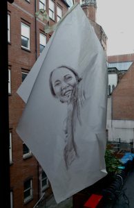
As the prints were now on a transparent medium they were hung flat on a studio window. The back illumination of the image encouraged the portrait to ‘float’ on the paper and the dot matrix became more prominent on closer viewing.
A further hanging was introduced. Hung irregularly on the window, from one corner of the print brought another interpretation. The portrait sits irregularly on the paper and is illuminated irregularly from behind. It brings a three dimensional ‘unframed’ presence to the image and the material it is held within. If the print was to be hung for display in this manner it would be clear to the viewer that it was intentional. The viewer would be encouraged to look around and into the portrait. Back lighting would need to be selected: in a backlit frame? On a live window with a relevant background? On a clouded glass window in the gallery?
The transparency of the tissue would allow a number of prints to be hung in front of each other giving a new interpretation. This concept was presented again by chance as the prints were laid on a light box before hanging. They were off register and made a serial staggered image, not unlike the ‘feel/ ambience’ of the dot matrix digital effect of the original chance occurrence. Taking this option further made for in line serials. Alternatively positioning oppositional prints, ie left faces right and vice versa, made the prominent portrait elements make more abstract images.
The serial display of tissue prints clearly bring a very different impression of the subject and make manifest a pleasure and engagement with the materiality of the printed portrait. These illuminating plays with prints brings us back to asking the questions of style and content, meaning and decoration, accuracy and likeness and rationales for portraiture?
To Conclude:
Finally for this period of investigation that began as drawn silkscreen portrait printed on to flat white paper; followed by additional layers of beaded marks and inks; print on to tissue paper; vacuum dot matrix onto transparent papers hung on windows and layers of prints, a final print on tissue is dropped and taken from the print room floor to bench where the image on paper is smoothed a flat as possible.
The capability of the tissue paper to be manipulated in tactile material ways is at odds with the norm of making prints on sturdier paper. Quality heavy weight paper for print is handheld with care throughout the print process. From the paper store to the print bed, print racks to plan chest and eventually to the framers table, the paper is kept flat to maintain the uniform quality for the printed image to be held upon.
The tissue print is fragile and inconsistent from the onset. The print held upon it is no longer static, flat, and uniform. The paper doesn’t land on the print bed or rack, but drifts with the air below it and has to be ‘glided’ on to surfaces. If it is let float without direction in the print room, studio or gallery it will land on the last surface in the space, probably the floor. It can be lifted and taken to the bench with care to avoid any long term creasing, but it is not flat until smoothed on to the surface. To that point the paper is crooked, crumpled, wrinkled. Making it flat to show the portrait at its best brings a satisfaction beyond the customary heavy weight paper landing on the bench, which has its own satisfaction.
References:
- Material Encounters Research Centre
MATERIAL ENCOUNTERS intends to extend and interrogate the boundaries of materiality within the context of contemporary art. The centre provides a critical intellectual space for the exploration of embodiment, subjectivity and aesthetic practices as they are encountered through material and theoretical investigations. Central to the discourse between the researchers is a shared commitment to examine the possibilities and unknowns of matter as a critical meeting point between thought, intention and the expectancy of what might transpire. The centre researchers occupy a broad territory across contemporary art theory and practice embracing cultural exchange and collaboration with scholarly partners both within and beyond the academic environment. This diversity facilitates a thought-provoking and richly discursive situation contributing new thinking and insights to an international community of researchers in contemporary art.
- Writing on Drawing. Ed Steve garner. Intellect
Chapter 9 Stephen Farthing, recording: And questions of Accuracy.
- Price, D. (2003). Albrecht Durer’s Renaissance, university of Michigan Press p225
- Engberg,S. (2005). Chuck Close Self Portraits 1967-2005.SFMOMA p. 119
- Sontag, S., 2001. On style. , Against Interpretation and Other Essays, Nueva York, Picador, pp.15-36.
- https://www.lukerodgers.ca/2009/02/susan-sontag-why-style-is-important/