PMC V&A Print Visit

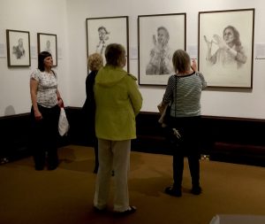
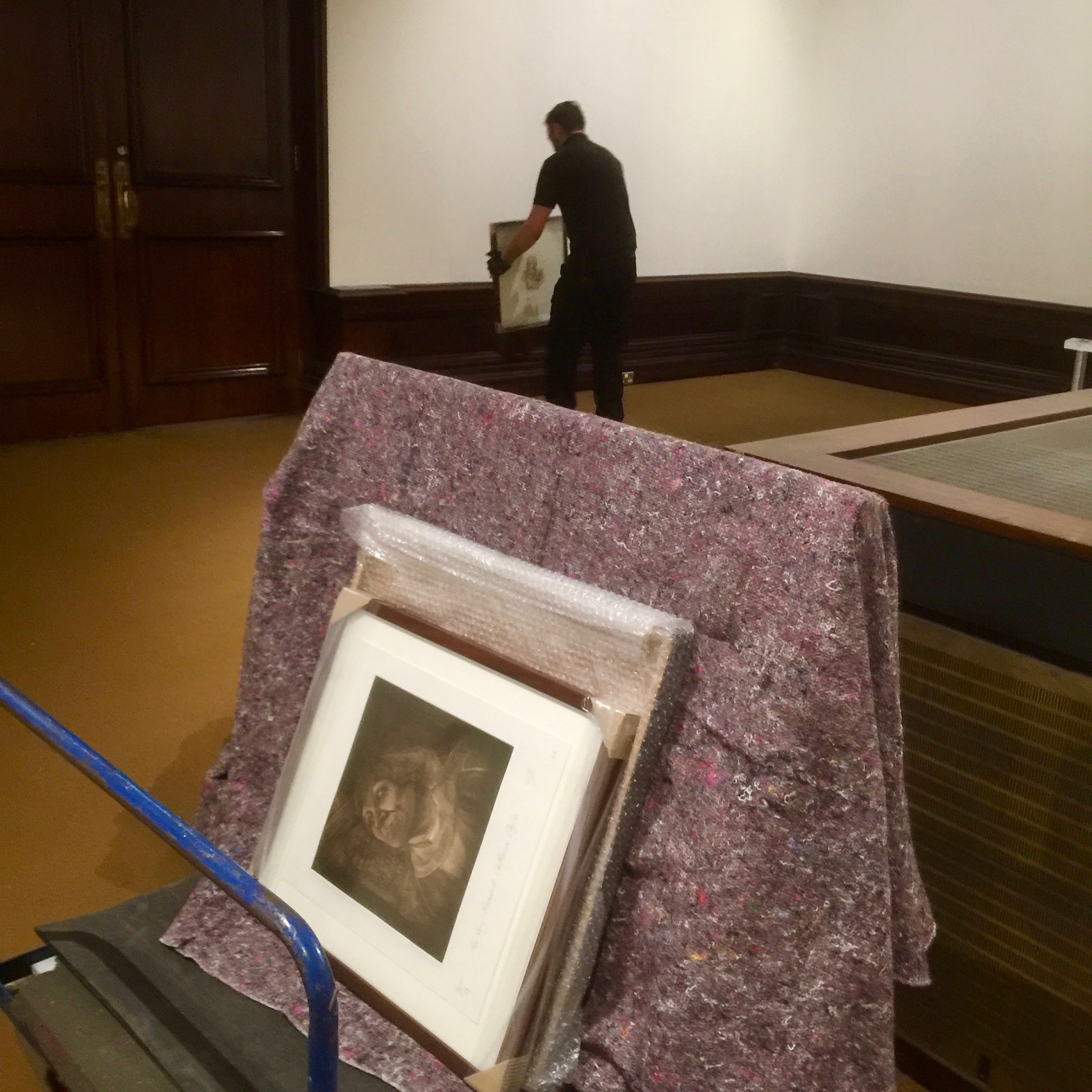
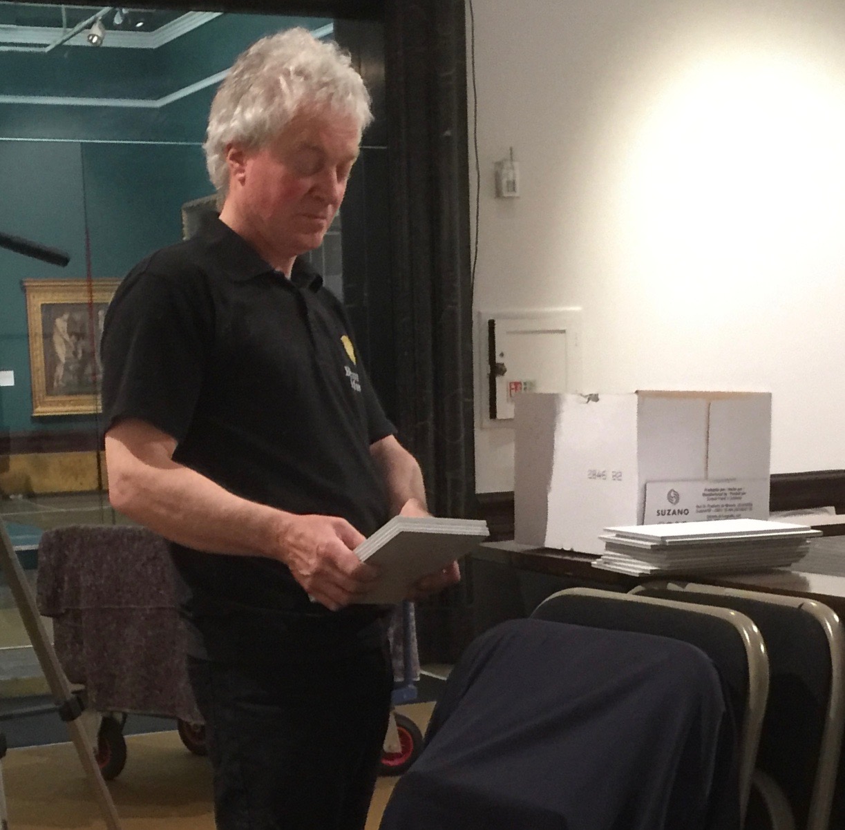
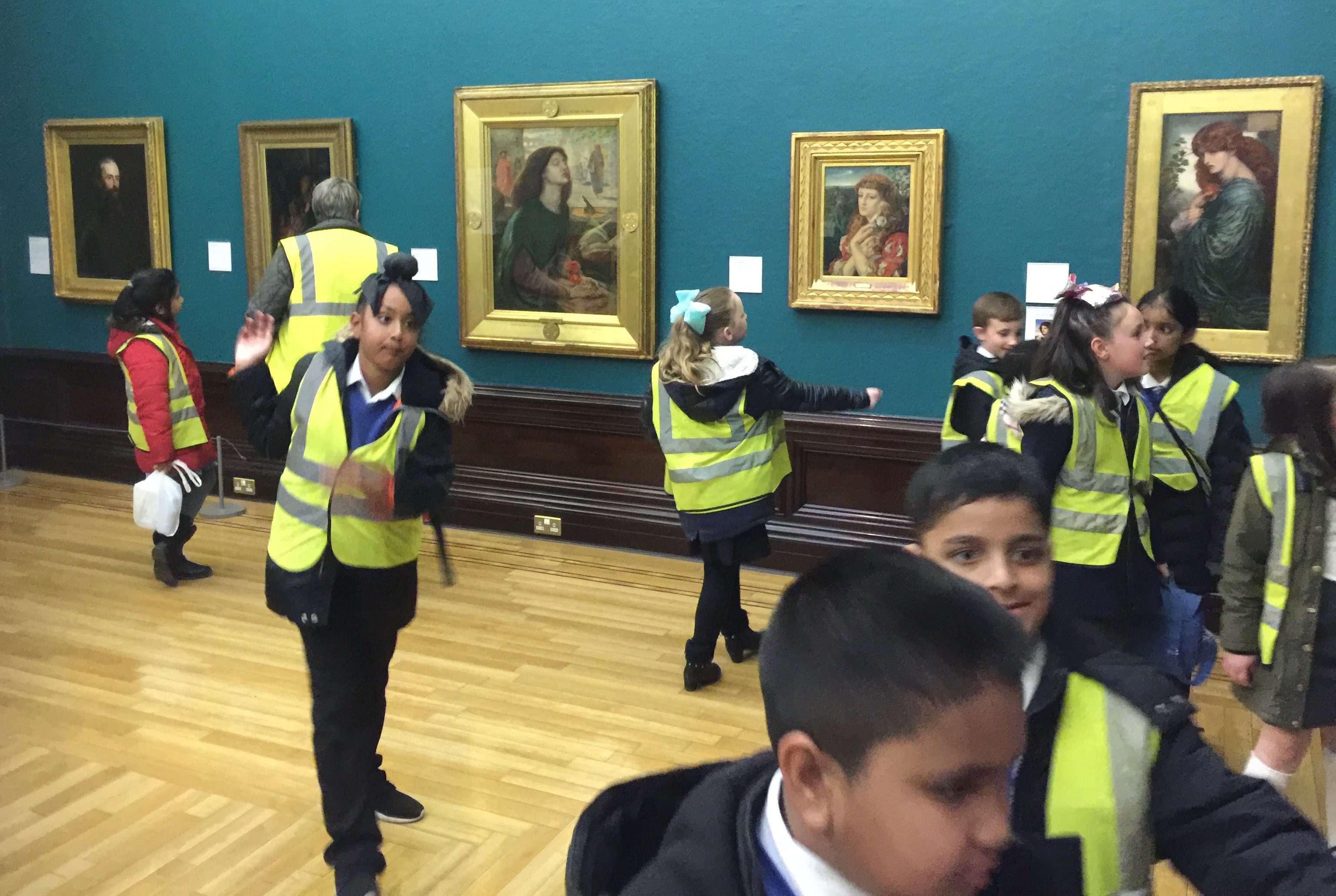
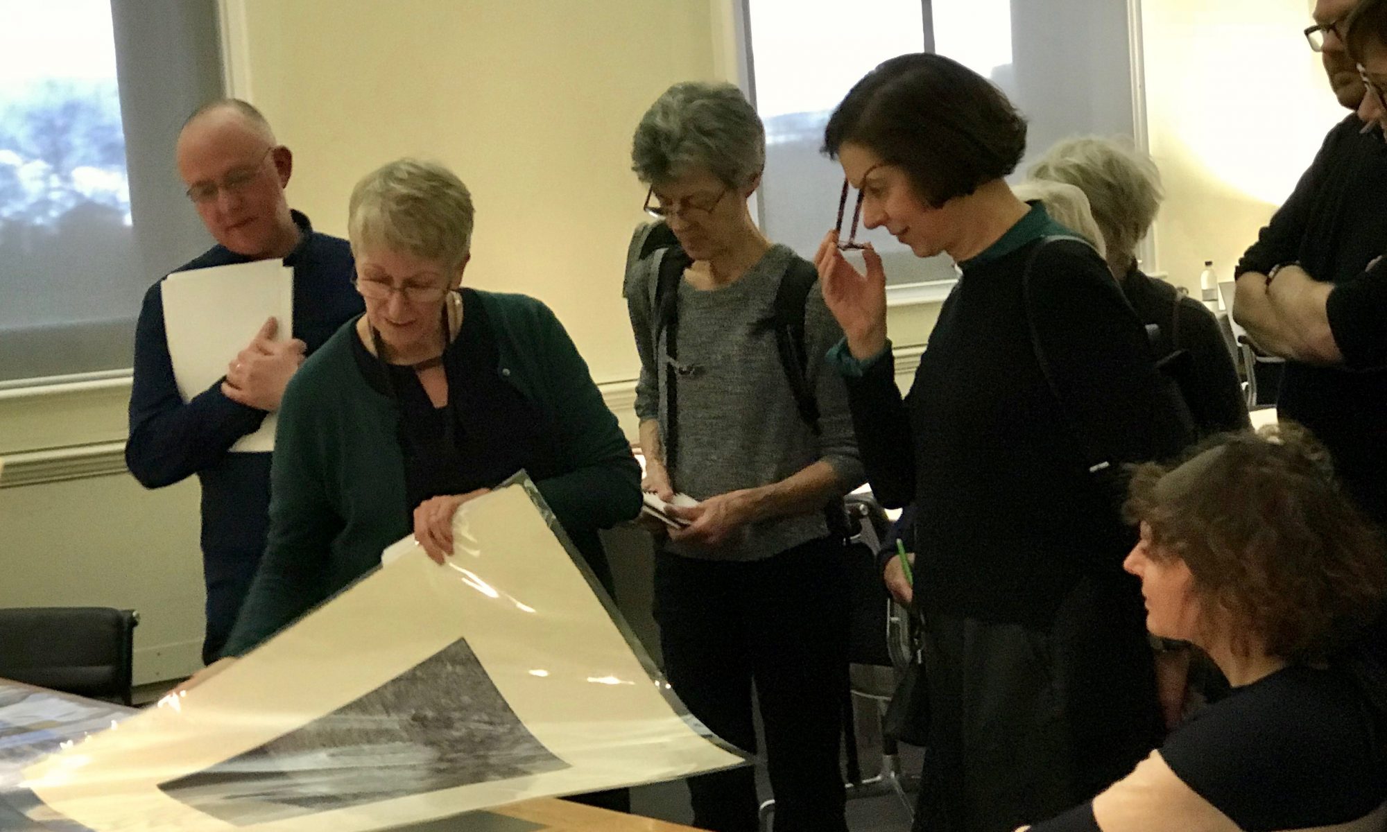
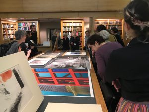
Members of The Printmakers Council were privileged to be offered the opportunity of a guided tour of examples of the Victoria and Albert Museum print collection in V&A Study Room lead by Head of Prints Gill Saunders and on this occasion ably supported by her curating colleague Tim Travis.

This 2018 visit is in response to the success of past V&A visits, and a unique opportunity to view prints selected from their archives. The print selection follows the recent PMC exhibition ‘Print City’, held at the Morley Gallery with selected prints related to cities and the urban environment.

The V&A collection of works on paper number over 1 million pieces of which about 500,000 are prints and the remainder drawings, watercolours and photographs. The V&A has been collecting contemporary prints for many years since its inception.

There is a slide show of our visit below. PMC Member Denise Wylie also captured the visit and has published on her facebook page .

V&A print room visitor book
the arrival - David Hockney - sign of what's to come on the visit
new exhibition road entrace
ready to go
getting in
gill saunders head of prints introduction
first print is london's kerning
londons kerning
no lines only letters
chris ofili
concentration
inspection
smart phone capture
russian manhole cover stamps
tim travis describes prints from Russian revolutionary artists
canary construct
digital print-Tom Noonan
detail
bag for life in support of the homeless
plastic bag for life
drawing and print
whistler prints
note taking
Hockney's rakes progress
the wallet begins to empty
the drinking scene
meeting the good people
Gill Sounders Head of print
urban prints
drawings and lithographs
Gill points out catalogue number
work on moscow metro
Tim Travis Curator
Robert Gibbings Lino cut
London Bridge today robert gibbings
wood cut southwark Bridge Robert Gibbings
W Richardson
Leonard Potter colour Lino cut prints
Leonard Potter
Leonard Potter
Denise documenting the visit
Nevinson, Christopher R
Nevinson
Nevinson
Nevinson
Nevinson, Christopher Richard Wynne
woolworth building original drawing Joseph Pennel
Nevinson, Christopher R
print
Shenadoah
Martin Lewis mezzotint with glow
unworked plate to achieve light glow
detailed viewing
Tim Travis
Tim describes Notting hill series
notting hill housing trust prints
the series
nottinghill
notting hill street
Justin De Villneurve
Gill explains background
denise with phone portrait
meanwhile the cataloging continues
green label cataloging
Denise
impressive
title detail
corner detail
wrecking ball
Guy checks the hogarth book
Gin Lane engraving
detail
detail
permanently high
viewing last prints
Q & A
drawing
drawing
from mezzotint
mezzotint
IMG_3799
free viewing time
sharing a special Piranesi find
final touches
later as we leave
Catherine_bray_with_board 10x8
Strand & Whipman Manhattan Ashmoleum 10x8
Tall American Tate Britain All2Human10x8
Edin modern art_Michael_armitage10x8
Julia Stewart ikon Bock 10x8
Edin modern art kilted 10x8
Hayward_Hearing Gursky 10x8
Victorian_Giants NPG10x8
Ai Weiwei RA thinking waiting10x8
Rauschenberg Tate10x8
previous arrow
next arrow
 
Shadow

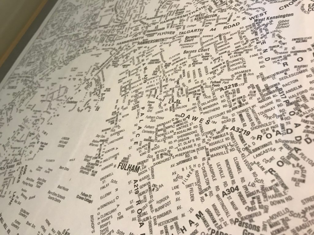
Gill began with typographical map of the city: London’s Kerning, which is a detailed street map with no delineating lines but each street is defined by its lettering. It was commissioned from NB: Studio (designer) by the International Society of Typographers in 2006

no lines only letters. London kerning

She then went on to highlight two prints by Chris Ofili made in Barcelona following his painting graduation show from the Royal college of Art where he met V&A curator Rosie Miles, who asked if he had made any prints.  He had not, however Rosie said that if he ever did let the Museum know.

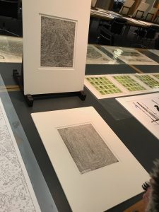
Following graduation he saw some ancient rock drawings in Zimbawe made by artists in a trance like state.  He visited Barcelona and took himself into a similar trance and began drawing city landmarks on etching plates and produced 10 prints as a spiritual response to the city. These are two of them. Gill mentioned that attending degree shows was an opportunity to purchase works before they become too expensive!

Tim Travis took over to tell us about contemporary digital prints, including a monoprint by Russian artist Gluklya showing a monument to unknown workers, and a large-scale digital print by Tom Noonan.

russian manhole cover print
russian manhole cover stamps

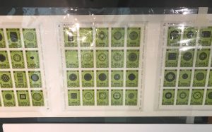
He also introduced a unique Russian print featuring manhole covers included in a series of stamps titled ‘the best Sewerage for the best people’.  Each stamp has a subtitle dedication from the artists across the world that inspired the artist Alexander Kholopov while unable to travel out of Moscow. Images were shared across 70 countries via mail. An early example of mail art and a precursor to art and social media.

Gill showed us 4 of David Hockney’s series of 16 Rake’s Progress etchings, made while studying at the RCA when it was next door to the V&A. Guy Butters commented that Hockney prepared and printed his own plates and word has it that one of the reasons he took to print was that paper and materials were free at the time, unlike the expense of canvas and paints.  Gill suggested his prints may be even better than his paintings!

A surprising print was made on a plastic bag, part of a project to draw attention to the issue of homelessness in the city: Franko’s B’s A Bag for Life. Perhaps printed on throw away material, to chime with attitude much of society has to its homeless members.

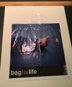
We saw prints by WW1 war artist Joseph Pennell and prints of apocalyptic biblical scenes by 19th century painter John Martin.  Tim told us of the range of representation of the City by artists throughout the 19th century. Sometimes romantic, others reflecting anxiety about the spread of industrialisation and expanding metropolis, while other created images of cities of the imagination. In the 1980s Brodsky & Utkin were artists at the Moscow architecture institute. They worked so closely together they were awarded one diploma in their joint name. Moscow was supposed to be the ideal city and Stalin’s contribution/ legacy was the metro, whereas Khrushchev’s project was new housing which were all built on old historic sites. Tim commented that ‘houses die twice’. 1. When people leave them 2. when demolished. At the time Russian printmakers had to print when they could as materials were not freely available. Etching paper was not always available and multiple copper plates were made and printed later when paper became available.

Gill took us through prints by Whistler of the Thames.  A wonderful Hogarth book of engravings showed urban settings including Beer Street and Gin Lane illustrating the effects of alcohol on less wealthy city dwellers. Also on show were Victorian views of upmarket society entertainment at Vauxhall Gardens and Robert Gibbings’ wood cuts of London bridges, as well as colour lino-cuts of city transport, workers and life in the 20’s and 30’s by artists of the Grosvenor School.

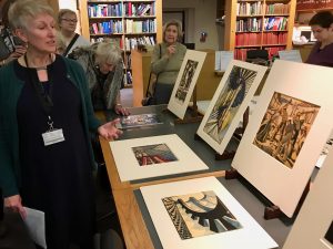
One from this group of prints was by the artist Leonard Potter.  He was a late-comer to print having worked in stained glass, but in the 1930’s turned to colour lino-cut. Gill remembers receiving a call from reception one afternoon a few years back:  “Mr David Potter to see you”. Not knowing a David Potter, she nevertheless less went to meet the unknown visitor and met an elderly gentleman holding a battered carrier bag. Mr Potter said “you might want these” and brought out 3 colour prints of “my father Leonard’s work. We thought you might like to have them.” A truly generous and truly wonderful gift.

Following on from lino cuts we were shown a stunning collection of Christopher Nevinson’s City scenes including a 1918 Futurist influenced semi-abstract mezzotint with rich, inky black velvet shadows.

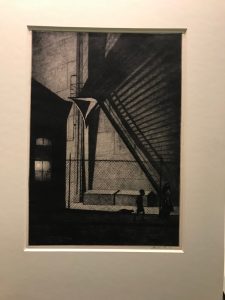
Ash Can School artist Martin Lewis’s 1939 drypoint and sandpaper aquatint Shadow Magic featured a dark urban scene with a bright glowing light bulb achieved by leaving one small area of the plate unworked.

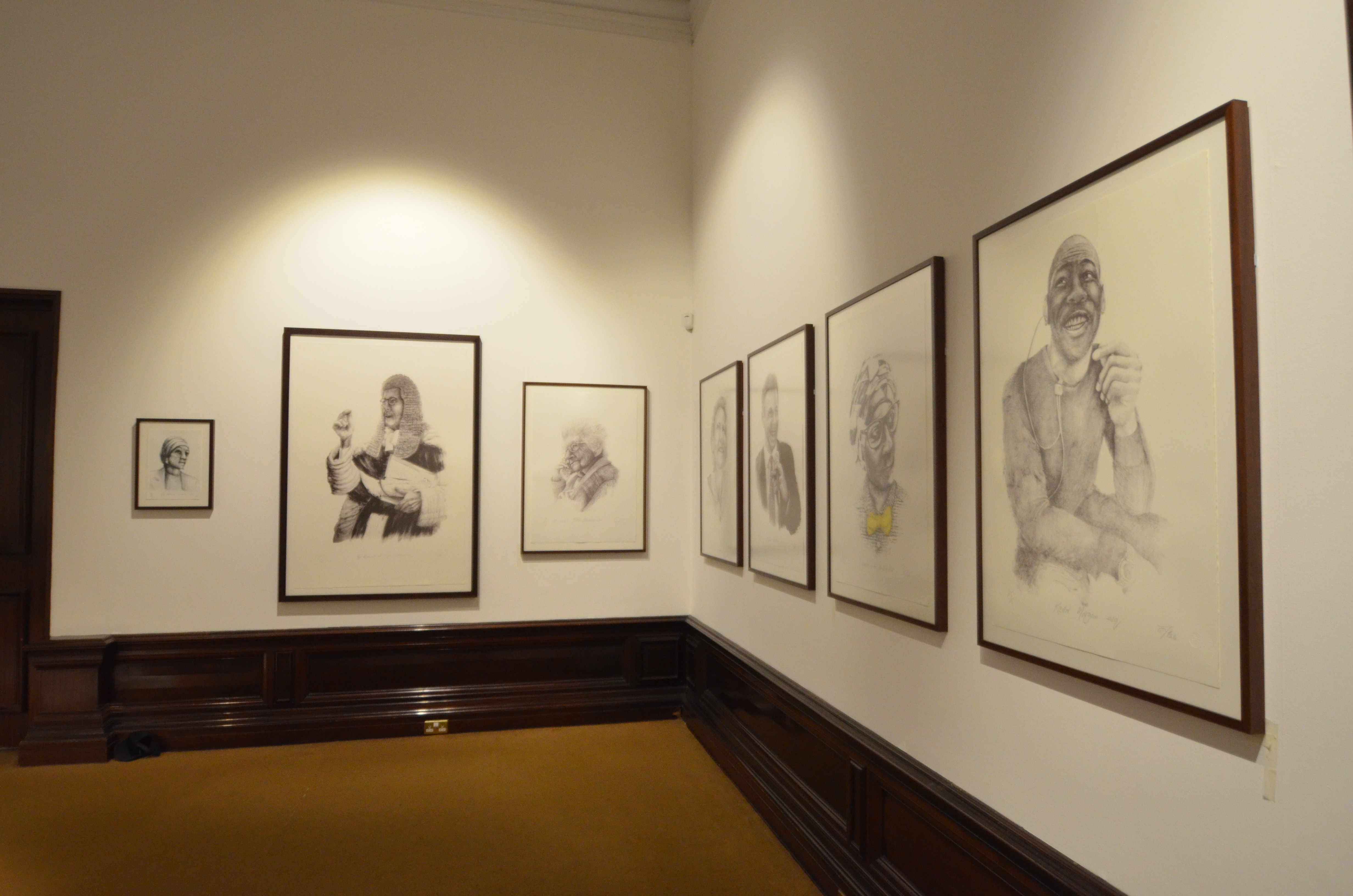
Tim brought us up to date with a series of colour screen prints by 12 artists working with an Royal College of Art partnership to support the Notting Hill Housing Trust refurbishment in 2003 including a print of (local resident?) Justin de Villeneuve.

Gill concluded the expert and insightful tour by showing a collection of abstract prints responding to the city experience.

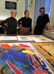
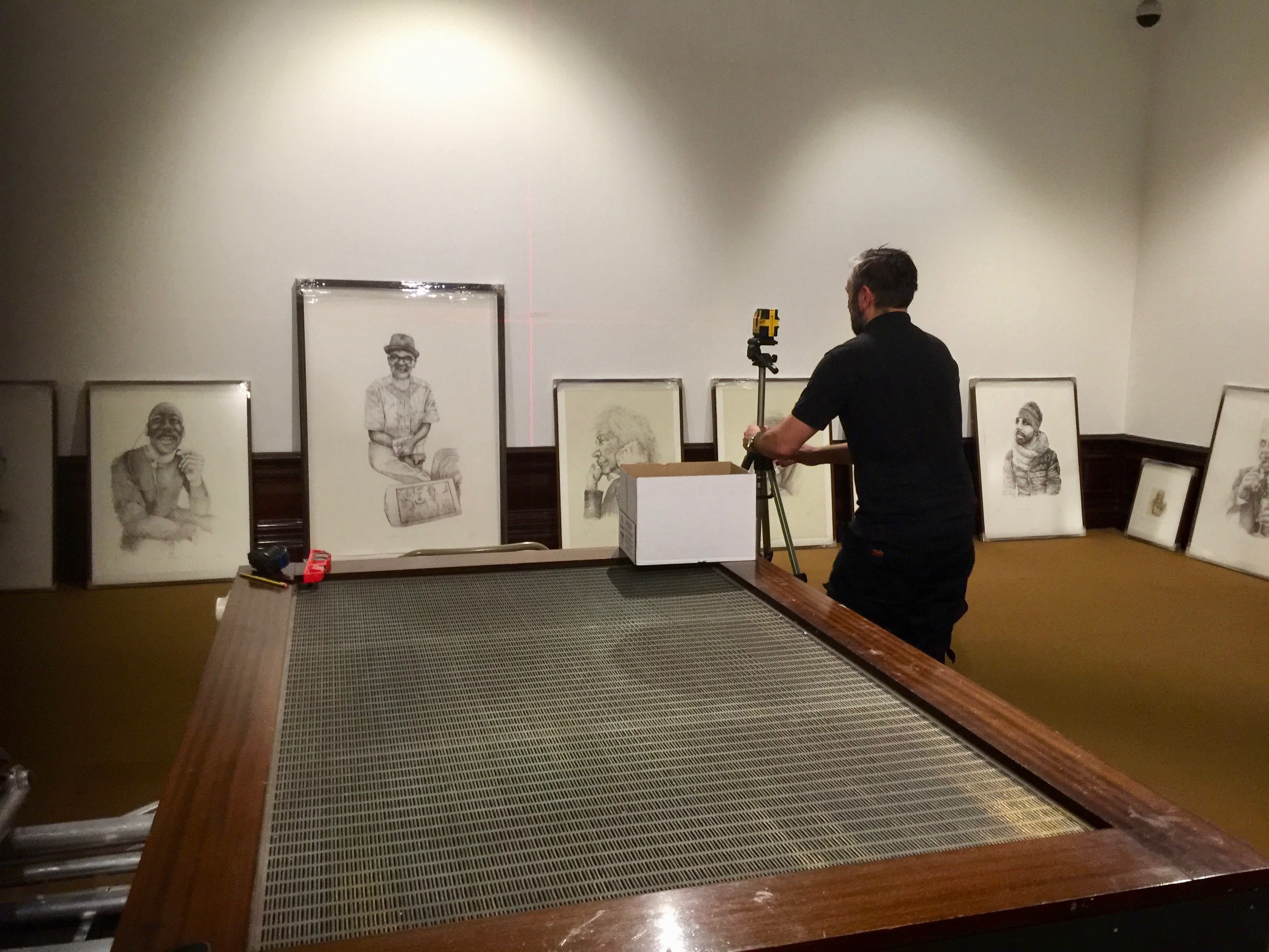
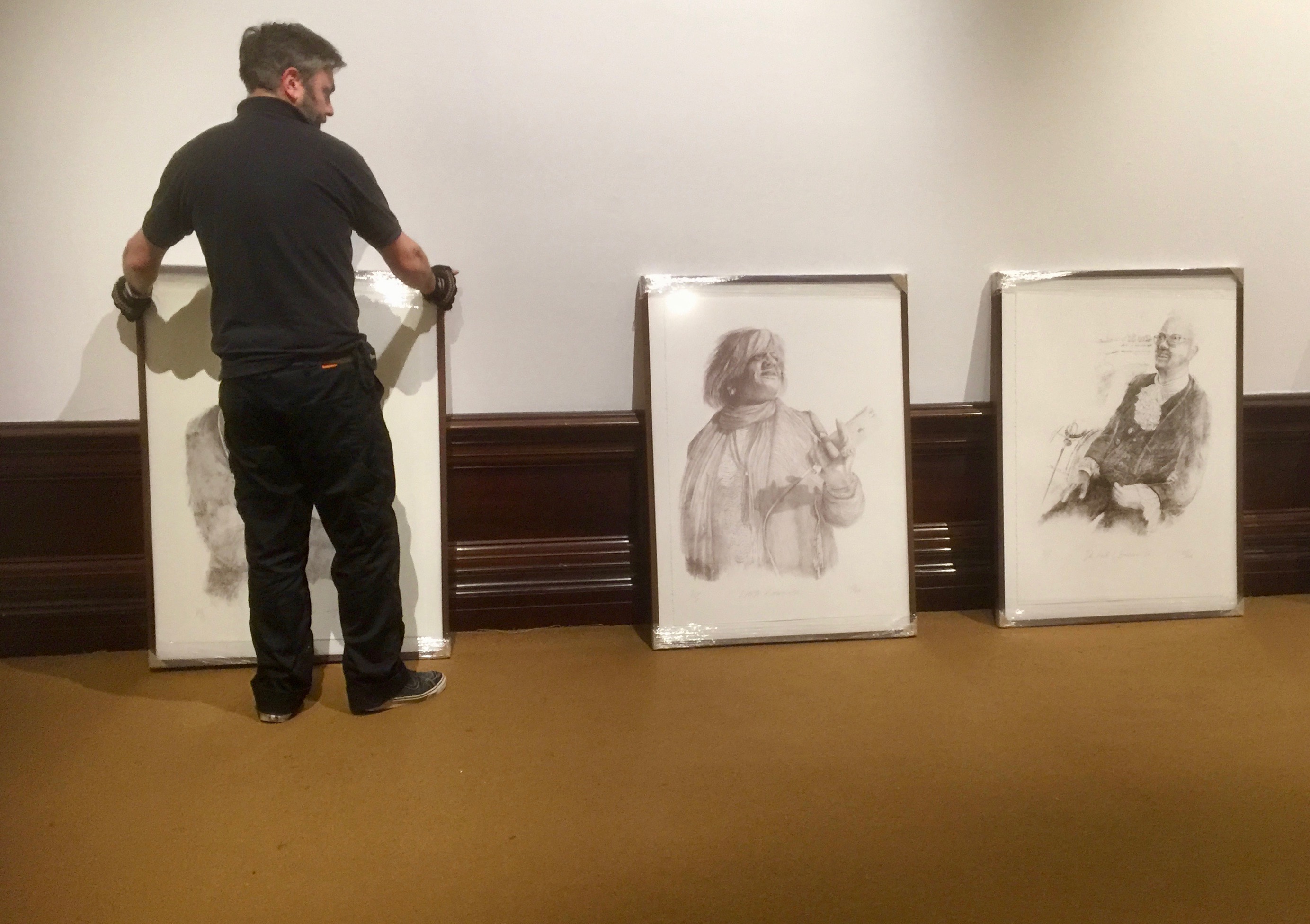
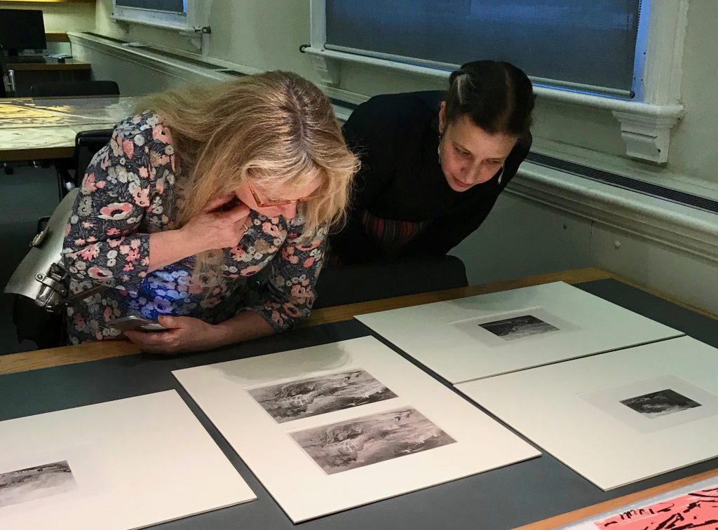
As we reached the end of our tour of four extended tables of multi genre printmaking Gill and Tim took questions about the prints we had seen and the city concept that had inspired their selections. We were encouraged to spend more time up close with any of the prints with a generous period of free time in the room which members enthusiastically took up.


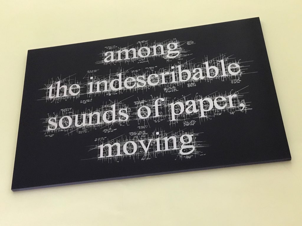
Gill also pointed out the print by Liz Collini specially commissioned for the Print Room with its text: “Among the indescribable sounds of paper, moving.”

Do look at PMC Member Denise Wylie’s excellent review of the visit on her facebook page .

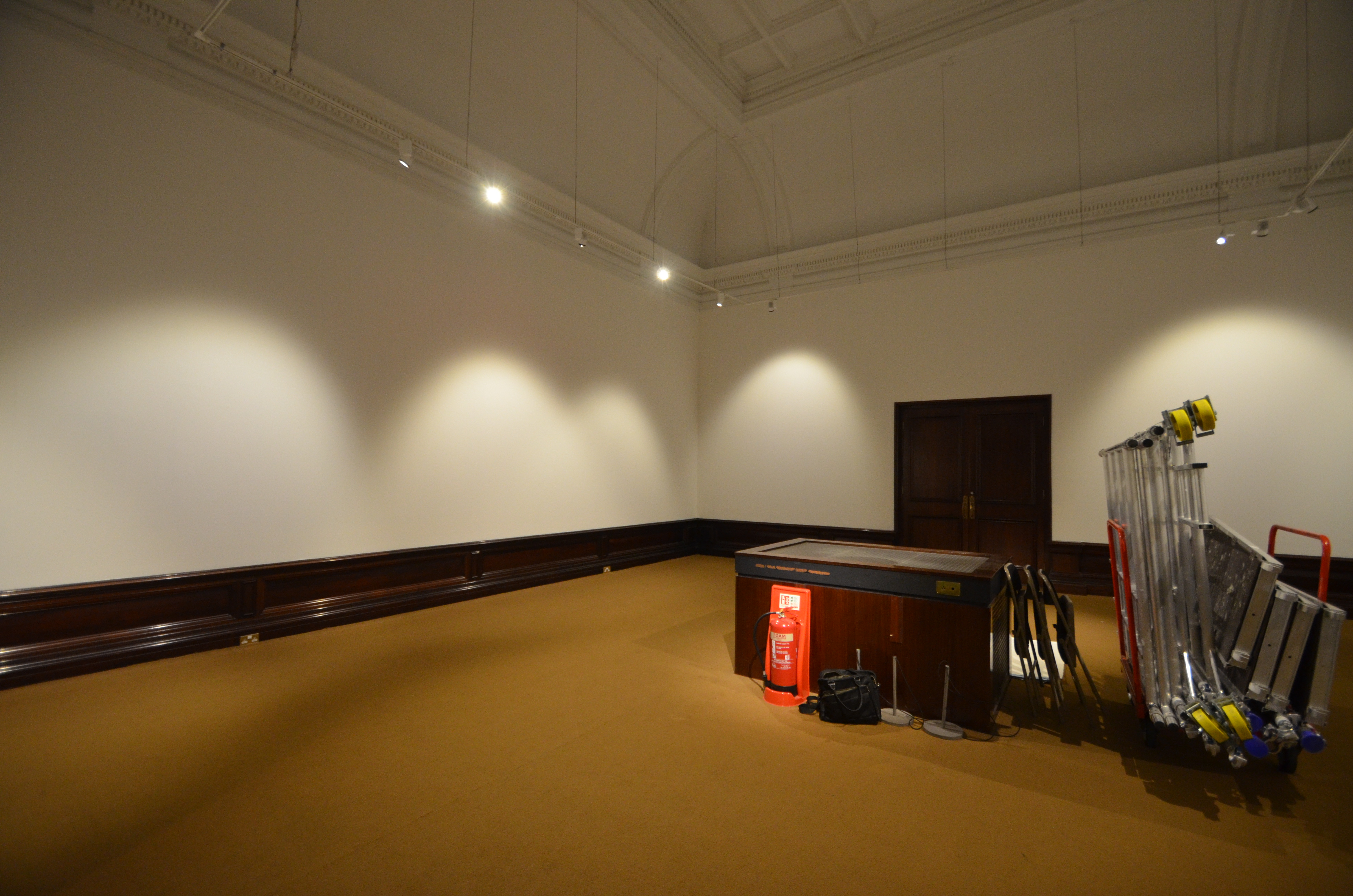
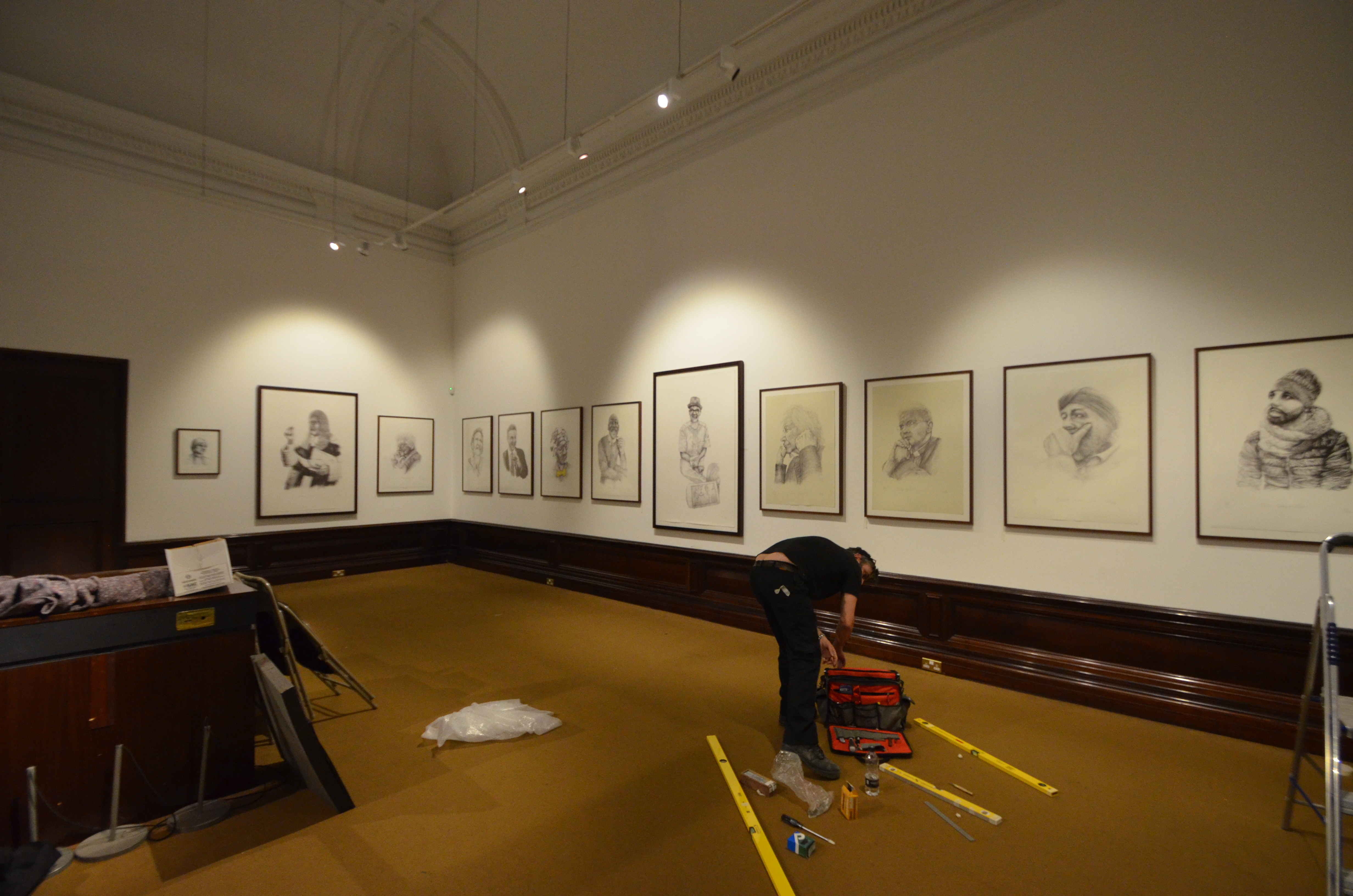
The Print Room is a study room where original prints can be viewed, after looking at the online catalogue and booking in advance. Gill and Tim encouraged PMC Members to make appointments and visit to see the most wonderful and wide ranging collection of extraordinary printmaking.

All the prints can be viewed on the V&A collection site: https://collections.vam.ac.uk/

Printmakers Council City and Mini Print

The Printmakers Council was formed in 1965 a group of artists including Julian Trevelyan, Michael Rothenstein, Anthony Gross, Stanley Jones and Agatha Sorel who saw the need for a society that would promote new developments within printmaking. Since then it has consistently promoted the place of printmaking in the visual arts. More about the history of the Printmakers Council here

In 2017 the Council invited artist printmakers to submit works for the Print City and Mini Print  exhibitions which opened on November at the Morley Gallery in Lambeth London.  The exhibits showed the breadth of UK printmaking including silkscreen, etching, linocut,  lithography, solar and plastic engraving. I submitted a mini print  (19×19) of an inkjet print on pastel paper – Welsh Bowl with Mermaids Purse, Sheep’s Wool and Rabbits Tail.  The Mini Prints are a portfolio that will be held by the V&A Print Collection. I met Michael Pritchard from Staffordshire who had his digital prints in the city exhibition that sat alongside plastic engravings by Louise Hayward and Guy Butters Underground Surveillance that hung in on of the windows which are included in the slide how of iPhone pictures from the opening night.

Scottish visitor
City Print full house
close inspection
Welsh Bowl Inkjet print- ejt
mini prints
IMG_5553.jpeg
4 mini prints
plastic engravings
kipling estate LH
louise hayward underground.jpeg
michael pritchard digital.jpeg
Committee Convo
Rebuilding the Built
IMG_5585.jpeg
underground surveillance Guy Butters
Morley Gallery
Imperial war museum gate house
Imperial War Museum Frontage
previous arrow
next arrow
 
Shadow
The gallery is nearby The Imperial War Museum which was particularly dramatic that night with a bright moon low in the sky.
Imperial War Museum Moonlight Gate House

moon stories

moon stories, inkjet print #2/5 2017
Museum Enabler Steve S enjoys the print drawing of him reading moon stories
Museum Enabler Steve S and Jonnie Turpie shake on it


Museum of the Moon

Museum of the Moon is a new touring artwork by UK artist Luke Jerram.

Measuring seven metres in diameter, the moon features 120dpi detailed NASA imagery of the lunar surface. At an approximate scale of 1:500,000, each centimetre of the internally lit spherical sculpture represents 5km of the moon’s surface.

Moon Story, Drawing and social media.

The original drawing was begun when the artist visited the Museum of the Moon exhibition and spotted a ‘moonlight’ in the corner in the dark expanse housing Luke Jerram’s massive moon. On a closer view the moonlight was a table lamp beamed on a book being read by Steve to an entranced family. The illuminated reader and family provided a strong composition to base a drawing on. The artist took iPhone pictures, transferred them to an iPad, into adobe procreate and using an apple pencil the drawing was created through a number of states. An early version was posted. on Instagram channel where  Museum Manager Jessica spotted it, showed it to Steve who was surprised and impressed. Jess used Instagram to contact the Artist to let him know Steve would like a copy if possible.

Once the drawing was finished proofs were made on a high quality Cannon inkjet printer on to a range of papers before an edition of 5 were printed on 300 gsm aquarelle off white paper. Two months on from the Saturday encounter in the Museum of the Moon the 2nd print of the edition was presented to Steve who along with Jessica enjoyed seeing the mounted fine print. Of course it quickly appeared on the @thinktankmuseum feed.

Thinktank


Tracey Drawing Conference

Tracey Drawing Conference

Presentations from Day 1 at Loughborough University Fine Art Department in this slide show.


Following an introduction to Drawing / phenomenology: tracing lived experiences through drawing,  by Conference Organiser and host Deborah Hartley, a diverse and insightful series of  presentations covering intensely local to expansive global drawing projects ….

Deborah Harty: drawing is phenomenology?

Jane Cook: Drawing the Domestic: a practice-led phenomenological study through–drawing investigating notions of the experience of home. 

Martin Lewis: Perfunctory Acts of Drawing. 

Marion Arnold: The Sensing, Knowing Hand: a Phenomenological Drawing Tool.

Eleanor Morgan: Fixing the ephemeral: the materiality of sand-drawings.

Phil Sawdon: … feel my way … outline judgements … I made some pictures

…… there was a choice of 4 workshops for the afternoon session.

I selected the intriguingly titled : Gained in Translation: Drawing Art History presented by Sarah Jaffray from the Bridget Riley Foundation at The British Museum.  Surprisingly this was a participatory session where we were encouraged to draw from the collection of British Museum prints inc great masters and more recent drawing works.  Beginning with quick draw exercises to get us loosened up we worked through pictures at speed and then on to a longer 10 minute drawing session.  
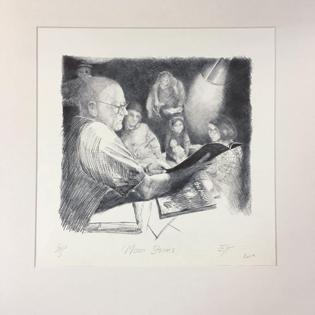
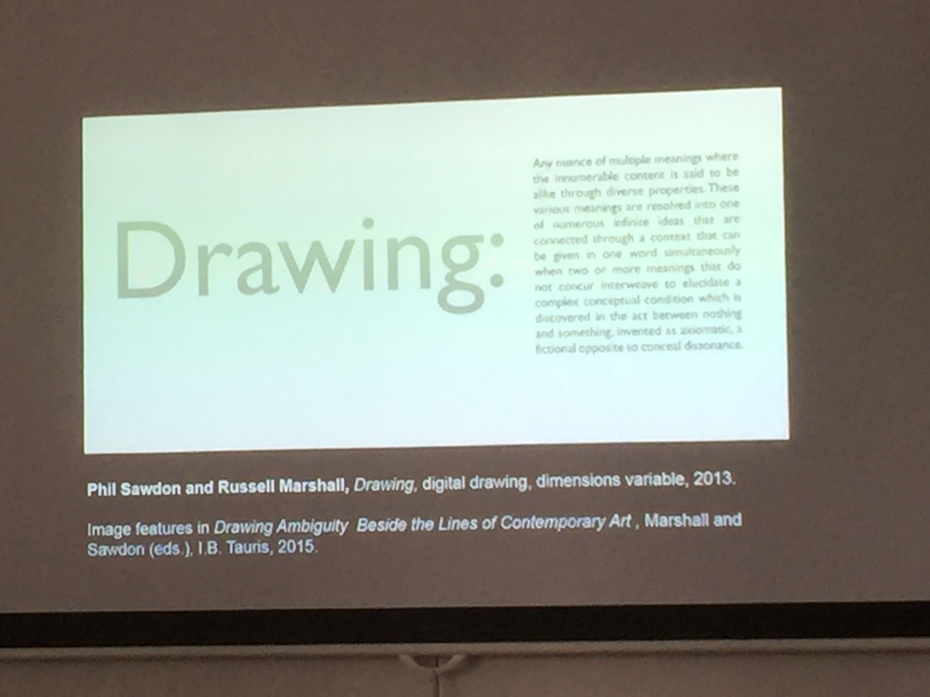
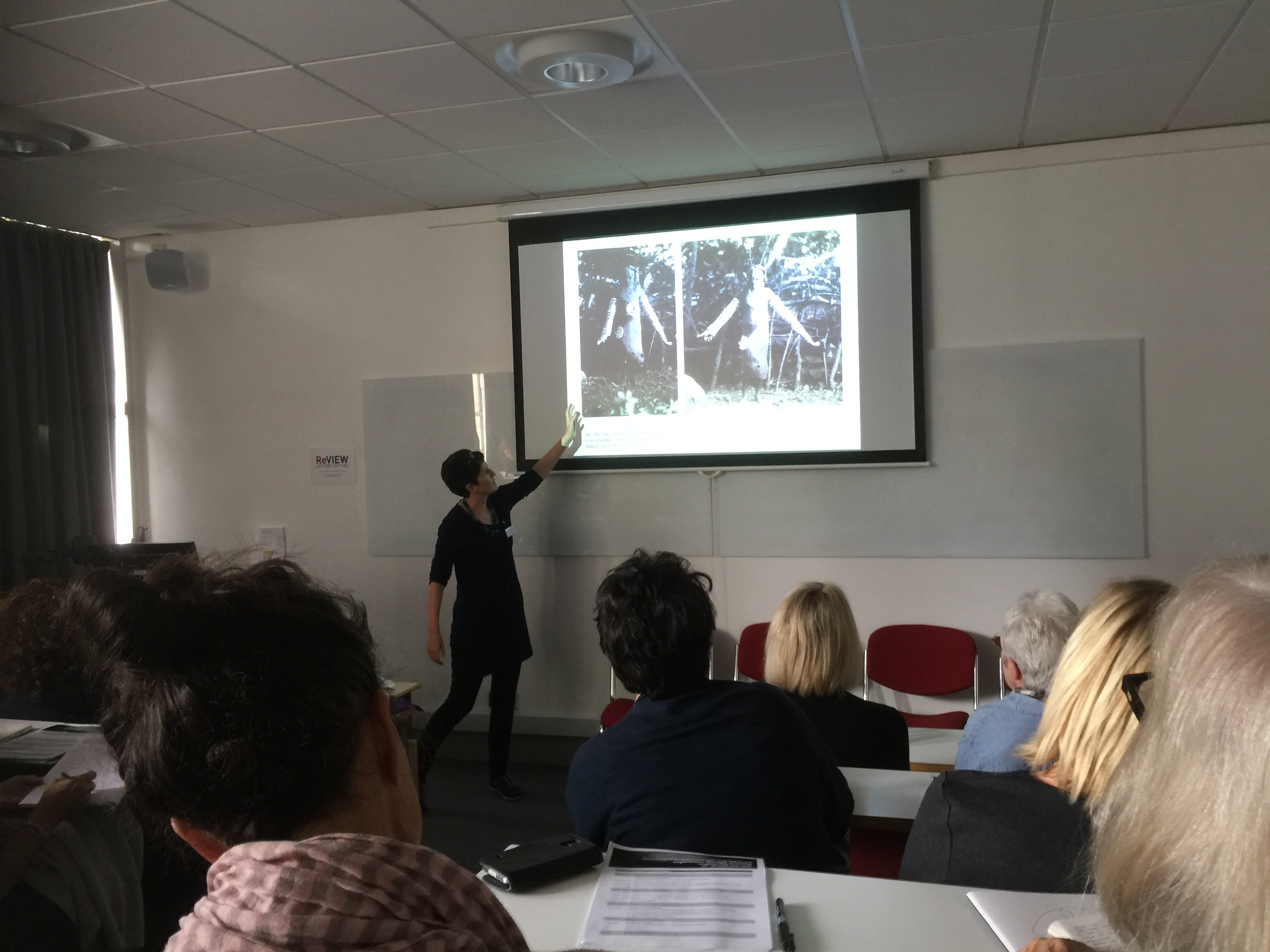
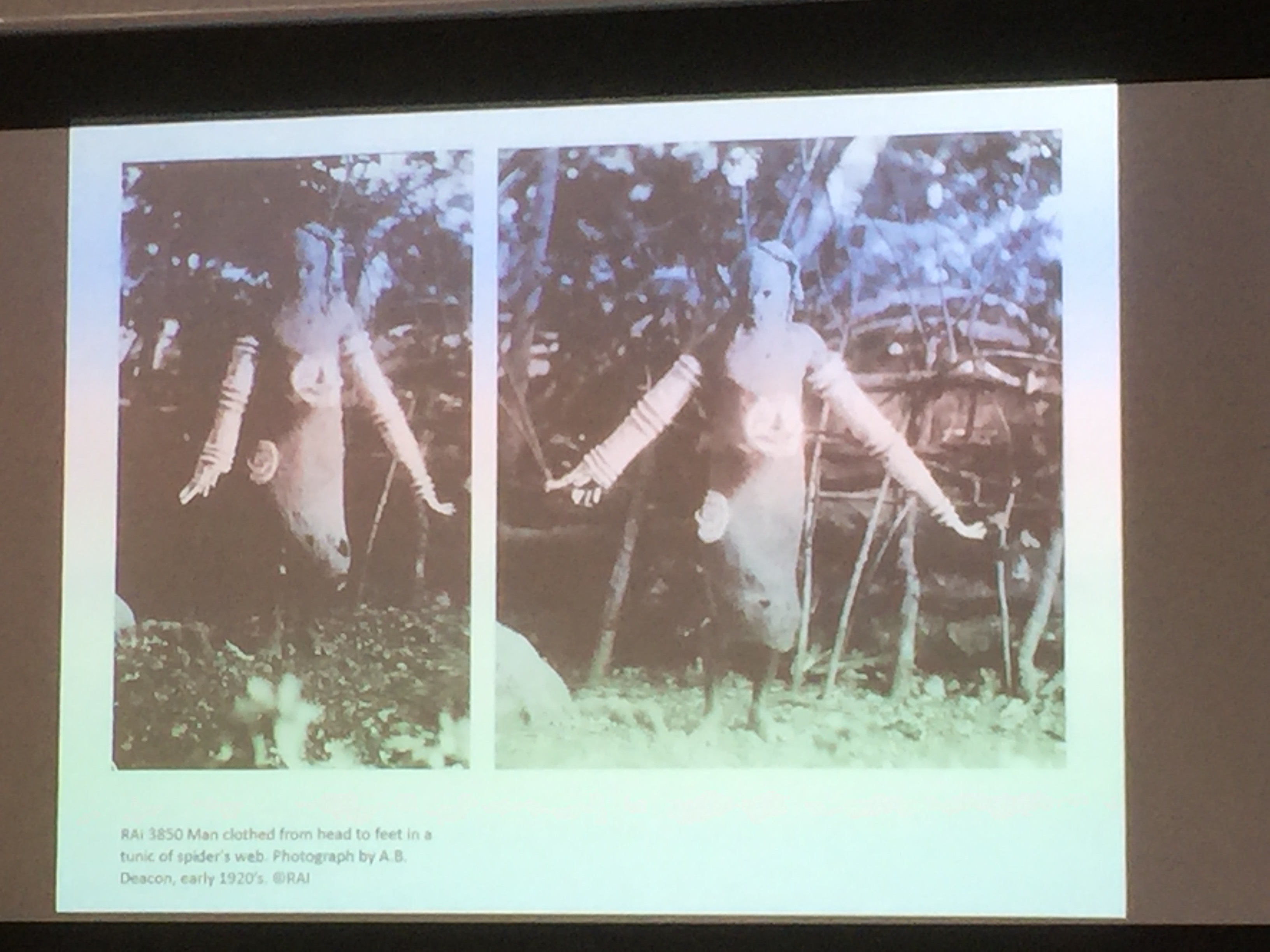
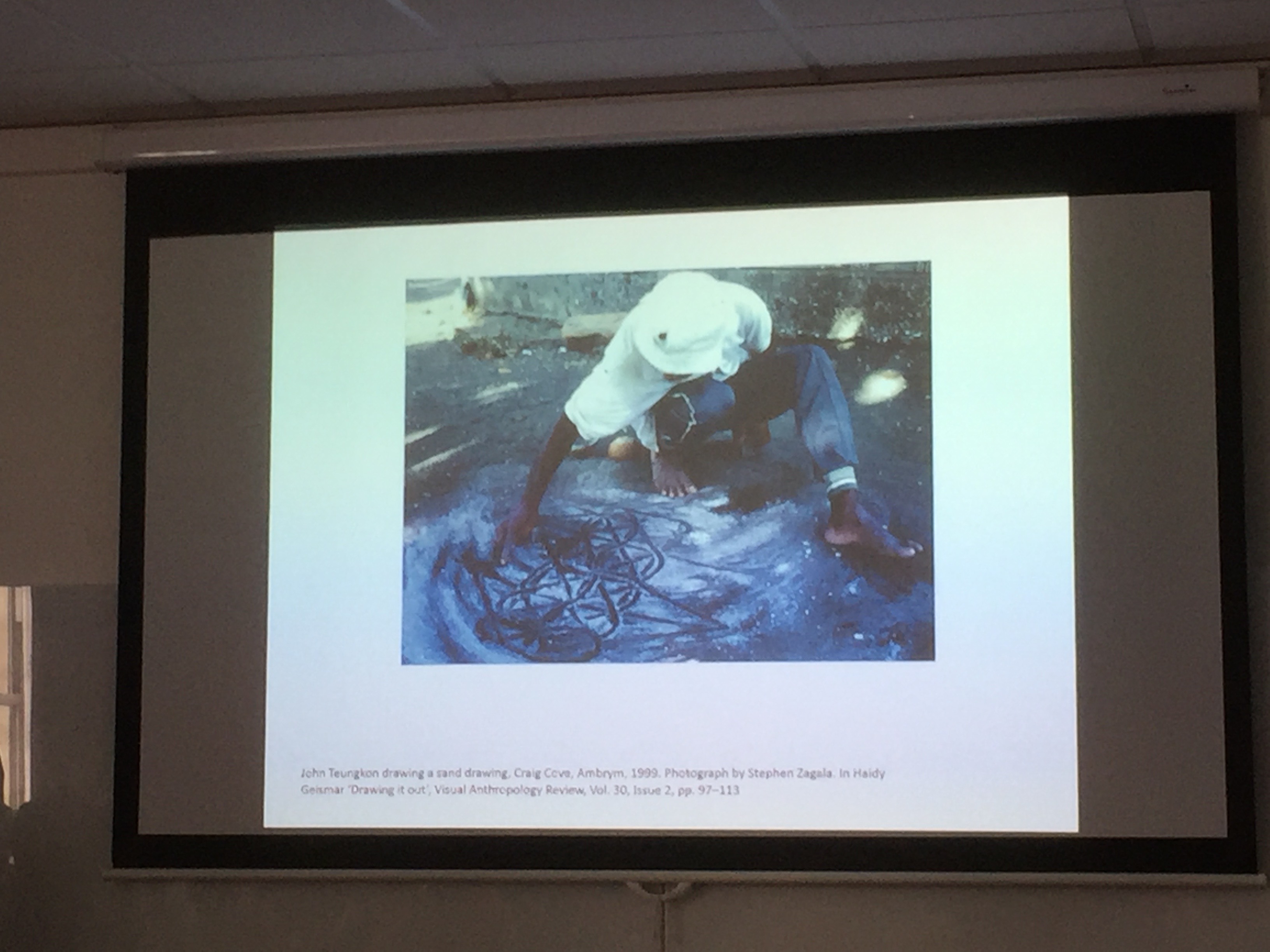
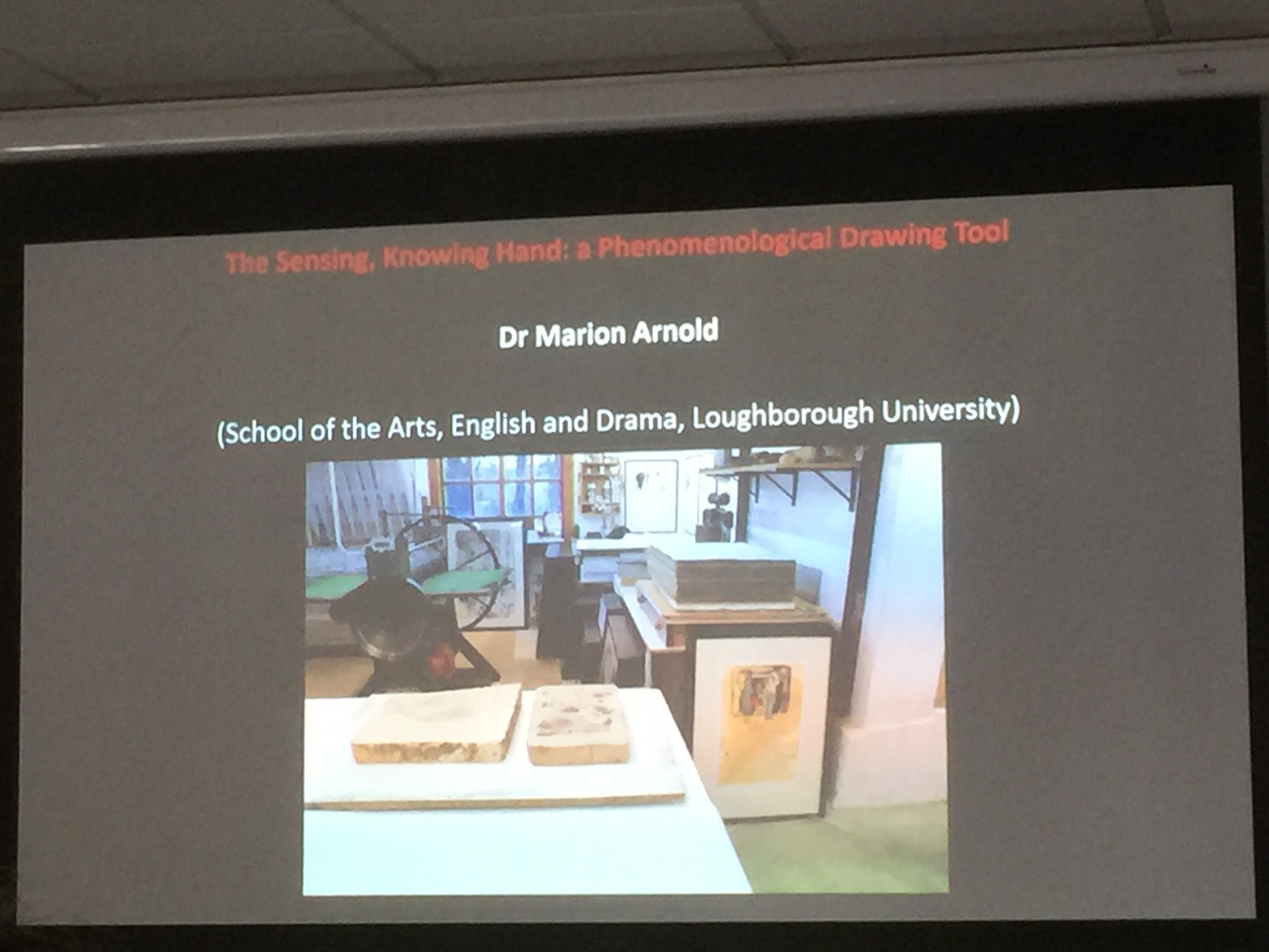
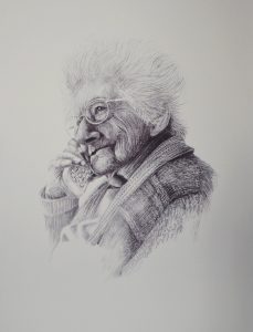
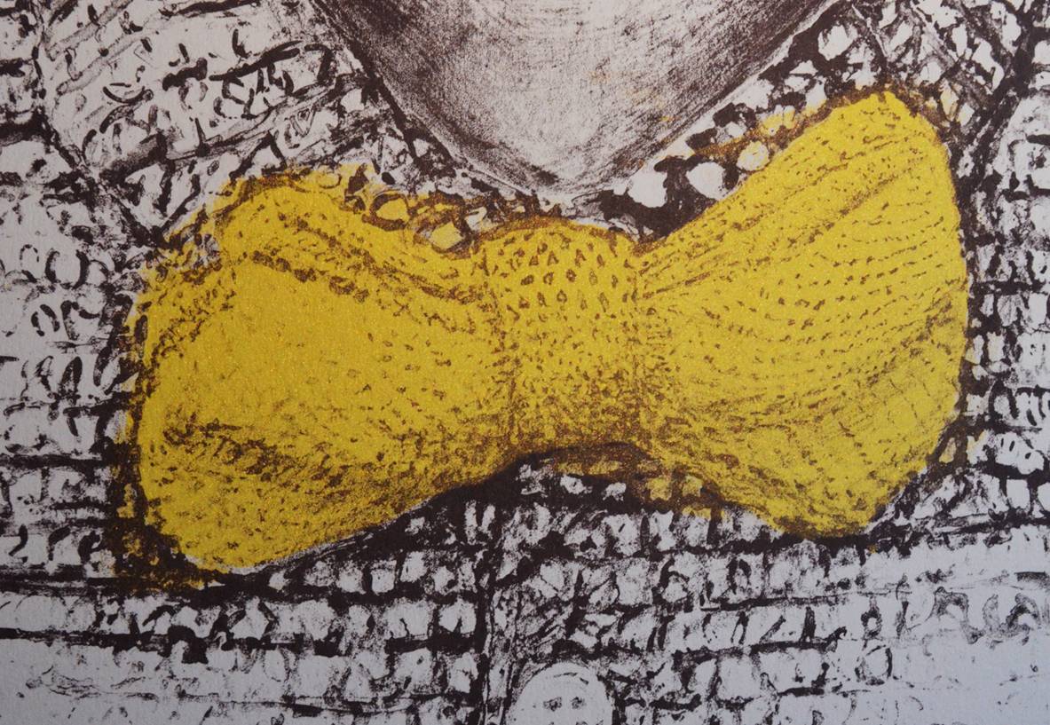
My selected drawing for this longer session was  Michel Thevoz in the library of the Art Brut Museum, Graphite by Ariane Laroux. This longer focus on ‘copying’ or ‘Re, Representing’ a drawing enabled me to begin to understand the flow of the drawing through the artist’s eyes, by copying her drawing with intense attention to detail to honestly copy and represent  her drawing.

The drawing captured the subject, but left much of the subject out. Much of the paper remained white and untouched. Following the drawing from head to hand seemed to reveal decisions made by Ariane Laroux to draw her subject, which may have gone unnoticed without the attention to detail required to copy her drawing. This seemed to confirm the thesis that faithful copying from original art is valuable to the copier in terms of dexterity, skills and insight into the artistic process.

I was not attempting to make better the original, but to replicate it honestly to the best of one’s ability to make a genuine copy. I felt the process of drawing Ariane’s Drawing brought me closer to her process to draw her subject. It was no longer an exercise, but an engaged desire to be true to her drawing, and to be with her, in her mark making and her decisions to draw parts of her subject that illuminated her whole subject. I did not know or see her subject before her, as I did not know the Ruben’s or Leonardo’s subjects, but with licence and dedicated time to draw from her picture I got to know the subject and even closer to the artist’s representation of the subject. Whilst being drawn into the process and giving as much as I could into the timeframe I felt I wanted to talk to Ariane about her drawing choices, in this portrait, because I thought I ‘knew more’ than when I began.

Sarah Jaffray’s workshop focussed on translation, which is wholly pertinent, however I took from it ‘the right to copy’ as an educational, skills and insightful process of value. She, through the Bridget Riley Foundation,  encourages drawings of the drawings, for the benefit of of the contemporary drawer.

This process encouraged  me to question where Drawing and Phenomenology meet?

The workshop abstract : 

Gained in Translation: Drawing Art History

Drawing from drawing is as old as the artist’s workshop: students drawing from their master’s work, tacked to the wall of a studio, began their journey to mastery through faithful copying. Today however, in the wake of post-modernism’s reaction against authority, copying from a ‘master’ feels outdated and has thus been erased from contemporary arts education.

For the past three years the Bridget Riley Art Foundation at the British Museum has worked with over 1,000 university art students to revive and interrogate the value of drawing from drawing as a contemporary research method. In the process of over 150 workshops we found that students who initially dismissed the practice as ‘servile copying’ began to legitimise the process with the language of translation.

Building on this qualitative research, our workshop will examine the practice of drawing from drawing through the lens of translation theory. We will discuss translation, in the manner of Walter Benjamin, as a mode of cognition that allows the translator to critically interrogate their own artistic language. Working through a series of drawing exercises from (reproductions of) drawings in the British Museum’s Prints and Drawings collection we will actively explore the question: what can translating teach the translator

Those interested in drawing from the collection can make an appointment at : www.britishmuseum.org.

The  Artworks used from the British Museum collection:

1. Paul Cézanne, Study of a plaster Cupid, c.1890; graphite. 1935,0413.2

2. Bridget Riley, Untitled 2 (Circles with verticals), 1960; Pencil, blue ink and gouache paper. 2013,7097.2

3. Vincent van Gogh, La Crau from Montmajour, France, May 1888; Pen and brown ink, over black chalk and graphite. 1968,0210.20

4. Ariane Laroux, Michel Thevoz in the library of the Art Brut Museum; graphite. 2001,0929.12

5. Théodore Géricault, Study of Soldiers fighting Civilians, 1823; Graphite over red chalk. 1920,0216.3

6. Sol Lewitt, Untitled, 1971. Pen and yellow ink. 1981,1003.27

7. Antoine Watteau, Studies of a woman standing, seen from behind, a half-length woman with head in profile to left and women’s hands, 1684-1721; Red and black chalks, 1857,0228.213

8. Peter Paul Rubens, Mary Magdalene, c. 1620; Black chalk, heightened with white. 1912,1214.5; H16

9. Frank Auerbach, First drawing for ‘Ruth’, 1994; graphite. 2013,7059.48

10. Leonardo, The Virgin and Child, 1478-80; Pen and brown ink, over leadpoint, the lower sketch in leadpoint only. 1860,0616.100, P&P 100

11. Barbara Hepworth, Sculptural forms, c. 1938; ink on paper. 2008,7082.1

12. Honoré Daumier, Clown playing a drum, c.1865/7; Pen and black and grey ink, grey wash, watercolour, touches of gouache, and conté crayon, over black chalk underdrawing. 1968,0210.30


Rembrandt’s HUIS

Rembrandt huis etching chamber

I visited a range of galleries in Amsterdam recently.  The Stedelijk, Foam, Marseille Huis, Rijks Museum, Van Gogh Museum which were all a pleasure and update on my previous visits years ago. There are great opportunities to see a wide range of European Art of the highest quality and there was a regular insight and celebration of the value of Artist’s printmaking. Whether traditional etching, lithography and mezzotint, through French poster printmaking to Dutch multi colour photography from black and white negatives made in 18th C Egypt.

However I was most surprised by Rembrandt’s Huis on a city centre High Street.  The Huis he bought and early in his career to include domestic and commercial accommodation for family and clients as well as his Painting Studio, collections room, apprentice salon and ‘etching chamber’. It was also the house he had to sell when he was made bankrupt later in life.  An inventory of all his possessions was made to assess the value that could be accrued. This includes an early picture I had not seen before – old man with curly hair

This inventory has enabled the house to be brought back to its original state for his creativity. I’ve never been one for recreating historic museums, however experiencing the rooms he lived and worked in had a strangely ‘real’ feeling.  He not only painted and printed in these rooms, but slept in that box bed and looked out of that window by the front door he opened and welcomed met clients and sitters.

The experience was brought more to life by a enthusiastic guide and paint preparation and etching demonstrators. They were not dressed in 17th C clothes , but modern black aprons while presenting knowledgable demonstrations of the techniques adopted by the master.  All of which made more real the experiences, trials and tribulations captured in books and internet films I am researching to understand his portraiture and printmaking.

Pictures from the Rembrandt Huis visit.

Picture from the Amsterdam visit

Rembrandt Huis

Etchings

Printed Portraits Opening Day

May 10 th arrives and the 30 Printed Portraits will be revealed to all and those  who feature on the walls of the Birmingham Museum and Art Gallery.

In the morning I was attending to final details including briefing the wonderful front of house team and remaking the nameplates with larger type and a Shrieval coat of arms. A gentleman came into the space and after a while focussing on the pictures I asked what he thought.  He had seen the exhibition advertised on the BMAG Whats on listings and had travelled in especially from Telford in Shropshire to see it.

We talked about the how he is semi retired and visits galleries near and far to get a sense of artists work close up. We discussed portraits, photography, art before taking a picture of each other. He asked if he could take my picture in front of the Portrait of Eileen Wright as it is his favourite because of the ‘glint in her eye at her age’, as well as the big buttons on the phone she used to take he 97th birthday call.


Mike had been to the TATE in Liverpool to see the Rossetti Monna Vanna portrait and had taken a celebratory picture. I pointed out that next door in Gallery 17 is a beautiful picture by Rossetti of Beatrix.  He thanked me and went to see it, quickly returning with glee and after one last tour of the portraits made his comment in the book.

As the normal viewing day came to a close  a group of women came into Gallery 16. They viewed the portraits with interest and consideration, sharing their views to each other about the portraits and the subjects. They enthusiastically reflected, and nominated their top three! Top of their favourites  was Eileen Wright.

discussing anita’s portrait
which is your favourite?


I heard later that evening at the private view that as they left the Museum they met Eileen’s daughter and husband on the gallery entrance doorsteps and eulogised about the portrait exhibition and in particular the one of the older lady making her birthday phone call.     Wonderful

Eileen Wright takes 97th Call

Dr Robert Grose Hangs and lights the exhibition


DR Grose slots in frame of The very Rev Catherine Ogle

There are many clever,  precise skills and crafts required to hang a 30 frame exhibition.  Especially as I wanted a very aligned approach.  Getting the balance right between the 3 different sizes of frames to provide an equality of status for each portrait, while a unity across the 4 walls was a priority that Dr Rob achieved to perfection with his attention to detail at every stage. Rob also suggested not using the traditional ‘mirror clips’ to hang the show, but to use  security picture fixings. These have the benefit of being hidden from the view as the frames ‘magically’ hang on the wall.  In addition the spring locks are secure and prevent the frames being removed with out the ‘special lever. Lawrence at the Framers was able to supply.

Click on the gallery below to see pictures of the process.

Dr Rob Top tip : If the walls are not necessarily flat – you end up with rocking pictures. This can be remedied with a slice of cork behind the frame, but it can become uneven to look at on the oblique view which matters if the galleries are big.

The exhibition is in the Print Room, Gallery 16 in Birmingham Museum and Art Gallery 


High Sheriff WM Printed Portraits installation

The High Sheriff Printed Portraits were framed by Lawrence at The Framers in the Custard Factory, Digbeth, Birmingham. ‘The Hangman’ Dr Rob Grose  and I collected the frames to transport to the hallowed and impressive galleries in the city’s municipal Gallery in the city Centre. Lawrence assisted with the 3 Large A0 frames.  It was a cold and damp start, but we were let through the historic, heavy metal gates and up in the slow, but sure lift to the 2nd floor gallery level.

Gallery 16 was pristine after the recent redecoration, but a tad daunting in its emptiness. While we got underway the galleries seen through our closed glass doors were bustling with visitors and groups of eager school children travelling in from their city schools to see the collections and be inspired to write and draw.  The Front of House staff and volunteers are very experienced, knowledgable and open to engage with all visitors. In fact our first visitor pre public viewings were invigilators eager to see the new exhibition and to understand more in order to respond to visitor’s questions.

Gallery 16 has brass plates on each door designating it the PRINT ROOM.

Originally this was a dedicated and curated print room, but it is now utilised for a range of exhibitions. It seems vey appropriate to be exhibiting the High Sheriff Printed Portraits here.

Click ‘Installation’ gallery to see how we embarked on the hang.

Hanging the exhibition was a revelation. Individual prints began to ‘connect’ with each other and we began to see ‘themes’ that had not been apparent until this moment. Some subjects looked one way, while others looked elsewhere. Hands began to follow each other, and subject’s emotions became clearer and clearer and the exhibition began to reveal itself.  Each portrait and its subject  is important in itself, but gathered together they become a body of work that reflects on the breadth of people I met in the West Midlands in 2015/16.

The exhibition is in the Print Room, Gallery 16 in Birmingham Museum and Art Gallery 


Twoasone print submitted to ONPAPER

My twosome, double up  4 colour silkscreen has been included on the ON PAPER artists submissions site.  

ON PAPER is a project to promote the art of printmaking and develop connections between printmakers around the world. It is based in Barcelona and run by an art association with Nuria Melero as a main organiser.

ON PAPER contest : 3rd ANNUAL ‘ON PAPER’ INTERNATIONAL PRINTMAKING AWARD 2017

The shortlisted artists for the On PAPER Award 2017 will be exhibited in The Chicago Printmaking Collaborative, Chicago USA, from July 8th – August 31st 2017.  More information here :

More about Twosome here :


Social media & sharing icons powered by UltimatelySocial
error

Enjoy this blog? Please spread the word :)

Instagram